CrazyForATB, while I appreciate the Walt Disney Studio pictures, Walt's face does NOT belong on our coinage. The man was violently racist (four words: Song of the South) and anti-Semitic (among other things, he invited a Nazi to America to help her publicize her new film). I would argue that
Hamilton Jackson (much later ETA: sorry, this is why Nina shouldn't type at 3am) doesn't belong, either, and again, three words: Trail of Tears. (My thoughts on Edison can be found over in the "should the $10 or $20 be changed" thread--I don't like him either and think he should be replaced with Nikola Tesla.) I would nominate in their places Harvey Milk and Robert Frost.
As for myself, if I redesigned our money and could have my way 100%:
THE PENNY: ending in 2015, the sesquicentennial of Lincoln's death, the final year of the penny would feature a "double obverse" (for our purposes, I'll refer to the Lincoln bust as the obverse). The Lincoln obverse would show the Lincoln bust; above Lincoln's head, "UNITED STATES OF AMERICA". The date would be in its normal place. On the reverse, we would see the obverse of the
Indian cent, that which was in circulation during Lincoln's Presidency. The word "LIBERTY" would appear on this coin in the place where "UNITED STATES" exists on a period
IHC, and "ONE CENT" where the date appears on a period
IHC. This would be available in its regular Zincoln form for circulation, and also in a full-copper version available only for collectors, ordered directly from the Mint.
THE NICKEL: changed to a steel design, the new nickel would feature Benjamin Franklin on its obverse in a front-facing bust. The date would appear under the bust, the words UNITED STATES OF AMERICA above and alongside it. On the reverse would be an updated version of the Fugio cent sundial, with the words WE THE PEOPLE replacing the sun and FIVE CENTS replacing MIND YOUR BUSINESS.
THE DIME: Franklin Roosevelt remains on the obverse, but in an updated bust facing forward. IN GOD WE TRUST is removed* and the bust is moved slightly leftward to make more room for that poor squished date; the words WE THE PEOPLE replace IN GOD WE TRUST. On the reverse instead of the pretty but cluttered current device we have the words TEN CENTS in the centre, surrounded by a wreath of olive branches. UNITED STATES OF AMERICA remains at the top.
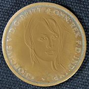
THE QUARTER: Sorry, Washington, you're being shunted aside for the
Presidential dollar Liberty! The date and mintmark replace the $1 symbol, the words WE THE PEOPLE skimming along the rim. The reverse takes the form of the current cent's back; however, with the additional room, I'd do something fancy to it (it's 2am, cut me some slack here). The words TWENTY-FIVE CENTS appear below the shield and UNITED STATES OF AMERICA above.
THE HALF-DOLLAR: Replaced by the original Sacagawea design. IN GOD WE TRUST is replaced by WE THE PEOPLE. E PLURIBUS UNUM remains (my main objection to this motto is on coins where the design is already cramped) and the words ONE DOLLAR replaced with FIFTY CENTS. This coin is further differentiated from the now-discontinued Sac dollar by its colour: silver instead of gold.
THE DOLLAR: Say goodbye to the one-dollar bill and hello to the one-dollar coin featuring the bust of Gouvernor Morris**, the man who put together all the bits and pieces of the United States Constitution. The obverse features Mr. Morris in a front-facing bust with the legend WE THE PEOPLE above his head, the date appearing alongside. The reverse features the words UNITED STATES OF AMERICA above Mount Rushmore, that monument of the puzzlingly endearing. The words ONE DOLLAR appear below it.
THE TWO-DOLLAR BILL: Jefferson is out. César Chávez is in. The new bill series is loosely inspired by the UAE's 20-dirham bill (which is actually really beautiful, instead of an epileptic mess of colour and random stuff), and our new two-dollar bill is a light green and cream. The portrait is in the style of the 3013 $100, off-center to the left facing toward the middle of the bill, and extending to the edge of the bill. To the right are the words TWO DOLLARS printed over the Treasury symbol. The border of the obverse appears to be a simple, dark green line to the naked eye; however, magnification will show microprinting of the entire preamble of the Constitution. The words UNITED STATES OF AMERICA appear just below the top "line." All four corners feature the $2 symbol inside a device; the top two devices are adapted from the top-right $1 device on our current bill, while the bottom two are ovals. All bills will now have a double-watermark: the bill denomination along the left-hand side, turned on its side (so, the words TWO DOLLARS), the face of the individual on the bill on the right. To the right of the bust are the two signatures on our current bills, stacked one on top of the other. The BEP seal would still appear on the left*** and the serial number would be printed as it is on the 2013 $100. On the reverse, we have a rendering of farmers in the fields below the words WE THE PEOPLE; to the left is printed the old quarter-dollar eagle in a circle, and to the right the words "Yes, it can be done" (the English translation of Chávez' motto "Si, se puede") printed over a similar circle and overrunning its edges. The reverse of the bill also has the microprint border.
THE FIVE-DOLLAR BILL: I love you, Lincoln, but your time has come. Take heart: your replacement is Martin Luther King, Jr. This bill is a light red and cream and features a red microprint border containing the heart of the "I Have A Dream" speech. The denomination devices are as appearing on the $2, with a security strip reading US 5 US 5 running directly to the right of King's face. On the reverse we have a rendering of The Mall as it appears in the famous photographs of King's iconic speech, with the words WE THE PEOPLE above the rendering. The circles appear as on the $2, with the Chávez quote being replaced by "Injustice anywhere is a threat to justice everywhere."
THE TEN-DOLLAR BILL: Hamilton is replaced by someone slightly less girly-looking, Miss Susan B. Anthony. This bill is a light blue and cream, appearing as previous bills in the series, with the security strip to Anthony's left. The dark blue microprint line features the 14th Amendment of the Constitution. Unfortunately, I know less about Miss Anthony than I'd like (until I was fifteen I believed my mother's tale that she was on our money because she'd sued to take prayer out of schools and until last year it never occurred to me to research her), and so cannot offer a rendering or quote for the reverse. Perhaps Earle can spot me here?
THE TWENTY-DOLLAR BILL: Harriet Tubman. This bill is yellow and cream and features microprint of Frederick Douglass' letter to be included in Tubman's first biography. The security strip is all the way on the right side of the bill. The back features a rendering of a station on the Underground Railroad, and the included quote is "I never run my train off the track."
THE FIFTY-DOLLAR BILL: If I hadn't designed this series with speeches and quotes so prevalently placed, this would be a triple portrait of Robert Frost, Edgar Allan Poe, and Mark Twain. Since I did, however, we will instead honor . . . . . EINSTEIN. (Jbuck, you were just WAITING for me to say Tesla, weren't you.) Given that Einstein was a megagenius who had huge thoughts on all kinds of things, I'm not even going to ATTEMPT to select quotes for microprinting or the reverse; let's pretend I have a giant committee at my disposal that can understand his technobabble way better than I can, and that they have selected something appropriately pithy, moving, and deserving of posterity. This bill is a light indigo.
THE ONE-HUNDRED DOLLAR BILL is still a bill I hate because they're so hard to make change for. But let's give a round of applause to the new hundred with GEORGE WASHINGTON on the front and the crossing of the Delaware on the back. This bill is microprinted with Washington's four things necessary to the wellbeing of the United States, and is printed in orange and cream.
*someone is going to get mad at me. All I'm going to say is that the Constitution says the government must not prefer any one religion over another, and plenty of religions practiced in this country have no specific god (e.g. Transcendentalism), multiple gods, or a goddess.
**Someone is also going to get the impression I hate George Washington. I actually think he was a pretty awesome guy. I just don't like the current designs of him on our money.
***I could've taken it off, but even my imagination doesn't extend that far.