| Author |
 Replies: 15 / Views: 1,085 Replies: 15 / Views: 1,085 |
|
|
Valued Member
United States
95 Posts |
|
|
|
|
Pillar of the Community
United States
1795 Posts |
Yes I agree with you 100%. Sure does to me as well.
|
|
Pillar of the Community
United States
2624 Posts |
|
|
Bedrock of the Community
United States
62064 Posts |
Looks normal to me: 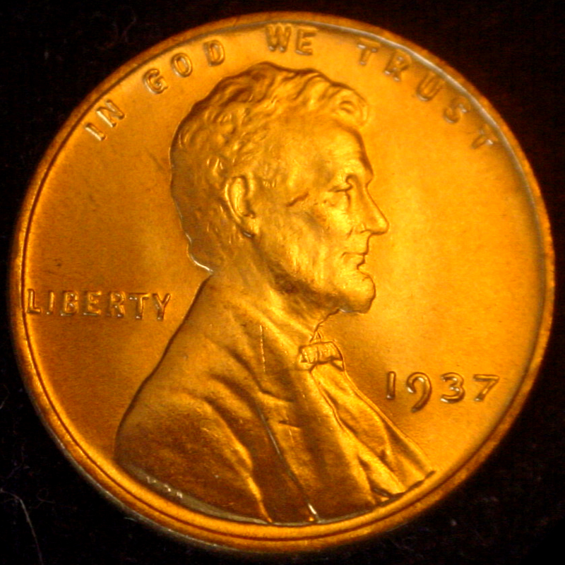 |
|
Valued Member
 United States
95 Posts |
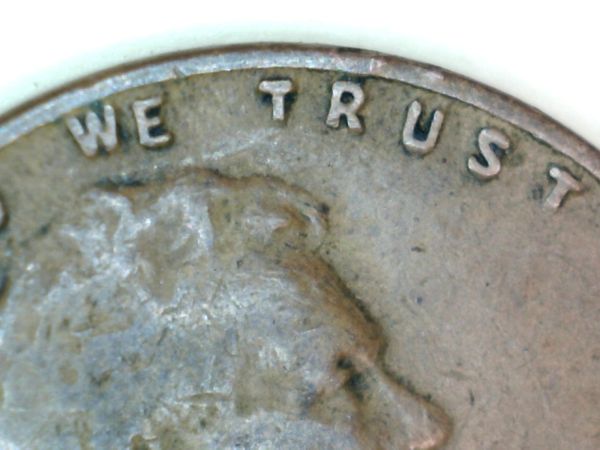
Coop I'm just a new guy and I trust both your expertise and eyes but could it be the same metal flow around the E that occured around the 7 (see it between the W and E and the metal flow looks like it extends on top of the E as well to the rim), it makes it appear the the letter is slightly lower..now I have to figure out how to convince my eyes or let it ride to another time and accept it as a part of the normal minting process.
In everyones experience does metal flow cause these optical illusions to occur often? Again maybe it's just me.
|
|
Pillar of the Community
United States
1795 Posts |
Your not seeing anything wrong; it is lower as to the reason why I'm not going to say. It very well may be part of the minting process and is accepted as normal. I know what I see and I'm sure you do.
|
|
Rest in Peace
United States
10625 Posts |
Looks to me like this cent spent a couple of cycles in the dryer or something similar. Appears to be a lot of PMD. Just my opinion of course. |
|
Rest in Peace
United States
2668 Posts |
Yes, a dryer will move a letter off the party line.  |
|
Pillar of the Community
United States
2651 Posts |
This is a somewhat of an uncommon error. Rotated Picture Error...
The OPs picture is rotated to the right. This makes the E look lower than it is. Coops picture is taken straight up and down. IMO its normal. (however when I first looked at it it looked lower...but turn your head straight on the original pic...normal)
Edited by Jayman931
07/25/2013 1:35 pm
|
|
Pillar of the Community
United States
2624 Posts |
When I saw ctguy's photo I grabbed a stack of wheat cents and compared the "WE". It looked the same on the three I looked at,all different dates.That was how I concluded ctguy's coin was normal.
|
|
Valued Member
United States
246 Posts |
well Dryer Coin does seem to be one of the favorite answers |
|
Valued Member
United States
246 Posts |
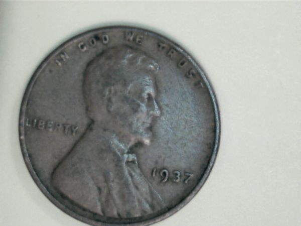
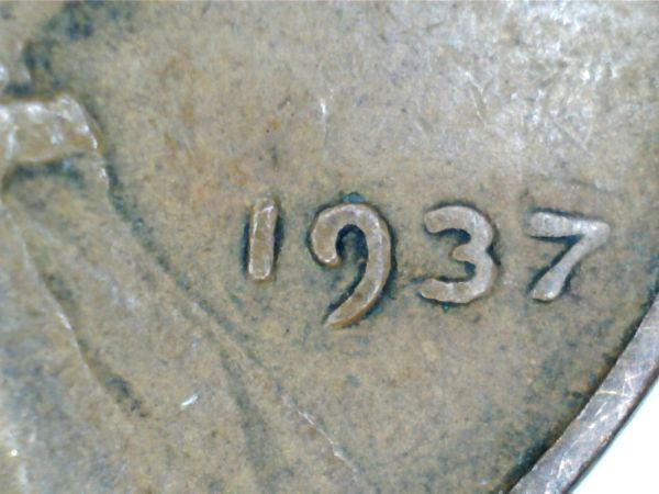
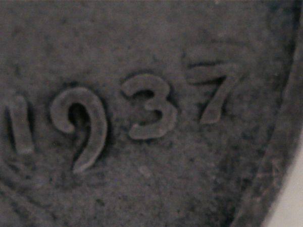
just like the 1937 is not parallel with liberty on this cent, these things happen. its normal, but not.. I guess
Edited by randy0050
07/25/2013 8:34 pm
|
|
Valued Member
United States
207 Posts |
Also, the bottoms of the letters "W", "T" and "R" are worn out and therefore shorter, which in turn makes the "E" appear lower than them. When you replace the worn-out bottoms, as shown below, the "WE" now looks closer to coop's photo.  |
|
Pillar of the Community
United States
1795 Posts |
Gentlemen those are all reasonable answers and I can accept that as to why it looked lower to me. If you listen you will certainly learn ...Thank You!
|
|
Moderator
 United States
56855 Posts |
The E is lower and it's not because of the minting process it is the way the die was made,IMHO John1  |
|
Valued Member
United States
95 Posts |
All, Thank you for the excellent observations and education, Agreed - Gentlemen those are all reasonable answers and I can accept that as to why it looked lower to me. If you listen you will certainly learn. And I am learning  |
| |
Replies: 15 / Views: 1,085 |
|