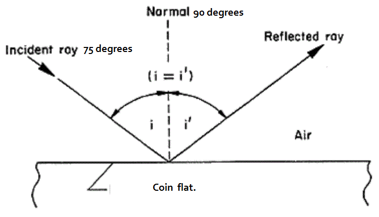
The toning (patina) certainly enhances the character of many coins, by heightening the fine details in many instances. I find many subtleties of the design I may have missed stand out. Especially beautiful are the coins with nice rainbow toning or hues that blend in to one another. I have a copper or bronze token, not sure which, when looked at is ordinary. However, when tilted in sunlight shows the most GORGOUS shades of blue tones. When I received it I was very disappointed, as it showed no blues as in its ad. While inspecting it, I tilted it and out shone the most beautiful blues. I'm stumped as how this token can have 2 distinct appearances depending on angle of view ? It is a hard coin to photograph to show the toning. Can anyone explain the reason for the 2 visual appearances?
Search CCF Members
eBay Tools
eBay Coin Search Engine
eBay Coin Categories
All eBay Categories
eBay / CCF Member List
eBay / CCF Member Sales
Popular Items
Error Coins
US Error Coins
US Cheap Coins
US Hot Coins
US Most Watched Coins
Aussie Cheap Coins
Aussie Hot Coins
Aussie Most Watched Coins
Canadian Cheap Coins
Canadian Hot Coins
Canadian Most Watched Coins
Ancient Cheap Coins
Ancient Hot Coins
Ancient Most Watched Coins
World Cheap Coins
World Hot Coins
World Most Watched Coins
eBay Coins By Type
eBay Coins By Year

|
|
This page may contain links that result in small commissions to keep this free site up and running.

Welcome Guest! Registering and/or logging in will remove the anchor (bottom) ads. It's Free!