| Author |
 Replies: 17 / Views: 4,498 Replies: 17 / Views: 4,498 |
|
Valued Member
Norway
148 Posts |
Hi, I am new to this forum, but I work in a coinstore in Norway, and I've been fiddeling a for a while with photos(I think they're quite good, but something is still missing) It seems the coulor is a bit "off" on some, and the whitebalance is as good at it gets. I'm using a copystand with a 5500k photolight. So, here's a selection of photos I'm quite pleased with, and some I'm not so pleased with. (Mix of Norwegian and Americans) Okay, The thing is; I feel the light is maybe a bit sharp on the 2 Kroner piece, as it has a lot more luster than what shows up on the picture. The others is just to here what others think. Basicly I have most trouble with white coins, in a high grade, I can't get the right luster, if you know what I mean? Should I try to diffuse the lights? As for now I'm only getting light from one side, execpt the gold ones, and the 2 americans. They have kinda axial-light-thingy I've made. If I use light from both sides of the coin, it looks very scratchy.     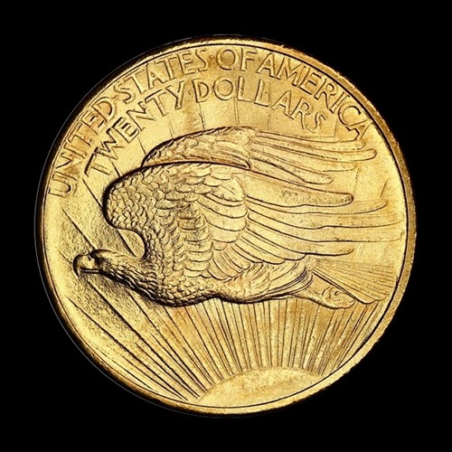  Edited by aleroe
03/16/2014 2:32 pm
|
|
|
|
New Member
United States
22 Posts |
That's about the best you can do with that camera. I think those pictures are great anyway.
|
|
Valued Member
 Norway
148 Posts |
Thanks : )
I've got a Eos 550D, with uhm.. macro 100mm I think.
|
|
Pillar of the Community
 United States
4038 Posts |
The 1 Krone and 1907 US Gold pics are the best of the bunch, and will be hard to improve on. Your lighting technique is pretty variable. Looks like both of those are mostly axial, or at least high angle. They have excellent shadow detail around the devices, and even illumination. The worst pic is of the 1916 Cent, as it does not show much detail on Lincoln's face. The highlights are a bit overexposed. The 2 Kroner is good, but not to the level of the 1 Krone. You might try reducing the exposure a bit to eliminate the over-exposure, and possibly increase your diffusion on this coin.
|
|
Valued Member
Norway
148 Posts |
Thank you! The gold pieces I'm quite happy with. I've made a couple of new photos of the one cent, and 2 Kroner piece. There's one problem, as far as I am concerned, about axial-light. The coin seem to look better on photo, than it actually is in real-life. If there was a way to combine the styles of the two photos, it would be nice. As you can see, there's quite a difference on the "axial Light" and the diffused light. 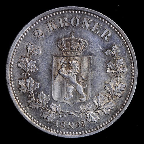 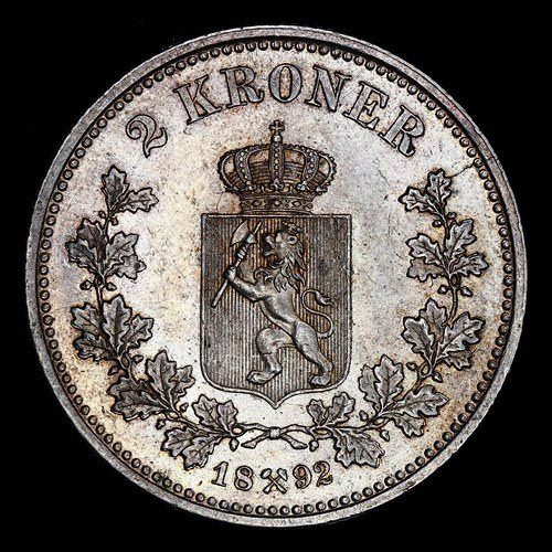 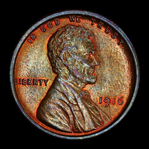 Edited by aleroe
03/17/2014 09:31 am
|
|
Moderator
United States
23522 Posts |
Quote:
The coin seem to look better on photo, than it actually is in real-life.
Observe the coin in "real life" under the exact same lighting you're shooting it. We rarely do that, expressing excruciating care with imagery yet looking at the coin in-hand under whatever lamp is handy - and that's why imaged coins look so much "better" than what's under your loupe. They *are* better than you're seeing. You're just not "seeing" them right.  |
|
Valued Member
440 Posts |
Aleroe can you post a pic of the "axial light thingy" you are using. I'm currently dabbling with this also and would like to get some ideas before I build a permanent setup.
|
|
Valued Member
Norway
148 Posts |
Superdave, That is indeed true.
I've seem to have "fixed" my problems now, I've had my camera set up at +4 contrast, now I'm mostly working with -4 to 0. Very rarely +4.
That setting has vastly improved my photos.
Thanks again, for feedbacks.
You might see some more pictures from me, somewhere in the forums.
|
|
Valued Member
Norway
148 Posts |
This is the setup I use, It looks silly, but it works. The little white lamp is the axial-light-thingy. I can move it so the light is straight over the coin, and I can remove, to adjust where the light comes in. The lamp I use is a lamp with a huge magnifying glass inside, which I have removed, to make it fit right under the lens of the camera. The little black box with glass on top, is just to remove any shadows from the sides of the coin. Makes it easier to crop/cut coins away from the background. Hope this will give you some ideas.  |
|
Valued Member
Norway
148 Posts |
|
|
Moderator
United States
56855 Posts |
How about trying an 18% gray scale backround? John1  |
|
Valued Member
Norway
148 Posts |
Here is a result of reducing the contrast. This is one of my best pics as of yet.   |
|
Pillar of the Community
Australia
674 Posts |
Love these two shots.!!  |
|
Valued Member
Norway
148 Posts |
|
|
Valued Member
Norway
148 Posts |
We are getting there. 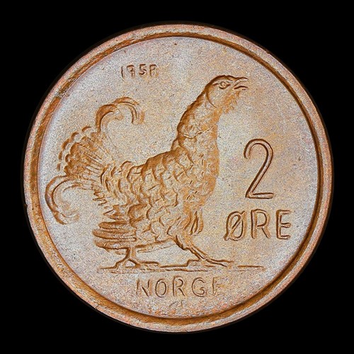 |
|
New Member
United States
2 Posts |
Thanks for posting pics of your setup aleroe! I've been wondering what is the best way to photograph my collection (I'm new) and your ideas are pretty good, I'm going to try them out when I photo my coins :D
|
| |
Replies: 17 / Views: 4,498 |


