| Author |
 Replies: 108 / Views: 21,345 Replies: 108 / Views: 21,345 |
|
Pillar of the Community
Canada
2805 Posts |
Just a thread for all the coins that we think aren't up to par for some reason. Be sure to include why you dislike this particular design, and how it could be worse. I'll start!   Why it's bad: No pictorial elements whatsoever, this Malawian issue has a special place in my heart for including a numerical denomination at the center of BOTH sides. There's no doubt it's ONE PENNY, but when the rest of Malawi's first coinage from the late 1960s is quite competently designed, surely just a tiny bit of creativity could have gone into this one? It could be worse: The words are easy to read. As a coin, it might be immensely boring, but it's certainly utilitarian. |
|
|
|
Pillar of the Community
United States
1839 Posts |
I think perhaps everyone is too bored or uninspired to post in this thread  |
|
Valued Member
Canada
160 Posts |
It's not too bad, sure it's not too exciting, but it could use a little more in the design. It is however the first coin I've seen where the obverse is practically identical to the reverse. Interesting in that factor alone. IMO.
|
|
Bedrock of the Community
United Kingdom
18069 Posts |
I think the Guernsey decimal halfpenny deserves a place here: 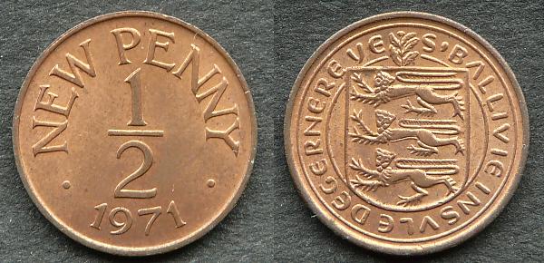 Edited by NumisRob
08/19/2014 03:10 am
|
|
Pillar of the Community
United States
3253 Posts |
|
|
Pillar of the Community
United States
4692 Posts |
Swedish plate money. Not all coins are round. It can't get much more boring than this.  |
|
Pillar of the Community
Australia
9565 Posts |
This is one that comes to mind... (no offense to our Finnish friends)  Steve |
|
Bedrock of the Community
United States
20753 Posts |
It is odd that our Lincoln Cent appears in such posts as this. Probably the most collected coins in the USA yet so many think it is just plain. Possibly that silly shield doesn't help. |
|
Pillar of the Community
United States
1476 Posts |
Quote:just carl wrote" It is odd that our Lincoln Cent appears in such posts as this. Probably the most collected coins in the USA yet so many think it is just plain. Possibly that silly shield doesn't help.  The OBV is fine although it seems the relief has flattened out too much but the REV is just "plain" bad. Dar |
|
Pillar of the Community
United States
602 Posts |
|
|
Bedrock of the Community
United Kingdom
18069 Posts |
The Communist countries of Eastern Europe were pretty good at creating really boring coins - here's an East German 10 Marks struck to commemorate the 25th anniversary of the DDR: 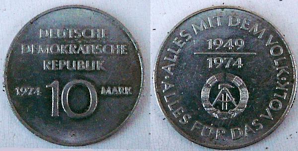 Edited by NumisRob
08/19/2014 3:43 pm
|
|
Bedrock of the Community
United Kingdom
18069 Posts |
I don't want to offend any Dutch CCF members, but for me the 1982-2001 Queen Beatrix series of Dutch coins are among the most boring coins of all time. It's as if the designers had a brief to produce something quickly and cheaply, and I reckon they must have been Republicans as the portrait shows little respect for the Queen. But what is worse is that these coins wore very badly in circulation - the large two-and-a-half guilder (US half dollar size) looked especially grotty after a few years' use. I remember visiting Holland in the 1990s and it was quite possible to pull Juliana coins of 1969-80 out of circulation in EF or better condition, but I saw Beatrix coins that I would have graded only as VG or F! 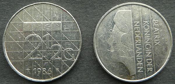 Edited by NumisRob
08/20/2014 1:15 pm
|
|
Pillar of the Community
 Canada
2805 Posts |
  A cripplingly boring design from the Dominican Republic. "You know what'll make these words exciting? Wreaths!!" - every 19th-century coin designer |
|
Valued Member
United States
102 Posts |
Minted around 650 BC, the earliest coins could certainly be considered boring from an aesthetic perspective. The obverse was nothing more than striated lines, representing the flowing water of the rivers in which electrum, the metal used to make the coins, was found. The iconography of ancient coins progressed very quickly but these types marked the start of what eventually became the diversity and detail of modern coinage:  Edited by SmallEagle
09/04/2014 11:31 pm
|
|
Bedrock of the Community
United States
10045 Posts |
I'll start with a US coin. This particular $1 coin does nothing for me. The 3/4 portrait is poorly realized and the reverse is well, so derivative of the most boring designs produced by the US mint in the last 30 years.  |
|
Pillar of the Community
United Kingdom
548 Posts |
 I always hated this commemorative issue, struck for The Duke of Edinburgh's 90th birthday. It's just a close up portrait of a very old man. It's pretty obvious that almost no thought went into the design. Incredibly the coin was struck in silver, gold and platinum versions. Who would spent the money to buy the platinum version of this horrid coin? |
| |
Replies: 108 / Views: 21,345 |


