| Author |
 Replies: 108 / Views: 21,224 Replies: 108 / Views: 21,224 |
|
|
|
New Member
Canada
36 Posts |
Rock money. 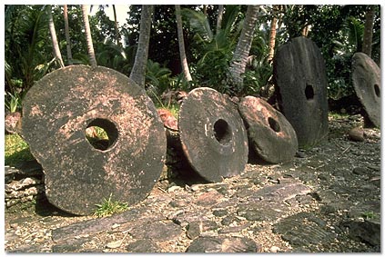 |
|
Pillar of the Community
United States
4963 Posts |
Quote:
I like minimalism too I generally prefer coins with something interesting, but minimalism is better than an overcrowded design... take, for instance, the Florida Statehood Quarter dollar. Quote:
Any american quarter between 1965-1998. I agree that the Washington quarter dollar is not the most beautiful of coins. I don't know about the rest of you, but I've always thought the eagle's body looked just a bit misshapen. By the way, this would also apply to 1932-64, but at least those ones have silver content. Edited by Numisma
10/13/2015 7:20 pm
|
|
Pillar of the Community
United States
9395 Posts |
Of the coins I have pictures of, I think this one has the least interesting design: German States / Saxe-Weimar-Eisenach -- 1792 3 pfennig:   |
|
Pillar of the Community
United States
4963 Posts |
That one's kind of neat, but it is very simple.
|
|
Valued Member
Slovenia
459 Posts |
I kind of like the Estonian euro coins :)
There are - for me - others, much worse, uninspired designs out there ... From the top of my head, almost all circulating post WW2 Yugoslavia coins. My mind just starts to produce white noise, when I'm dealing with those :p
|
|
Pillar of the Community
Australia
9458 Posts |
|
|
Pillar of the Community
United States
4870 Posts |
I think the Jefferson nickel 1938-2004 is boring. Though I also think the new design is also boring and uninspiring. Now if the original obverse and the bison reverse were kept.... I also dislike the fact a lot of coins now are low relief. I think that in itself takes away the character of the coin. I would gladly accept the Washington quarters with the eagle rather than all these rotating designs on them now.  Edited by TheForce
10/14/2015 08:00 am
|
|
Pillar of the Community
United States
4963 Posts |
I don't mind the earlier Jeff nickels, but the 2005-present ones just don't do it for me. The 3/4 view gives the impression that the designer was trying too hard to make it look artistic, when in fact it just makes it look less like a coin.
|
|
Moderator
 United States
189767 Posts |
Quote:I agree that the Washington quarter dollar is not the most beautiful of coins. I don't know about the rest of you, but I've always thought the eagle's body looked just a bit misshapen. By the way, this would also apply to 1932-64, but at least those ones have silver content. You can narrow the date range further by focusing on the spaghetti hair.  |
|
Pillar of the Community
United States
7390 Posts |
I like the rev design of the Washington quarter especially in proof personally. The eagle design is very noble imho and the proof finish makes it jump with the bold, defined feathers |
|
Moderator
United States
189767 Posts |
Finally, a defender.  |
|
Pillar of the Community
United States
4870 Posts |
Wait....what!? The spaghetti hair RULED!! The ATB coins are too flat for my personal tastes. Just wait till they are heavily circulated. Hip hip hooray for Washington quarters (1932-1998)!! |
|
Pillar of the Community
United States
6130 Posts |
Edited by Finn235
10/14/2015 12:53 pm
|
|
Pillar of the Community
United States
1314 Posts |
Denmark's Commemorative issue celebrating High School Shop Courses. 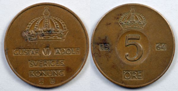 JimBucks' Swedish plate money is the best though. It looks like one of my auto body projects. (That I learned in a high school shop course.) |
|
Pillar of the Community
 United States
1888 Posts |
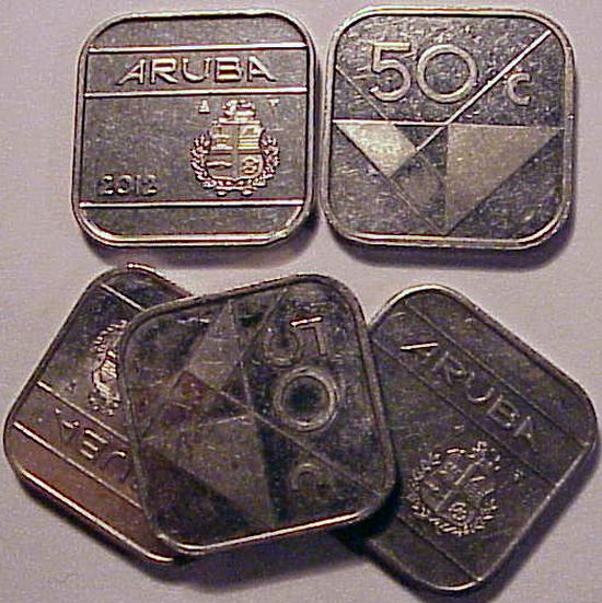 Seriously, a square coin? What's up with that? Jamming coin counters? And that modern art on the reverse looks sort of like a map of the Bermuda triangle . . . On the plus side, these are super easy to pick out of a massive 4-for-a-dollar tub. And there is a nice long date run, with some challenging low mintage years. Bus still, b-0-r-I-n-G. |
| |
Replies: 108 / Views: 21,224 |


