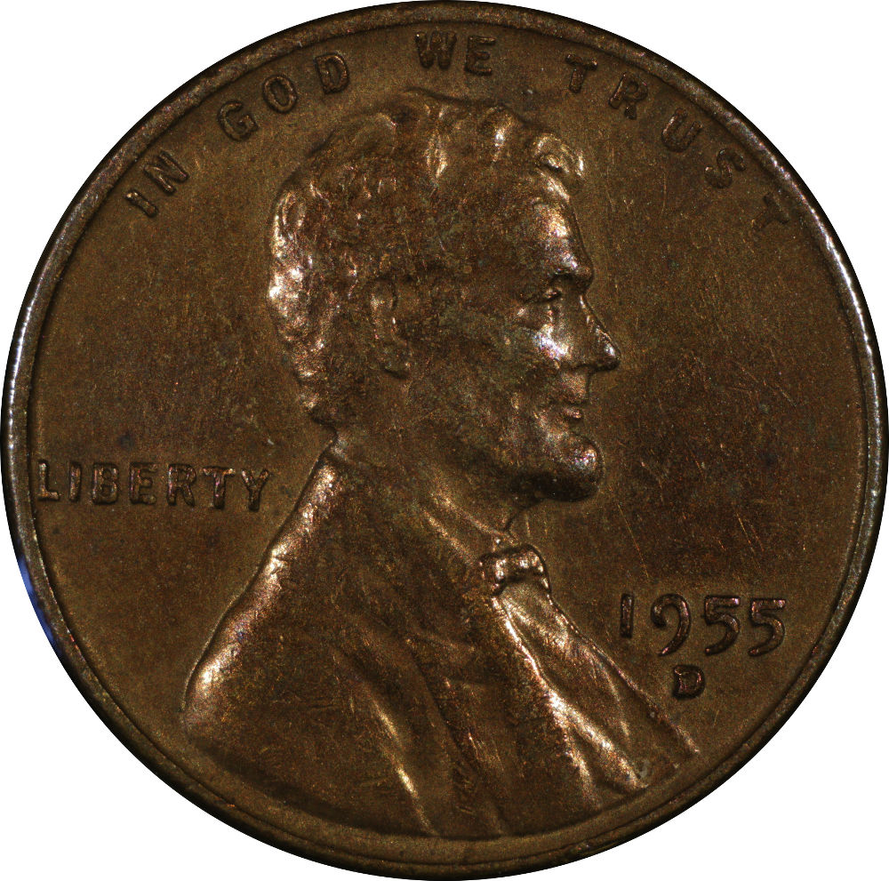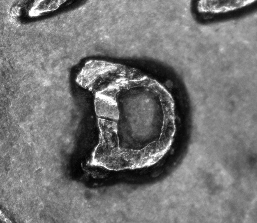
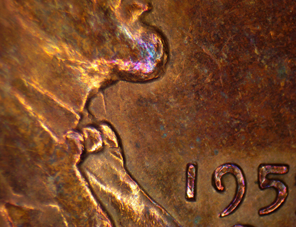


Nice pics ! The top serif looks like it has taken a hit , so hard to say for sure there. The bottom serif has a bit too much shadow on it to say for sure though it looks like it might have a split there.
Could you get a better lifhting angle there at the bottom serif
Could you get a better lifhting angle there at the bottom serif