| Author |
 Replies: 40 / Views: 4,752 Replies: 40 / Views: 4,752 |
|
Pillar of the Community
United States
974 Posts |
Poll Question
Guess the grades if you want they are both graded by PCGS.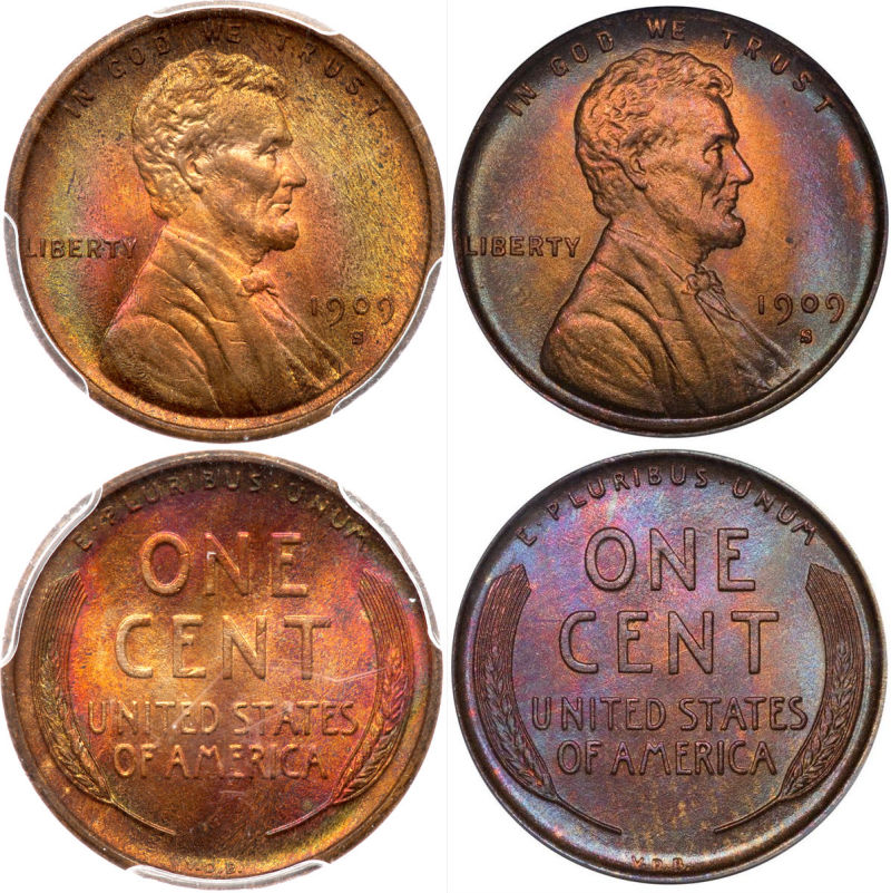
|
|
|
|
Bedrock of the Community
United States
11951 Posts |
I could not decide. So did not vote.
I like the strike and eye appeal of the coin on the
right better, but would not buy it because of the
finger print.
The one of the left is ok ... but does not jump
out to me.
Unless it was a killer price, for me .. I would
not buy either one.
|
|
Bedrock of the Community
United States
94367 Posts |
The coin on the left has wonderful color, very lively. Love it. Guessing 63/64 on both. Here's mine for color comparison: 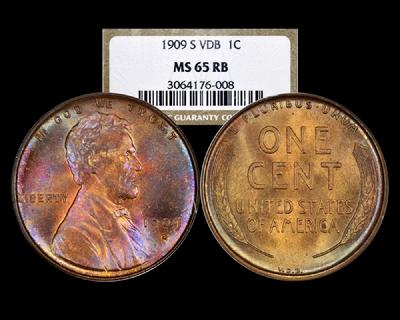 Edited by Coinfrog
08/27/2015 4:51 pm
|
|
Pillar of the Community
United States
946 Posts |
I've been hunting for a toner like these for awhile...I have a 63rb but would love another one..have to look like these though
Wow fantastic pieces all 3 coins.
|
|
Pillar of the Community
United States
946 Posts |
First coin posted is a 63+ or 64 even. That second one though. Those fields are immaculate. This one I'm giving a 66 all day
Beautiful
|
|
Pillar of the Community
United States
946 Posts |
That 2nd coin IMO would be the a epitome of a toned SVDB...if it didn't have that carbon spot.
|
|
Moderator
 United States
190660 Posts |
Wow, tough call. This is why I like brown cents. Well, that and the substantial cost difference.  |
|
Valued Member
United States
241 Posts |
I like the obverse of the 2nd coin and the reverse of the first. Overall the first has more appeal to me for wholly personal aesthetic reasons: I prefer it's red tones over the dark purple on the reverse of the second. The second, however, is a stunner with clean fields on both sides of the coin - and hardly a mark or ding anywhere. I would think it grades higher - but don't know if the fingerprint on the reverse (that doesn't really doesn't bother me on this coin) nocks it down a notch.
|
|
Pillar of the Community
United States
4932 Posts |
One on the right. More centralized color.
|
|
Pillar of the Community
 United States
5828 Posts |
I voted the one on the left, although honestly I like coin 2's reverse better...
|
|
Moderator
United States
23522 Posts |
I suspect one could alter the lighting slightly and make the second look very much like the first, or vice versa. That's how toners are. Either way, I choose the hues and consistency of the right hand coin, ten times out of ten.
|
|
Pillar of the Community
United States
4897 Posts |
Went with the left one over alll. Better strike imo.... but that reverse on the right one is just so........
|
|
Pillar of the Community
United States
7375 Posts |
I choose the one on the left. Like the flow lines on the right side of the obverse.
|
|
Bedrock of the Community
United States
94367 Posts |
 Somehow, the one on the left seems more natural and bright. |
|
Bedrock of the Community
United States
20753 Posts |
Left. Looks real. Right is to toned.
|
|
Rest in Peace
United States
10625 Posts |
I'm a right winger on this one. |
| |
Replies: 40 / Views: 4,752 |


