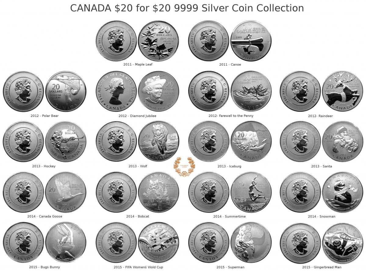
That app looks worth looking into -- I'm truly impressed! It's converted your physical collection into a very convenient and attractive photographic display. Absolutely awesome!
The images would look even better if I could upload sizes beyond the current limit. My individual coins are usually 3-4MB 4000x4000 pixels... which is already beyond the limit.
gimp gives you the ability to resize individual layers, or the entire image. You can also set the jpeg quality which can help reduce the size for websites like CCF.
Great skills and nice presentation, Canadian Coins. I personally prefer my coins pictured as "live view", but this way not less impressive. Btw, for the Gimp, don't you have to know the Linux, something like Red Hat or other distributive?
Actually seeing the coins together, gives a great snapshot of Canadiana. They look good together as a collection. I much prefer how the denomination isn't a big part of the design anymore. I too prefer the live views on coins. Is it the program that makes it look more like an illustration. Who would of thought this series would continue. A satisfying silver collection for a small investment. I wonder how many dies they go through for 1 design of 250,000 pressings.
C_C I hope you don't mind I am using your image for my desktop, its a great reference. What are your thoughts on the dino coin.
The dino coin is really well crafted and among the better $20 for $20 I think. Julius Csotonyi effectively exaggerated the observer's perspective as if you were looking at the animal only a few feet away. This POV makes the head of the beast even larger than normal. Dino is clearly mad (or hungry), and it's coming at you fast.
The teeth are sharp and the frost makes them stand out. This is a good example of frost well utilized.
On the other hand, the ground and vegetation are lost in the noise. Same goes for the legend. But I think the artist wanted us to focus on the main character.
Overall though, the various matte textures and frosted background make it difficult to know what you are looking at when you first look at the coin. My wife and kids took a bit of time to figure this out. "Oh! That's the mouth!" Yep - that's all there is to see!
The obverse is uneventful.
In conclusion, I enjoy the coin and I'm happy to add to my collection. I hope 20 for 20 continues!
It would be nice if the RCM had trays for the new boxes they sell that would fit coins in the $X for $X series. It's hard to imagine they make big profits on these coins. I think it would give them serious profits. The box is very nice and would make a fantastic storage case for these. Otherwise cardboard sleeve and glued on plastic pouch it is. To have them set up as shown in the image posted earlier would be awesome.
Disclaimer: While a tremendous amount of effort goes into ensuring the accuracy of the information contained in this site, Coin Community assumes no liability for errors. Copyright 2005 - 2026 Coin Community Family- all rights reserved worldwide. Use of any images or content on this website without prior written permission of Coin Community or the original lender is strictly prohibited. Contact Us | Advertise Here | Privacy Policy / Terms of Use