| Author |
 Replies: 31 / Views: 6,394 Replies: 31 / Views: 6,394 |
|
Pillar of the Community
Canada
1751 Posts |
I have been looking at ebay a lot the past few days. I keep getting impressed with the quality of coins from the 80s & 90s. The frosting is so much better than on current coins, even on the nickel coins, it stands out in photos. I am not very impressed with more of the current frosting. The details really seem to pop on the older coins. Especially on some photos on ebay. I have really started to appreciate the older proofs more. What do others think of the comparison with older coins. |
|
|
|
Valued Member
Canada
430 Posts |
I agree. The quality and craftsmanship of the of the Mint's NCLT coins from the 1980s and 1990s were much better, including the proof set cases made out of genuine Canadian leather. The coins today are just pump and dump. Back then there was care, and I still remember some coins having the little inspected by number... paper insert in the coin box. The coin packaging and cases back then were primarily made in Canada. The coin cases today are all made in China, including that MC Platinum member wooden box. The themes and commemorative coins were meaningful back then. Today, so much crappy and useless themes. I said to the RCM Mint staff at the Vancouver store, that you guys know everything about the birds, bees, planes, animals, flowers, cars, fishes, moose, crystals, horoscopes, zodiacs, Chinese stuff, etc. and some history stuff, that it would be easy to find a social science teaching job next! Edited by Coinsplus
01/15/2016 10:11 pm
|
|
Pillar of the Community
 Canada
1751 Posts |
I like the coin cases from the 80s & 90s better than the maroon clamshell. I have a number of silver dollars with the little inspection tag. I wonder what the inspection process is like, or how thorough it is. They need to improve the frosting. Also make more use of various finishes. The coins with numerous finishes are stunning. Those wavy lines on the obverse of 5 oz coins is a turn off. Now how they did the fields on the color circulation 5 oz coins is very attractive. It catches the light and is dazzling, its the 1 thing I do like about the coloured big circulation coins.
|
|
Valued Member
Canada
256 Posts |
80's and 90's were coins made with quality.
Now you get everything and anything stuck on to them.
Quality - the mints don't know what this means
|
|
Pillar of the Community
Canada
2845 Posts |
I could be totally off the mark but as time goes on, I think the demand for those older sets will increase as younger collectors choose to accumulate older years. The reason I think that, the coins are bright and lustrous, some with cameo appeal as opposed to either more expensive high-grade circulated or cheaper dingy old coin. While I believe the hobby will sustain itself for at least a few more decades, how much money and what is collected may change with time.
|
|
Valued Member
Canada
135 Posts |
Is the recent trend of adding the "wavy lines" to the obverse of coins an attempt to mask poor quality control?
With the lines, it is MUCH more difficult to find nicks or imperfections on the coin surface. Just as many others have stated, I find the lines to detract from the beauty of the coin... there's just something about an unblemished, shiny coin surface (versus all of those lines).
|
|
Pillar of the Community
Canada
2845 Posts |
Blastofffireworks, you might be referring to Specimen Sets from the mid-90s to present?
They're not my first preference either. Over the same time period, proof sets were also released.
|
|
Valued Member
Canada
135 Posts |
Quote:
Blastofffireworks, you might be referring to Specimen Sets from the mid-90s to present?
They're not my first preference either. Over the same time period, proof sets were also released. Sorry... a bit more clarification here. Older NCLT coins didn't seem to have those "wavy lines", on the obverse... making them more attractive, in my opinion (especially when coupled with better designs and quality control in production). A fair number of new coins have those "wavy lines" on the obverse (Voyageur coin, Canadian Landscape Series, etc.) Does anyone know if the "wavy lines" on newer releases are, in fact, an attempt to mask potential quality issues? Example, "borrowed" from an e-bay listing:  |
|
Pillar of the Community
Canada
1751 Posts |
Those lines are so distracting, it almost gives me a headache. Why do they think they need to add anything to proof coins, if they need to do something us the field finish from color big coins. That finish is stunning and doesn't bother the eyes. Someone must of been hung-over on a Monday, thinking those lines attractive. They are a huge minus for me. Good thing only 1 side is viewed at a time. I think gold plating serves to cover up frosting flaws. A member once remarked the current frosting, makes the queen, look like she has a rash. I agree with his comment, especially compared with proofs from the 80s,90s.
|
|
Pillar of the Community
Canada
2845 Posts |
Quote:
A fair number of new coins have those "wavy lines" on the obverse (Voyageur coin, Canadian Landscape Series, etc.)
Does anyone know if the "wavy lines" on newer releases are, in fact, an attempt to mask potential quality issues?
Now I understand, thanks for clarifying. It certainly would lead one to wonder what's the purpose considering the wavy lines closely resemble the image of a whole lot of finger prints! |
|
Pillar of the Community
Canada
5327 Posts |
Too many engineers, as I mentioned before just a simple proof and no frosting would have been better design.
|
|
Pillar of the Community
United States
2408 Posts |
Edited by canadian_coins
01/16/2016 3:05 pm
|
|
Pillar of the Community
Canada
2845 Posts |
Canadian_coins, that visual comparison is striking! Given the definition of Obverse (king or queen's head) -- "the side of a coin or currency note bearing the chief device and lettering; broadly : a front or principal surface." It's interesting to reflect how, over time, it's become the Reverse side of our coin that draws all attention and thus, serves as opportunity for RCM to fill the empty space with whatever they decide might be most appealing. |
|
Pillar of the Community
Canada
1751 Posts |
The more I look at the kings face, the less details I see. There is almost no details defined on the kings face. The ear,eye, and moustache are almost gone.It really does look like a fine rash, as opposed to smooth. The plating helps.
C_C your comparison pics are what I was shooting for. I just couldn't find good examples, as my loop is broken. Your thread are wonderful! Too bad we cannot bring it to the die makers attention. It would be great if they would go back to the earlier quality of frosting. They need to slow down on the innovation side and concentrate on what was great in the older coins. I wonder how many collectors enjoy viewing their coins under magnification, as I do. C_C your threads were a great read ty for including the links.
Edited by pocket change 50
01/16/2016 6:40 pm
|
|
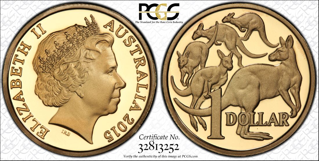
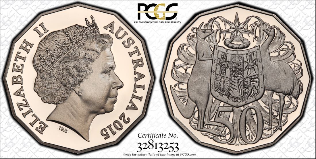
Pillar of the Community
Australia
7096 Posts |
|
|
Pillar of the Community
Canada
1751 Posts |
Wow are those RAM coins. I prefer this frosting over the current RCM frosting. I also think the queens portrait is far superior to our. I feel a crown speaks to her as royalty. The marks on the neck, remind me of shark gills, Id remove them. |
| |
Replies: 31 / Views: 6,394 |