| Author |
 Replies: 11 / Views: 1,845 Replies: 11 / Views: 1,845 |
|
|
Pillar of the Community
United States
5318 Posts |
As I add more coins to my 3d collection, I'm noticing a some discrepancies between details in the portrait and details elsewhere on the coin, such as the obverse legend or the Roo/Emu on the reverse. Are mushy strikes common on the portrait, and in such cases do portrait details "reign" towards determining a final grade--or perhaps an average with other details applies here?  The ANDA grading guide doesn't address this issue, and I find this one of the more daunting aspects of grading accurately. Thanks for your insight!  |
|
|
|
New Member
United States
24 Posts |
|
|
Pillar of the Community
 United States
5318 Posts |
Sorry--no pics in this case because I'm more curious whether experienced collectors have noted a history of 3d strike issues and how they affect grade. If I were to post a photo of a specific coin as an example, I find my camera always provides an incomplete picture and it becomes a self-defeating exercise. One could browse this forum for my photos as examples of limitations to macro photography. I've seen this problem on other small silver coins, particularly the Canada 5c.
|
|
Pillar of the Community
Australia
1040 Posts |
I'm having the same problems with my camera Kurt. Having trouble justifying a new camera just to take pictures of coins.
After shillings, the threepence is my next favourite of the pre-decimals. And you are quite right with your assessment. The threepence has such intricate detail for such a small coin that it doesn't take much to impair the quality of the strike. It takes a lot of practice to determine what is wear and what might actually be an uncirculated coin struck from a poorly engraved die or a die clogged with grease or other contaminates. This problem is even further exacerbated with the weakness of strike of a lot of the threepence issues.
This often leads to a lack of detail in the Kings crown, in particular the diamond and pearls, and in the wheat stalks in the KGVI and QEII.
|
|
Pillar of the Community
Australia
1040 Posts |
Thought I would try a couple of pictures anyway. This is an obviously well struck coin with fantastic detail. 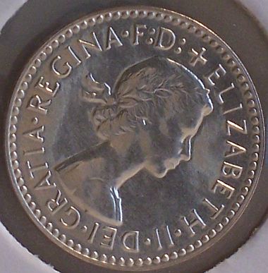 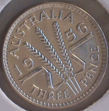 This one is a well struck coin, yet you can see the softness in the star and the edge of the shield, possibly from a filled or clogged die.  |
|
Pillar of the Community
Australia
2830 Posts |
G'day, those pics are very pleasing to the eye, as are the coins.
I've heard the early coat of arms described recently as "the kung-fu emu".
My favourite is the 1917 die-crack 3d: "three-legged emu".
Kurt, re legends: KG6 & QE2 had two legends each:
KG6 had "IND. IMP." upto 1948; lost it thereafter.
QE2 did not have "F.D." in 1953 & '54; it was added thereafter. Disappeared again with decimal conversion.
Peter
|
|
Pillar of the Community
Australia
655 Posts |
The threepence is notorious for weak strikes affecting only certain parts of the coin. I've seen stars almost flat yet still grade UNC. Some of the obverse crown pearls can disappear too.
|
|
Pillar of the Community
Australia
839 Posts |
lol kung fu emu... I like that old coat of arms design better than the newer ones.
|
|
Pillar of the Community
United States
5318 Posts |
Sean, those are good photo examples of what I'm talking about! In front of me I have a '43 3d that I'd call a aUNC, except the portrait looks more VF due to mushy details. I can understand how it would take only a little die/hub wear or grease to lose details seen easily in larger denominations. This has prompted me to revisit the grade on my 42-M 3d. Looking at the "big picture", I think it might qualify as an F. In retrospect, my practice of viewing coins under a loupe has the drawback in magnifying defects. The same goes for my specialized macro lens, which picks out every little scratch on the coin. "Kung-fu Emu"  Edited by KurtS
06/30/2008 11:48 pm
|
|
Pillar of the Community
Australia
1040 Posts |
Another thing that is common with all the WWII Australian struck coins, is weakness of strike. This was a deliberate act in order to extend die life, I believe.
|
|
Pillar of the Community
United States
5318 Posts |
I've noticed that too--even on pennies and halfpennies. As a bit of corroboration, I just received a 1911 Shilling, where the reverse looks a solid VF, but the obverse appears F at best. I think it's going to take some time to figure out predecimal grading. Edited by KurtS
07/03/2008 7:42 pm
|
|
New Member
United States
6 Posts |
I just completed my second article in a four part series on the early Australian coins and in it I mention the threepence and sixpence as being notorious for weak strikes. The problem is with the hing profile obverse portrait which has the highest point of the design directly opposite the Federation Star on the reverse. The thin planchets on the threepence and sixpence meant there was not a lot of metal to work with and these coins required high striking pressures to squeeze the meagre supply of silver into the deep recesses of the die. Of course this tended to stress the dies and to lengthen their lives the mints tended to back off the pressure somewhat, yielding the soft strikes so commonly observed. This state of affairs lasted until 1936.
In the case of the larger coins (shilling, florin) the high profile obverse simply wore quickly so grades like F/VF are common. One of the experiments the Melbourne Mint did in the early twenties was to adjust the curvature of the dies such that it produced slightly dished coins. This protected the obverse but of course the reverse suffered and on Australian pre-decimals the reverse was always the more important side so that practice was abandoned fairly quickly.
|
| |
Replies: 11 / Views: 1,845 |
|


