| Author |
 Replies: 11 / Views: 1,887 Replies: 11 / Views: 1,887 |
|
|
Valued Member
United States
232 Posts |
Hello, I have been tracking US coin production as a sign of how the economy is doing. Here is a graph which shows the results - pretty striking. By "circulating" coins I am just including cents, nickels, dimes and quarters - not halves or dollars. Obviously, at one point those were much more common in circulation, but now not so much. I debated putting in dollar coins, but the pattern has been to grossly overproduce them for a few years, and then stop producing them for many years, which is not very informative. Here is the dollar value of the coins produced:  So, in 2009 coin productions was $175,952,000 which is the lowest it had been since 1963. In production increased to $263,286,300 which is still 600 million or more less than previously in the decade. while that is higher than 2009, it does not seem like much of a recovery to me. You can also see a big peak in 1964 and again at the turn of the millennium. Drops usually indicate bad economic times (e.g. the dot com bust). I thought some of you might find this interesting, John Paul (edited to make graph clearer and edited again to put in correct graph) Edited by John Paul
02/15/2011 10:55 pm
|
|
|
|
Valued Member
United States
228 Posts |
Fascinating chart! Also when times get tougher, normally non circulating coins (cents and dimes), suddenly come back into circulation more.
Could be why we are seeing a lot more mint state coins in our roll-searching efforts!
|
|
Pillar of the Community
United States
651 Posts |
|
|
Bedrock of the Community
Australia
21789 Posts |
John Paul: I appreciate that you have put in a fair amount of work to produce this. The product of that work is quite valuable, and is appreciated.
I think your premise that total coin production is related to economic activity is correct, and the chart you have produced illustrates this.
The high spikes above a smoothed trend line are shown, and the reasons for these spikes could well be worth a comment by the rest of us in the CCF.
Edited by sel_69l
02/16/2011 01:36 am
|
|
Pillar of the Community
Australia
2830 Posts |
fascinating: but, please give me a history lesson - what explains the spike around 1964 ?
Vietnam ?
JFK ?
silver prices ?
India-China War ?
Peter in Oz
who was quite young in 1964
|
|
Moderator
 United States
56855 Posts |
I think the spike around '64 was caused by the change over from silver to clad. They flooded the market with clad coinage,IMHO.
John1 
|
|
Bedrock of the Community
United States
20753 Posts |
Interesting for sure. To bad there is no real, true way to overlay the economy on that chart. Periods of recession and/or depressions could be a decent overlay but really kind of vague actual dates for those.
Yet there is a small problem with any real comparisons with the economy due to the population increases also. For example the more people available to utilize coins, the higher the production could, might, should be to compensate for the addtional usage.
I find it interesting to that the production of coinage is not massively effected by wars or so called police actions like Korea.
|
|
Moderator
United States
191235 Posts |
Keep in mind that there was a date freeze at that time. Coins with dates from 1964 to 1967 may not have been minted in the year denoted on the coin.
I will search for an earlier post with the specifics...
|
|
Moderator
United States
191235 Posts |
|
|
Valued Member
 United States
232 Posts |
In response to just carl here are the recessions placed on the graph. The dates are from the NBER - who are the folks who date these things. Also, I added the 2011 to date data. I will work on doing the per-capita graph - I imagine the current drop will be even more dramatic still. 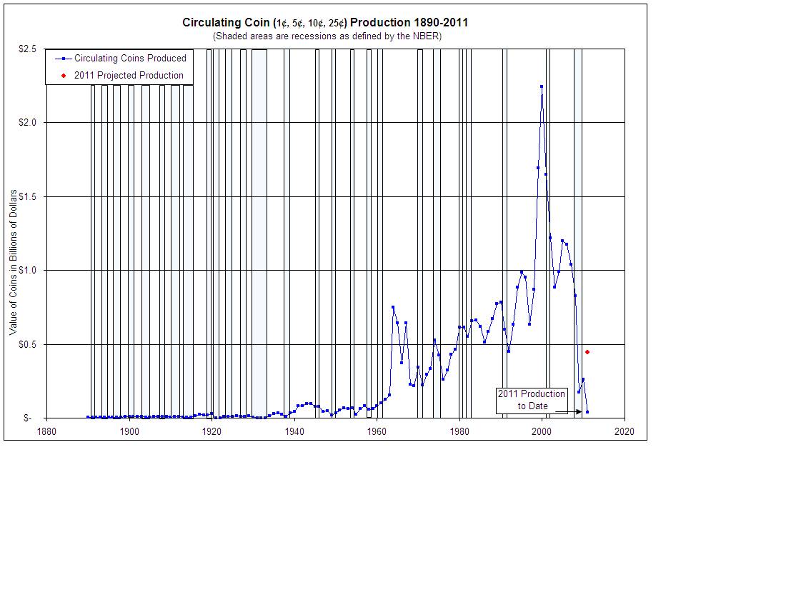 |
|
Pillar of the Community
United States
3283 Posts |
Looks like a stock market graph.
|
|
Pillar of the Community
Philippines
1156 Posts |
Very interesting year 1964, yes it could have been change from silver to base metals
|
| |
Replies: 11 / Views: 1,887 |
|


