
see that piece of verdigris makes it tough to tell, makes the D look puffed out like it does in SM. I had asked a seller for a closeup hoping to cherry pick one of these, but once I saw this figured it was most likely LM anyway.
I just learned this the other night... and I can tell you that's a LM for sure. The small motto uses a font thats totally different. The letters are wider than they are tall, and have very pronounced serifs.
There are definitely 3 sizes of the motto however. Yours is larger than mine, which is larger than the small motto.
When the 'D' of GOD or the leaf tips under the 'RUS' of TRUST are obscured I default to the berry stem comparison criteria.
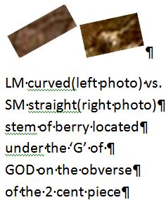
The attached side-by-side photo displays the distinctive UPWARD-arching curved stem of the LM(large motto)compared to the relatively straight stem of the SM(small motto).
In the photo attached from Sutler in this thread one can definitely observe the straight stem of a SM.
Disclaimer: While a tremendous amount of effort goes into ensuring the accuracy of the information contained in this site, Coin Community assumes no liability for errors. Copyright 2005 - 2026 Coin Community Family- all rights reserved worldwide. Use of any images or content on this website without prior written permission of Coin Community or the original lender is strictly prohibited. Contact Us | Advertise Here | Privacy Policy / Terms of Use