| Author |
 Replies: 23 / Views: 5,214 Replies: 23 / Views: 5,214 |
|
Pillar of the Community
United States
4932 Posts |
|
|
|
|
Pillar of the Community
United States
1606 Posts |
Not to mention that color. I've noticed there are even a lot of Philly "minted" vdb issues lately. I recently bought a vdb-s, but stuck with the no-slab-no-sale.
On the other hand, there was a very nice "legit" vdb-s that sold yesterday for $900. I wonder if it'd gone higher if folks weren't counterfeit shy ? .
|
|
Forum Dad
 United States
24202 Posts |
Color is irrelevant. Lighting can affect coloring drastically.
I'm not convinced.
|
|
Pillar of the Community
United States
1606 Posts |
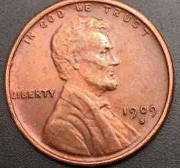
What about the location of the VDB? Doesn't it look a little too far clockwise relative to the wheat stalk tips?
Note: gotta go but will check back with this thread when I get back. I'm interested...
Edited by Biedercoins
12/02/2015 4:47 pm
|
|
Forum Dad
United States
24202 Posts |
Looks pretty dead on to me.  |
|
Pillar of the Community
United States
6370 Posts |
Seems to resemble #4, but the mintmark seems a bit high.  |
|
Pillar of the Community
 United States
4932 Posts |
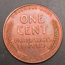
Look at the reverse for 5 minutes. Then you tell me if something looks off.
|
|
Pillar of the Community
United States
4932 Posts |
Look at the GAP between the wheat stock and the rim
|
|
Pillar of the Community
United States
1606 Posts |
With fresh eyes I'm not sure what to think. I know what Drew means about the reverse looking strange, but it also looks like the picture of the reverse isn't round & that could be part of the problem. I'd like to hear other opinions.
|
|
Pillar of the Community
United States
4541 Posts |
I think it genuine.. The b in vdb looks correct
|
|
Pillar of the Community
United States
4932 Posts |
If anyone buys the coin, I'll cover grading cost if it comes back legitimate. If not, then you're out of luck.
|
|
Pillar of the Community
United States
7629 Posts |
I was called in from afar to take a look at this thread.
Without question this coin is a fake, and not a very good one. Comparing individual elements, such as the initials and the mint mark is kind of irrelevant when the entire reverse is completely wrong for the issue. That sharp inner rim - doesn't exist on real coins. The design elements don't come close to matching up with a real coin.
1. The wheat stalks are a bad copy of the real thing. The ends of the lines at the top are not correct, the grains are not the right size or shape.
2. The letters of ONE CENT are horribly wrong. They are crude and rounded off in relief. The real coins don't look like this at all.
3. The O in "OF" is badly misshapen, again showing this to be a crude copy.
4. The entire reverse design is very flat. Real coins have a dish-like appearance, especially close to the rims. This aids in striking up the design properly.
It's all wrong, and the more I look at it the more I find that's wrong.
|
|
Moderator
United States
16684 Posts |
The reverse looks like a cartoon!
Terrible fake. That terrible pink copper look is always a huge flag.
Anyone familiar with the series would see this one as a joke.
swcoin.ecrater.com
|
|
Pillar of the Community
United States
1606 Posts |
|
|
Forum Dad
United States
24202 Posts |
|
|
Bedrock of the Community
Canada
10743 Posts |
It's great to see CC back at least for a bit... I thought that the reverse wheat stalks looked a little 'funny'.
|
| |
Replies: 23 / Views: 5,214 |