|
This page may contain links that result in small commissions to keep this free site up and running.

Welcome Guest! Registering and/or logging in will remove the anchor (bottom) ads and the security checks. It's Free!
To participate in the forum you must log in or register. | Author |
 Replies: 6 / Views: 1,788 Replies: 6 / Views: 1,788 |
|
|
Valued Member
United States
158 Posts |
Credit Scott Kelby for this tip - more powerful control for your B&W photos ! I consider myself a fairly advanced digital photographer, and have even done some commercial work for the Big 3 automakers here in Detroit (among other things), but photographing my growing collections of Morgan silver dollars has presented some special challenges. I began searching for a better method of processing my digital images, and have found a method that works for me.
I use a tabletop "studio" with controlled lighting for these images, a digital SLR, and a highly-rated 90mm macro lens, yet my images still seemed lacking when it came to post-processing. The color balance never seemed right, and each image needed a lot of tweaking in the computer before it pleased my eye. No matter what I tried - different lighting techniques, white balance calibration, etc. - nothing seemed to give me the results I was looking for. So I consulted the PhotoShop Book for Digital Photographers by Scott Kelby, and came up with a solution. It's "custom grayscale", with intense control over the final product. Even better, it's easy to accomplish and gives dependable, repeatable results, which is what I was searching for. So I figured I'd share.
1) Open the image you want to experiment with in PhotoShop.
2) In the Layers palette, choose "Channel Mixer" from the pop-up menu at the bottom of the Layers palette. Channel mixer is also found under the Image menu, under Adjustments, but this alters the image directly instead of using an adjustment layer that you can tweak or even discard later. Use the Channel Mixer layer from the pop-up menu in case of an "oops".
3) In the Channel Mixer dialogue box that appears when you create the new layer, check the box at bottom left that says "Monochrome". This gives you a B&W rendition to work from without altering the original image.
Your dialogue box should now look like this : 4) Use the sliders to blend the channels to your liking. A general rule of thumb is to make sure that whatever your percentages are, they add up to a total of no more than 100%. 4) Use the sliders to blend the channels to your liking. A general rule of thumb is to make sure that whatever your percentages are, they add up to a total of no more than 100%.
5) Tweak the overall brightness of the image by using the "Constant" slider at the bottom of the dialogue box.
6) If you decide you want to edit your Channel Mixer settings further, just double-click on the Channel Mixer layer in the Layers palette and the dialogue box appears again. When you're satisfied with the way your image looks, flatten the adjustment layer and save the file in your usual manner.
* Note : This procedure does not preserve the color effects of any toning that may be present on the coin, as can be seen in the example below. Even so, the Channel Mixer trick may work well for those that may have tried other procedures with disappointing results. Hope this helps someone else who, like me, has struggled with their coin photography. My solution was just to make the color go away while retaining the luster and detail of the coin. Using the Channel Mixer allows me to do this without throwing away or discarding pixels that would otherwise degrade the image ever so slightly during the processing phase. Hope this helps someone else who, like me, has struggled with their coin photography. My solution was just to make the color go away while retaining the luster and detail of the coin. Using the Channel Mixer allows me to do this without throwing away or discarding pixels that would otherwise degrade the image ever so slightly during the processing phase. Edited by CitizenPatriot
10/18/2011 09:44 am
|
|
|
|
Moderator
 United States
23522 Posts |
You sound like a person who very much understands how to get this right, so it's a tad baffling that you'd be having so much trouble with color. I'm going to throw a couple of ideas out, and please forgive me if it's obvious stuff you've already covered.
My Canon cameras have always WB calibrated better to gray than to white; I think this might be the paper itself used which isn't always going to be spot-on "white." I've achieved different color calibrations consecutively using two different white sheets (stacked, of course) which both appeared to my naked eye as "white." 18% gray is 18% gray every time, regardless of what my eye sees.
I'm guessing that as an advanced photographer you've probably taken monitor color into consideration - it's been an ongoing problem for me sufficiently annoying to have made me order an IPS panel.
Coins (for me) have redefined the concept of sensitivity to lighting position. Literally a few degrees of angle difference make radical changes in the overall appearance of an individual coin, including color, as the light is reflecting from an apparently-flat surface (the fields of the coin) which really isn't flat at all.
Lastly, and it's a big reach: Are you by chance using fluorescent lighting? Fluorescents using magnetic ballasts (electronic ballasts don't do this) flicker at twice the supply frequency. So, if your exposure is faster than 1/120, you won't be getting a full flicker cycle from the light, and color temperature changes during the flicker. As it does, of course, during the warmup period but I doubt that's a problem here.
|
|
Bedrock of the Community
United States
10045 Posts |
Quote:
So, if your exposure is faster than 1/120, you won't be getting a full flicker cycle from the light, and color temperature changes during the flicker. As it does, of course, during the warmup period but I doubt that's a problem here. A very good observation, there! You will have ongoing color problems using fluorescents...I just avoid them altogether. While I'm not much of a "pro" photographer, I have used photoshop in a professional capacity for years. I've found all my color correction can be handled by using the "color balance" window. But like SuperDave notes...the best way to control color is at the input end, with a correct WB setup and good lighting.  Note--not to dismiss Scott Kelby's technique, because it obviously works for him in whatever situations he needs. I've just found the color balance window more than adequate, and I think it has a bit more options than just tweaking the RGB channels independently--just my .02. Edited by DVCollector
10/18/2011 2:34 pm
|
|
Valued Member
 United States
158 Posts |
Quote:
You sound like a person who very much understands how to get this right, so it's a tad baffling that you'd be having so much trouble with color. I'm going to throw a couple of ideas out, and please forgive me if it's obvious stuff you've already covered.
My Canon cameras have always WB calibrated better to gray than to white; I think this might be the paper itself used which isn't always going to be spot-on "white." I've achieved different color calibrations consecutively using two different white sheets (stacked, of course) which both appeared to my naked eye as "white." 18% gray is 18% gray every time, regardless of what my eye sees.
I'm guessing that as an advanced photographer you've probably taken monitor color into consideration - it's been an ongoing problem for me sufficiently annoying to have made me order an IPS panel.
Coins (for me) have redefined the concept of sensitivity to lighting position. Literally a few degrees of angle difference make radical changes in the overall appearance of an individual coin, including color, as the light is reflecting from an apparently-flat surface (the fields of the coin) which really isn't flat at all.
Lastly, and it's a big reach: Are you by chance using fluorescent lighting? Fluorescents using magnetic ballasts (electronic ballasts don't do this) flicker at twice the supply frequency. So, if your exposure is faster than 1/120, you won't be getting a full flicker cycle from the light, and color temperature changes during the flicker. As it does, of course, during the warmup period but I doubt that's a problem here. Thanks for the thoughtful replies, y'all. Just to clarify, I'm using a prototype (ProShotBoxx) light box setup. It has highly reflective sides and a frosted acrylic top which helps diffuse the lighting. As for lighting, I've tried different combinations of flash and natural (sunlight) with varying results. Multiple flash boxes with diffusers (baffles), indirect lighting, long exposures using what little available natural light is available - you name it, I've probably tried it, including delaying the flash with second curtain sync. Yikes ! You wouldn't think that white balance would be a problem. Each time I shoot, I use a 18% gray/white/black combo card to to target and calibrate white balance in the camera (custom white balance). It's making me crazy. And yes, my iMac monitor is calibrated as well. Post processing : switch from RGB mode to Lab Color mode, select lightness channel, then sharpen slightly. Switch back to RGB mode and carry on. I sharpen first even before cropping. You are correct about the challenge of photographing coins. As I set up each shot, I noticed that the slightest variation in the angle of the coin to the plane of the camera's sensor induced some weird and wild results ranging from general dullness to blown out highlights. I'm going to research some of the LED lighting options I've read about here and give that a try. My simple goal is repeatable results, coin after coin. My local dealer has also expressed many of the same frustrations. If I can get on top of this, he will likely give me some coins to photograph for him - - I smell a barter program coming on ! My new slogan - "Will Work For Morgans !" Edited by CitizenPatriot
10/18/2011 6:33 pm
|
|
Moderator
United States
23522 Posts |
Yeah, you've been as thorough as you possibly could be. OK. How, specifically, would you define the problems which color is giving you? I will make one comment: the lightbox, as you describe it, is the precise opposite of what most of the experienced hands around here would recommend, myself included. Direct lighting when shooting coins is imperative, as it's pretty much impossible to show luster with any sort of reflected/diffuse lighting. Unlike a product shot, with lots of smooth curved surfaces that want to be flooded with light, a coin is more like shooting a prism - you only get to see it clearly when light is taking one single path through it. Below is a rather extreme example of what I'm talking about, but it will give you the idea: 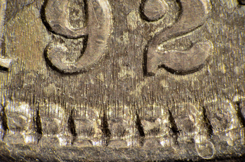 Every additional lighting angle on those striations complicates things rather than making them better. Your equipment and technique are obviously superior - the coin pictured above shows tremendous sharpness and contrast - but I have no clue as to what luster it may posses. This is the Holy Grail which some pretty astute folks here are pursuing - contrast and detail such as your image above, along with accurate luster representation. Do a Search of the Photography Forum for rmpsrpms' "RSD" setup to see one direction that seems very promising. But the implementation which gives you such excellent contrast may be the very reason color is frustrating you. |
|
New Member
United States
41 Posts |
Hi, new to the forum. I have been taking photos of my coin collection and agree with all the issues when it comes to getting the right image with lighting and camera settings. Curious if you have ever tried the method of using a piece of glass over the coin at an angle the camera directly above the glass taking the picture through the glass with light shooting directly at the angled glass? I put a small object in front of the coin between it and the light to stop any type of shadow directly on the coin. That has seemed to work well for me. Also I use a canon with a macro lens and hook it up to a utility canon offers which allows tethering the camera to the computer and taking the pictures with the mouse button striking a button on the program. Works well with being able to see the coin right on the computer screen before snapping. Also use photoshop and will try your suggestions.
|
|
Pillar of the Community
United States
3076 Posts |
 to the forum...I believe I have the online macro coins shooting set up with the glass bookmarked, Honestly I haven't tried it..most of the coins he was shooting were not..not LUSTROUS SILVER DOLLARS which I also have found as with many good results here on the forum recommend.. Very high angles of light which need to really hit the sensors...I tried for so many hours of unsuccessful shooting before I I got the true luster of the coin, using my old powershot pro1. and the highest verticle angles on the coin at around 10 and 2 o'clock, there abouts as not all coins are the same.. it gave me an exact copy of the coin in hand I was looking for...Diffusion gave me much better contrast but honestly color went right out the window....lower end coins are not problem, its these high end coins like Citizen is posting, where its not only the details of the coin for grade but for its luster showing just how nice these coins really in hand and are and exactly what they will receive....His coin in this post...Thats a real wow coin...he's really capturing fabulous details and definition.. Personaly I think most people are really getting great results from diffusion are the threads I have been reading for the past 6 months, from NON silver coins.. where these bright lights over power the coin..and diffusion lets plenty but not to much light threw....RPM's threads show much of this he's got it nailed.. |
| |
Replies: 6 / Views: 1,788 |
|
To participate in the forum you must log in or register.
Disclaimer: While a tremendous amount of effort goes into ensuring the accuracy of the information contained in this site, Coin Community assumes no liability for errors. Copyright 2005 - 2026 Coin Community Family- all rights reserved worldwide. Use of any images or content on this website without prior written permission of Coin Community or the original lender is strictly prohibited.
Contact Us | Advertise Here | Privacy Policy / Terms of Use
|
| Coin Community Forum |
© 2005 - 2026 Coin Community Forums |
| It took 0.33 seconds to rattle this change. |
 |
|
| |
| |







 Posted 10/18/2011 2:10 pm


