| Author |
 Replies: 23 / Views: 4,153 Replies: 23 / Views: 4,153 |
|
Valued Member
United States
80 Posts |
The US Mint released the line art of the official designs for the 2013 America the Beautiful Quarters today. The 2013 parks are White Mountain National Forest in New Hampshire, Perry's Victory and International Peace Memorial in Ohio, Great Basin National Park in Nevada, Fort McHenry National Monument and Historic Shrine in Maryland, and Mount Rushmore National Memorial in South Dakota. Here is the press release and here are the images: White Mountain  Perry's Victory  Great Basin  Fort McHenry  Mount Rushmore 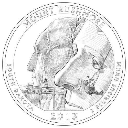 |
|
|
|
Pillar of the Community
United States
1211 Posts |
love great basin, and I actually like mt rushmore. I remember looking through the proposed designs and liking the more traditional view of just the monument, but this design is very cool.
i also think that given the poor options for perrys victory, that design also looks good.
not crazy about the fort mchenry or white mountain... that one is mt hood with more trees.
|
|
Bedrock of the Community
13014 Posts |
Fort McHenry is a bust to me. Its not as bad as some they had proposed, but it could have been a lot better considering what it is. Too much open space and if that was supposed to be bombs bursting in the air it looks more like a fireworks show. I would have rather seen all of MT Rushmore but I do like what they picked.
I do agree Perrys victory while not great was the best of the choices. Overall solid year but the disappointment of McHenry ruins it a bit for me
|
|
Moderator
 United States
188213 Posts |
|
|
Pillar of the Community
United States
965 Posts |
None of them are bad but perry's victory is a little bland, I love the New Hampshire one though and I'll have to buy some of those in the s mint variety to spend.
|
|
Pillar of the Community
United States
2651 Posts |
I think McHenry is the worst....I like all the others....My favorite is Great Basin...but I am sure that will change with the first 2013 that I find :)
|
|
Valued Member
 United States
80 Posts |
My take: the White Mountain one joins the "Mountain View" series that includes Mt. Hood, Glacier, Olympic, and Denali designs. I like Great Basin the best out of these, the tree looks nice and gnarled and dramatic.
|
|
Pillar of the Community
United States
538 Posts |
I didn't see the other options for Fort McHenry, but I like the one they decided on. I think with the right textures it will look awesome and it will go well with my Star Spangled Banner silver proof dollar.
|
|
Pillar of the Community
United States
3755 Posts |
The White Mountain sucks to be frank. As mentioned, just another mountain profile. They should have gone with the moose.
Fort McHenry..eh. It's there. Not as bad as it could have been, but nowhere near what it it should be.
Perry's victory. OK, I have to admit, I have NO clue what this is about (must have been asleep that day in history class) so I can't say what the potential is. BUT, given the choices I saw, this aint bad at all.
Rushmore and Great Basin, pretty cool. Those two I like a bit.
IMO, the worst year so far.
|
|
New Member
United States
5 Posts |
I like them, hopefully I will be able to get them in the 5oz variety also.
|
|
Valued Member
United States
456 Posts |
Too bad there isn't a single sign of wildlife this year. I will respectfully disagree with jbuck and say that the White Mountain design would be much better and look less like a copy of Mt. Hood if they had chosen the moose or whitetail design.
I really like Mt. Rushmore, however. Kind of neat to see the scale relative to the size of a man.
|
|
Pillar of the Community
United States
965 Posts |
I like mountains, thus I like coins with mountains. Go New Hampshire!  |
|
Pillar of the Community
United States
1817 Posts |
Not a great banner year for ATB designs, but they chose the best out of some very mediocre designs. Perhaps visiting the honored sites might inspire some more creativity? |
|
Valued Member
United States
449 Posts |
WHITE MTN- I agree with hondo, as soon as I saw it mt. hood came to mind. nice details but too similar.
PERRYS- different concept, very bold. but I like it, maybe it will get more people to look into the history of it.
BASIN- great detail, hard not to like
MCHENRY- its alright, but it just seems like the explosions in the air is too distracting, and detail on the explosions just dosent look good.
RUSHMORE- interesting and mysterious, instead of doing the traditional popular look, its more of a modern feel.
|
|
Valued Member
United States
449 Posts |
either way I cant wait to get my hands on these!  |
|
Valued Member
107 Posts |
I like the White Mountain Design!!
|
| |
Replies: 23 / Views: 4,153 |


