| Author |
 Replies: 20 / Views: 4,156 Replies: 20 / Views: 4,156 |
|
Valued Member
United States
374 Posts |
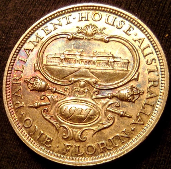
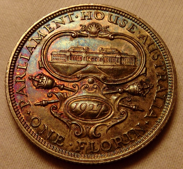
What do you think of the photos? I've been away from practicing, this is where I left off. Any tips would be appreciated!   |
|
|
|
Pillar of the Community
Australia
7096 Posts |
|
|
Valued Member
440 Posts |
Looks good to me. Coin appearance look true to life in pics to you?
|
|
Pillar of the Community
 United States
4038 Posts |
Looks good. What are you using for lighting? It looks very even. Contrast may be a bit low. I am viewing on my S4 so can't comment on sharpness...
|
|
Moderator
United States
56855 Posts |
Have you tried a gray background? I think it's 8% or 14% gray scale.. John1  |
|
Pillar of the Community
United States
5825 Posts |
Quote:
Looks good to me. Coin appearance look true to life in pics to you? Just about word-for-word as to what I was going to say. |
|
Valued Member
 United States
374 Posts |
What is the grey scale paper and where can I find it?
I'm using two ikea led lights that are diffused. Using a Canon dSLR on a tripod (no copy stand) that is jerry-rigged directly over the coin. 100mm macro lens.
More or less the photos look like the actual coin. The coin is not very reflective. ?should not use diffusion
The color is about right, did not adjust it at all. Maybe it is 20% off, but it is tough to say. It depends on what light you use to look at the actual coin.
I'd like to make the image a bit more interesting, maybe, bring out the surface/ depth more?
|
|
Valued Member
United States
234 Posts |
Your photos look great. Was that taken through a slab? What is the ring around each coin?
|
|
Pillar of the Community
United States
4038 Posts |
Reducing diffusion will increase contrast, and carefully adjusting lighting angles can help give more depth.
Contact me for photographic equipment or visit my home page at: http://macrocoins.com |
|
Moderator
United States
23522 Posts |
Quote:
Maybe it is 20% off, but it is tough to say. Use a background of consistent color - black, white or grey (I prefer white) - and it'll never be tough to say. When your background color is absolutely correct, the coin will be. That's why I use white, as it shows the slightest problem with white balance. |
|
Moderator
United States
56855 Posts |
I looked it up and it's 18% gray scale paper and you can get it on e-Bay and Amazon. John1 |
|
Pillar of the Community
United States
4038 Posts |
Sometimes reflection from the coin, or lens flare, changes the background color, so be careful not to make changes that actually mess up the WB. For instance, don't do MWB on background with coin in place.
Edited by rmpsrpms
06/17/2014 7:09 pm
|
|
Valued Member
United States
374 Posts |
ALP: the ring is where I quickly cropped the photo. It is raw coin sitting on a light grey background. Dave: I'll give a white background a shot, a bit, these two I uses the same light grey. Here are two others on without diffusion and the second using diffusion. Any other ideas? 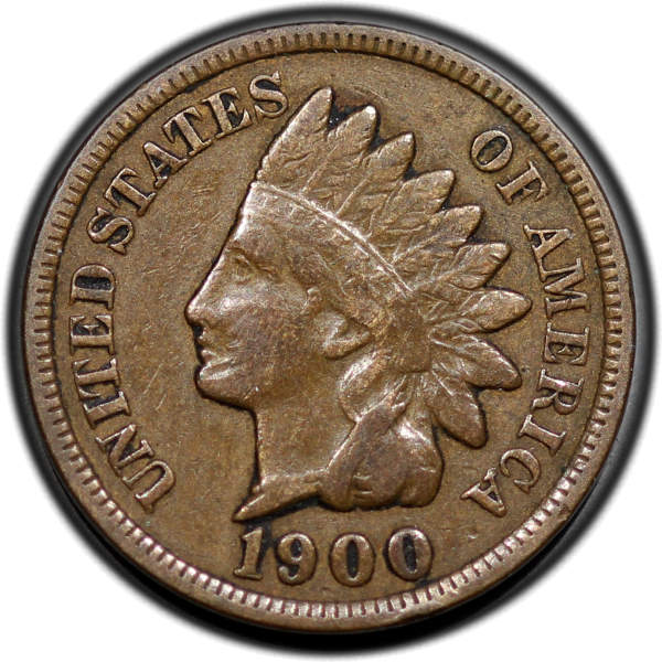 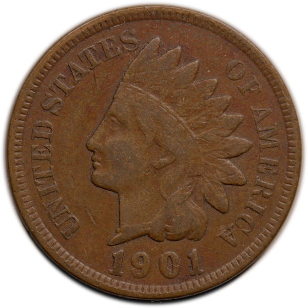 The 1900 IHC I used two of the IKEA lights above and behind the coin (if that makes sense), at 10 o'clock and one at 2 o'clock. The 1901 cent I kept the lights in the same place and used diffusion |
|
Pillar of the Community
United States
4038 Posts |
Try a little less diffusion.
|
|
Valued Member
United States
374 Posts |
How about this one? Can't quite get the color right. I'm using a RAW image and then messing with the color in Photoshop. I'd say this IHC has the typical color for a circulated Indian Head cent. It's slightly darker in the photo. I say the coin is slightly more yellow, but it is a solid medium brown with even tone. However, I kind of like the details in the photo and it has more depth.  |
|
Pillar of the Community
Canada
2781 Posts |
I raise my coins up off the (black) background by about 1/2" or so (just enough so that the background is out of focus). eliminates shadows & makes cropping or background re-filling easier. but then again I'm using an iPhone   |
| |
Replies: 20 / Views: 4,156 |