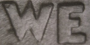
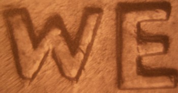
These pictures are taken directly from the "Cherry Picker's Guide" they are not of the whole motto , but they are of the area that is used to tell the difference.
This is the "Heavy Motto" . Notice that the letters are very thick, the middle point of the W rises slightly above the other letters, and the middle point on the W is pointed.
This is the "Medium Motto" for comparison. Notice the letters are thinner and the middle point of the W does not extend above the other letters, the midpoint of the W is somewhat squared off.
They changed it from the "Weak Motto" design that started in 1932 because of the weakness of the design. I guess it is a die variety then. Of the three primary obverse hubs, the "Light Motto" commands the biggest premium- so say Stanton and Fivaz !
Disclaimer: While a tremendous amount of effort goes into ensuring the accuracy of the information contained in this site, Coin Community assumes no liability for errors. Copyright 2005 - 2026 Coin Community Family- all rights reserved worldwide. Use of any images or content on this website without prior written permission of Coin Community or the original lender is strictly prohibited. Contact Us | Advertise Here | Privacy Policy / Terms of Use