| Author |
 Replies: 18 / Views: 3,708 Replies: 18 / Views: 3,708 |
|
Pillar of the Community
Canada
1505 Posts |
Test your skills 1876 H Large Cent   |
|
|
|
Pillar of the Community
798 Posts |
I will say MS-64 but somebody else say 63 for me.
|
|
Pillar of the Community
New Zealand
1679 Posts |
P301 Charlton re-punched T and A
MS63
Cheers Don
Vickies cents and GB Farthings nut.
"Old" is a figure of speech and nothing more
Edited by fourmack
04/23/2015 06:05 am
|
|
Bedrock of the Community
Canada
10743 Posts |
|
|
Previously Banned Member
42 Posts |
I would also say MS 63 Red
|
|
Pillar of the Community
Canada
972 Posts |
|
|
Pillar of the Community
Canada
1461 Posts |
Also 63 red but only because I think ICCS will penalize for the diminished eye appeal around then letters. Otherwise a 64
Edited by TheCoinHunter
04/23/2015 10:51 am
|
|
Pillar of the Community
Canada
1192 Posts |
|
|
Pillar of the Community
Canada
2187 Posts |
Quote:
Also 63 red but only because I think ICCS will penalize for the diminished eye appeal around then letters I heard ICCS was strictly based on detail and not on eye appeal. Not sure if they are still like that today. But i'd say MS64 |
|
Pillar of the Community
 Canada
1505 Posts |
Nice work everyone, MS 63 RB from ICCS.
A question on photography, the red look was not intentional, but just how it ended up looking, does anyone have any advice on how to watch for that type of distortion when bidding online?
|
|
Pillar of the Community
Canada
618 Posts |
|
|
Moderator
 Canada
10463 Posts |
Elements like the rim edge, are just too red for my liking, and I don't like the stuff around the edges of the legend and inside the 8. The colour just looks 'off' to me - it is not like the 1908 you posted...
My gut instinct tells me that PCGS would grade this one as: Genuine, Questionable Color
"Discovery follows discovery, each both raising and answering questions, each ending a long search, and each providing the new instruments for a new search." -- J. Robert OppenheimerContent of this post is licensed under a Creative Commons Attribution-NonCommercial 3.0 Unported License. See: http://creativecommons.org/licenses...0/deed.en_USMy eBay store
|
|
Pillar of the Community
Canada
1505 Posts |
Interesting observation SPP, I will see if I can take a picture that is more representative of the color to see if that makes a difference, in hand the coin is darker and not as red.
|
|
Pillar of the Community
Canada
1461 Posts |
Take pictures that slightly delay the flash. The colors for copper tend to be more natural that way.
|
|
Pillar of the Community
Canada
5404 Posts |
Roger you cannot compare colour with 1876. And 1908 totally different to start with.
|
|
Pillar of the Community
Canada
1505 Posts |
Here is another image using a UV and Polarizing filter, the actual color is somewhere between this and the original image. I have not used a flash to take pictures. Thanks for you thoughts and comments so far. 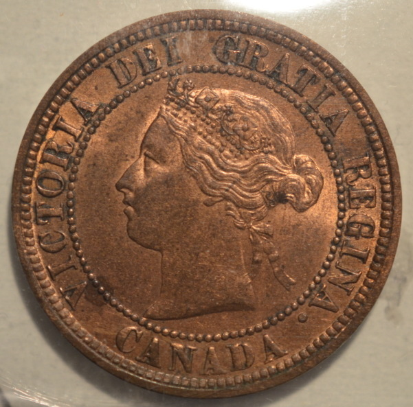 |
| |
Replies: 18 / Views: 3,708 |


