| Author |
 Replies: 27 / Views: 3,571 Replies: 27 / Views: 3,571 |
|
|
|
Rest in Peace
United States
17900 Posts |
I wouldn't purchase it. That's the only opinion I could have.
|
|
Pillar of the Community
United States
1788 Posts |
|
|
Valued Member
 United States
430 Posts |
I don't have this coin. It's up for auction soon at heritage. My question is, I've looked at a lot of grading videos/slideshows that try to define toning that is an addition to a coins' value or popularity, a subtraction, or is neutral. The answer on one video was if its "good" toning you will know it when you see it. Well I don't always know it when I see it. To me, the toning on the obverse is borderline awful. The first impression is Yeech. If you stare at it for a while there are some neat colors in there, almost a camo look. but overall this toning to me is a big negative. The reverse, to me, is a lot better. Maybe this would be a neutral category. I was kinda trying a straw poll to see if people on the board agreed with my opinion. So let it all out, you won't hurt my feelings if think its an ugly duckling. Interestingly, there is another bust H10C lot that is an MS-63 and looks like a much nicer coin. I can't wait to see which goes off the block for more. 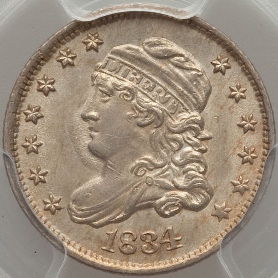 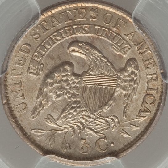 |
|
Valued Member
United States
430 Posts |
Coinlover, I just clicked through to the eye appeal page you posted. This was exactly what I was describing, except with 7 categories.
Edited by Wizzy1
04/16/2016 02:41 am
|
|
Pillar of the Community
United States
6370 Posts |
That last Half Dime is a perfect example of how a 200-year-old coin should not be blast-white. It has a very nice, completely-original smooth golden toning. |
|
Pillar of the Community
 United States
3098 Posts |
I would guess that the coin has a lot of flash to it when held in the light.
I've found that photographing coins with toning straight on can be difficult because you can't always get the full impact of the toning mixed with the luster.
I like the toning.
Paul Bulgerin
|
|
Pillar of the Community
United States
530 Posts |
|
|
Bedrock of the Community
Australia
21788 Posts |
Nice coin, and I would love to have it in my collection.
From Heritage authenticty unquestionable, but I have to admit, the color of it made me think a little. Color would put some bidders off, and the competition for this piece would be less for this reason.
Even if I was the successful bidder (and I am not in this competition), I would still seek further opinions even after purchase, even after I had bought it.
|
|
CCF Advertiser
United States
1533 Posts |
I actually like it. It looks like it was in an album for a long time.
|
|
Valued Member
United States
430 Posts |
Ok here is a new coin for toning/eye appeal evaluation. Requesting grades according to the PCGS eye appeal scale Amazing Positive Above average Neutral Below Average Negative Ugly I do not own this coin. It graded at MS66 making it a Top pop coin.     |
|
New Member
United States
43 Posts |
I'd be 'Amazing' if I found it in my change...
I'd be so 'Positive' if I under paid...
I'd be 'Above average' if I made money on coins...
I'd rather be 'Neutral' but I'm hooked!
I'm 'Below Average' in my coin hunting skills... dambit...
I can't be 'Negative' about anything...
Ugly... well crap - beauty is in the eye of the beholder...
|
|
Valued Member
United States
392 Posts |
 What Andrew said! Very clever. You took the words right out of my mouth.  Whizzy - That Seated Liberty half dime is absolutely, incredibly, pretty. Thanks for the pictures. Jack |
| |
Replies: 27 / Views: 3,571 |


