Five favorites of mine (in chronological order):
1935 Commemorative Silver Dollar marking the Silver Jubilee of King George V's reign. A most regal portrait on the obverse and the launch of the now-classic voyageur reverse design. An ideal start to a coin series!


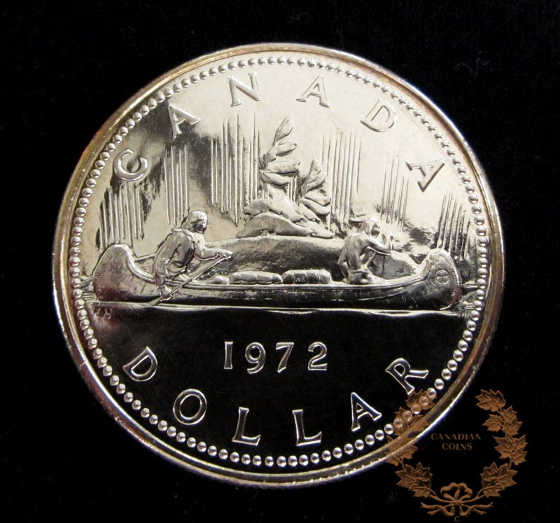
1989 Mackenzie River Exploration Silver Dollar commemorating the bicentennial of the first full-length voyage down the Mackenzie River by Alexander Mackenzie and his European crew. The coin's design has always captured my attention. Its commemorative design of Mackenzie standing in his canoe, leading his team through an unexplored river valley in the northwest of Canada is dynamic, well-executed and compelling. Kudos to designer John Mardon!
Mackenzie Silver Dollar
2008 Centennial of the Royal Canadian Mint Silver Dollar. The coin features a wonderfully creative and artistic transition between two iconic symbols of Canada - a Maple Leaf seamlessly transforming into a Canadian goose. The design makes use of wonderful imagery and is very well-executed - the selective use of gold plating adds to the coin's overall visual aesthetic.
RCM Centennial Silver Dollar
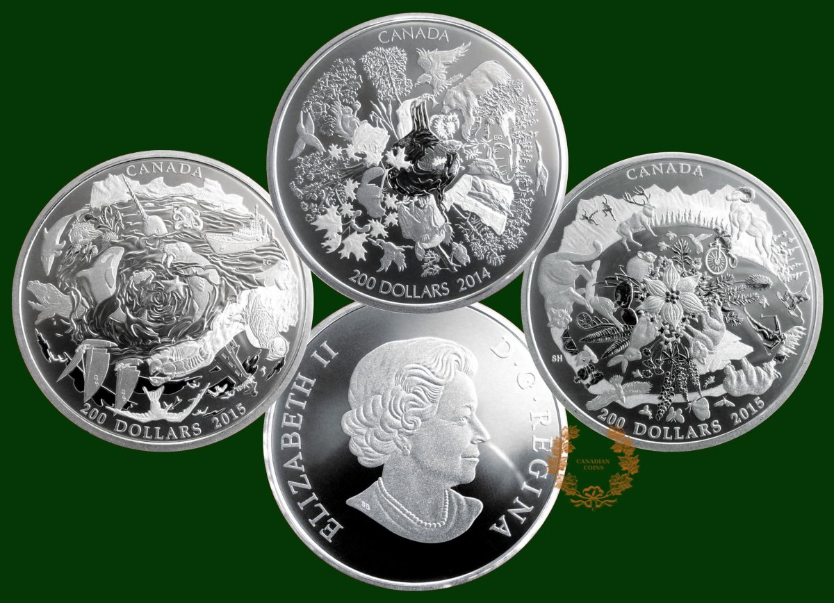
2015 Celebrating Canada Silver $10 Coin. The coin appeals to me due to its attractive use of symbolism to represent the major geographic regions of Canada. In hand, I find the proof coin to be very attractive. The use of multiple finishes in the gold-plated section really makes the various elements "pop." I am a fan of the use of symbolism on coins vs. "photos on coins" - this coin hits the mark nicely.
Celebrating Canada $10 Coin
2015 In Flanders Fields $20 Silver Coin. I find the artistry of the coin's reverse design to be exceptional - kudos to Canadian artist Laurie McGaw. The design incorporates well-chosen imagery from John McCrae's poem, is nicely-balanced around the powerful central figure of a mourning soldier and is a moving tribute to the fallen. The use of King George V's portrait on the obverse is also a nice touch which draws one back to the coinage of the WWI era.
In Flanders Fields $20 Coins
My runner up...
I also appreciate the simple elegance of the 2012 ½ Ounce Silver Farewell to the Penny coin. The use of selective pink-gold plating on the iconic two maple leaf design of G.E. Kruger-Gary makes for a great looking coin that is unmistakably Canadian. It was nice to see the design in an enlarged format on the 34mm silver coin.
Silver Farewell to the Penny coin
I believe each of the coins listed is an example of what the RCM can achieve when it is truly focused on creating art on coins.
1935 Commemorative Silver Dollar marking the Silver Jubilee of King George V's reign. A most regal portrait on the obverse and the launch of the now-classic voyageur reverse design. An ideal start to a coin series!
1989 Mackenzie River Exploration Silver Dollar commemorating the bicentennial of the first full-length voyage down the Mackenzie River by Alexander Mackenzie and his European crew. The coin's design has always captured my attention. Its commemorative design of Mackenzie standing in his canoe, leading his team through an unexplored river valley in the northwest of Canada is dynamic, well-executed and compelling. Kudos to designer John Mardon!
Mackenzie Silver Dollar
2008 Centennial of the Royal Canadian Mint Silver Dollar. The coin features a wonderfully creative and artistic transition between two iconic symbols of Canada - a Maple Leaf seamlessly transforming into a Canadian goose. The design makes use of wonderful imagery and is very well-executed - the selective use of gold plating adds to the coin's overall visual aesthetic.
RCM Centennial Silver Dollar
2015 Celebrating Canada Silver $10 Coin. The coin appeals to me due to its attractive use of symbolism to represent the major geographic regions of Canada. In hand, I find the proof coin to be very attractive. The use of multiple finishes in the gold-plated section really makes the various elements "pop." I am a fan of the use of symbolism on coins vs. "photos on coins" - this coin hits the mark nicely.
Celebrating Canada $10 Coin
2015 In Flanders Fields $20 Silver Coin. I find the artistry of the coin's reverse design to be exceptional - kudos to Canadian artist Laurie McGaw. The design incorporates well-chosen imagery from John McCrae's poem, is nicely-balanced around the powerful central figure of a mourning soldier and is a moving tribute to the fallen. The use of King George V's portrait on the obverse is also a nice touch which draws one back to the coinage of the WWI era.
In Flanders Fields $20 Coins
My runner up...
I also appreciate the simple elegance of the 2012 ½ Ounce Silver Farewell to the Penny coin. The use of selective pink-gold plating on the iconic two maple leaf design of G.E. Kruger-Gary makes for a great looking coin that is unmistakably Canadian. It was nice to see the design in an enlarged format on the 34mm silver coin.
Silver Farewell to the Penny coin
I believe each of the coins listed is an example of what the RCM can achieve when it is truly focused on creating art on coins.
Collecting history one coin or medal at a time! (c) commems. All rights reserved.
Edited by commems
08/08/2016 11:31 pm
08/08/2016 11:31 pm