


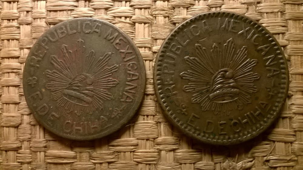

I'd judge your examples to be pretty high grade for the type.
I've also previously run across the cinco centavos version.


There're a lot of varieties of these, and the composition seems rather inconsistent as well.
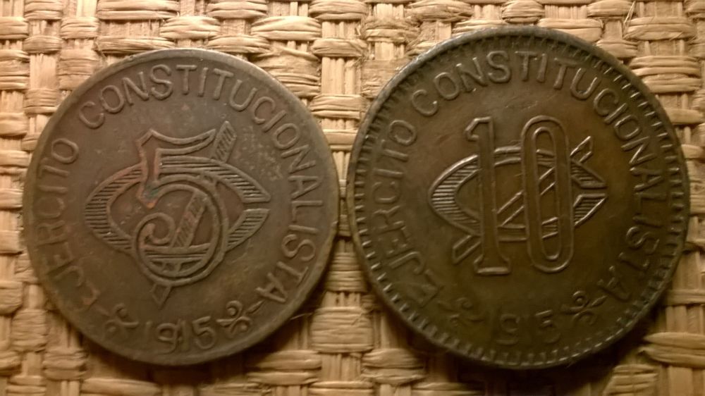
I like my 1915 dated one shown here for the clearly readable "Salazar" below the cap and rays. I'm presuming that's the name of the designer.
I've also previously run across the cinco centavos version.
There're a lot of varieties of these, and the composition seems rather inconsistent as well.
I like my 1915 dated one shown here for the clearly readable "Salazar" below the cap and rays. I'm presuming that's the name of the designer.
Colligo ergo sum


