Based on the fun that I had earlier this year with the letter A, I thought that I might take a crack at another letter. The letter S also has undergone some transformation and standardization since the Mid-Medieval time period. As before, I have chosen specific coins from my collection to illustrate some of the varieties of this letter. I do note that with much of the population illiterate (including the dudes at the mints), at least some of the shapes are probably more influenced by an ignorance of the correct shape rather than the actual shape for that mint at that time.
In keeping with the organization of the previous essay, the varieties start with the most the simple representation and progress to the most complex as defined by the number of strokes (or as was pointed out previously, by the number of punch strikes) as opposed to chronologically or geographically. More so than many other letters, the letter S has been represented in a horizontal configuration rather than the current vertical orientation. I have included this information as well, starting with non-vertical examples and then progressing to vertical.
I should point out this essay is not meant to be an exhaustive study of early medieval numismatic typography and I would welcome everyone's corrections, additions, and input. Anyone out there know for example why the letter S was made horizontal for so long?
Horizontal with 1 punch strikeThe letter S seems to have been oriented horizontally broadly across Europe during this period. Here are multiple examples, all with one punch strike. The first example is a denaro from the Italian Commune of Brescia, dated 1186 to 1254 AD (Figure 1). The second is a denar from the German Duchy of Bohemia, minted between 1061 and 1085 AD (Figure 2). Also, here is a contemporaneous denar from Bohemia (Figure 3). Finally, here is a denier of the French Duchy of Normandy, dated 943 to 996 AD (Figure 4). There are many others, but these are perhaps my clearest examples of this variety.
Figure 1
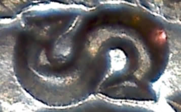
Figure 2
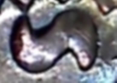
Figure 3
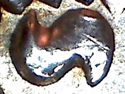
Figure 4
 Vertical with 1 punch strike
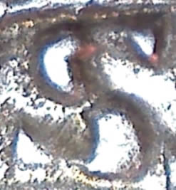
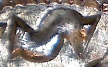
This is where we are today with the letter S, so it is a bit surprising that one of the earliest coins in this post will have the most modern orientation and shape. Here is a follis from the Byzantine Empire dated 945 AD (Figure 5). The serifs are highly visible, which is important as some later die makers chose to give those little guys a life of their own.
Figure 5
 Horizontal with 2 punch strikes
In many cases, this letter is represented by two distinct punch strikes. This seems most likely a way to economize on punches as the same half circle could be used twice to create this letter. Here is a dinero from the Spanish Kingdom of Aragon, dated 1109 to 1126 AD. You can see that the serifs are still there and integral to the rest of the letter (Figure 6). The same can be said for the serifs on this denier from the French County of Angouleme, dated 1170 to 1245 AD (Figure 7).
Figure 6
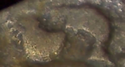
Figure 7
 45° with 2 punch strikes
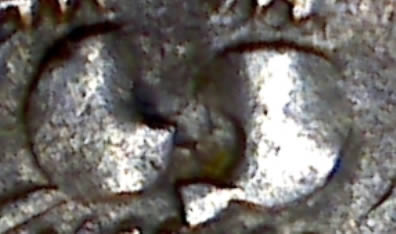
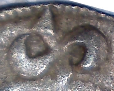
This variety of the letter S seems to be a result of the die maker either being careless or else simply not knowing the correct orientation for this letter. Elsewhere on this half denar of Hungary, dated 1020 to 1038 AD (Figure 8), there is an example of a vertically oriented S. Neither one contains serifs.
Figure 8
 Vertical with 2 punch strikes
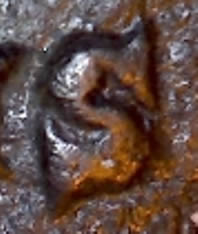
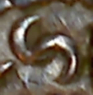
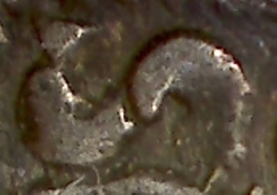
Similarly, the first example of this variety appears to be more representative of ignorance or carelessness as a correctly oriented letter S appears elsewhere in the inscription. Here is a folis of Hungary, dated 1172-1196 AD (Figure 9) with a backwards letter S. The second example of this variety has the same orientation and number of punch strikes, but looks very different. Early coins of Cologne contain a letter S with a horizontal stroke mid-way through (somewhat reminiscent of the letter Z for some current writers). Here is a denar of the German city of Cologne, dated 936 to 962 AD. Unfortunately, my example only has the bottom half of the letter visible so you will need to use your imagination a little (Figure 10). Finally, a third example of this variety looks pretty close to the modern S: here is an obole of the French Bishopric of Clermont, dated 1150 to 1250 AD (Figure 11).
Figure 9
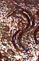
Figure 10
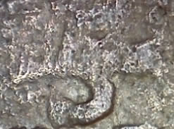
Figure 11
 Horizontal with 3 punch strikes
However, Cologne was not the only mint that incorporated a bar into their letter S. Here is a denier of the French County of Rodez, minted between 1154 and 1210 AD (Figure 12). This shape was known as the "long S" and folks who are familiar with medieval texts (and even fairly recent German writing) will recognize the lowercase F shape being used as an S. According to Wikipedia, this variety was halted in the English language by the London printer John Bell in late 1700s.
Figure 12
 Horizontal with 4 punch strikes
For at least some mints, those serifs on either end of the letter became important enough that the die maker used an extra punch strike. Here is a denaro of the Italian city of Susa, dated 1060 to 1108 AD (Figure 13).
Figure 13
 Vertical with 4 punch strikes
The last variety of this letter that I can find in my collection is similar to the previous variety, but vertically-oriented. Here is a denier of France, minted between 1060 and 1108 AD (Figure 14).
Figure 14