| Author |
 Replies: 17 / Views: 3,481 Replies: 17 / Views: 3,481 |
|
Pillar of the Community
United States
666 Posts |
Do you prefer one of these photos over the others? The only adjustments I made to the raw photographs were cropping and reducing file size to 300KB. (I'm still working on my focusing problem...) Thanks! 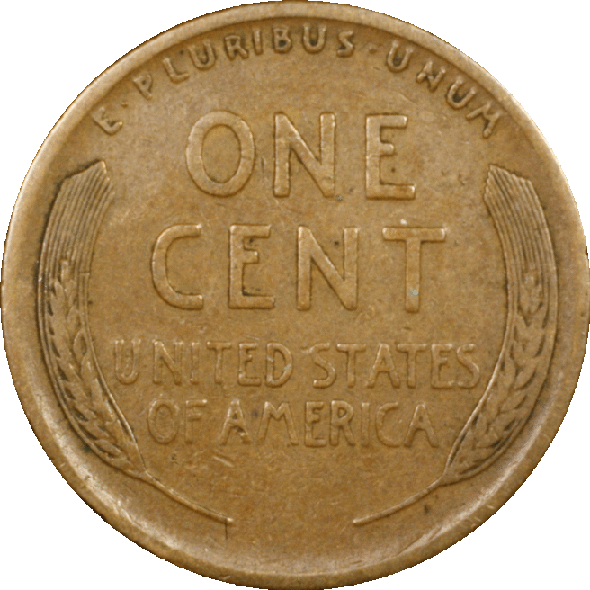 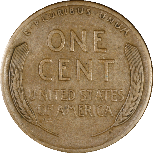 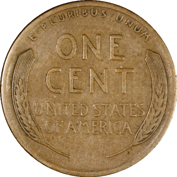 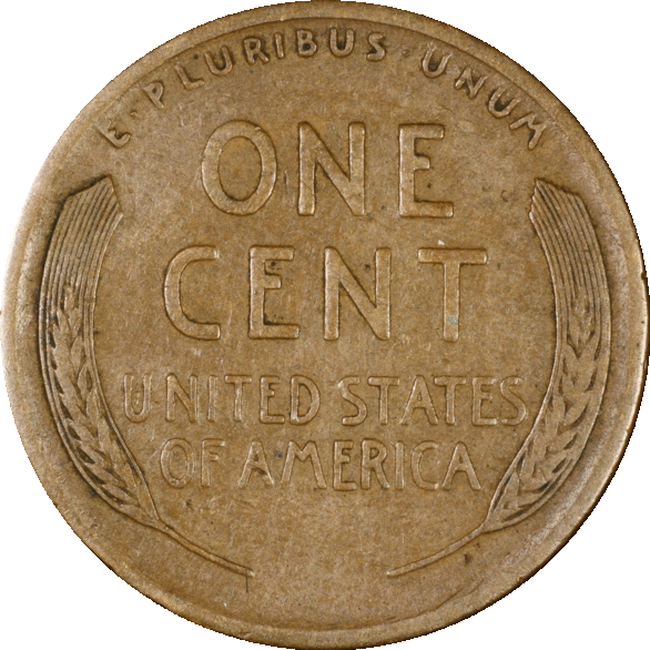 |
|
|
|
Pillar of the Community
United States
5825 Posts |
All look good.
Which one matches the coin's color best?
|
|
Pillar of the Community
United States
1298 Posts |
I like the last one. Looks sharper. Maybe mere sharpening?
|
|
Moderator
 United States
56855 Posts |
2nd and 4th. John1  |
|
Rest in Peace
United States
17900 Posts |
If I were picking only one, it would be #2.
|
|
Pillar of the Community
 United States
5682 Posts |
I like the 2nd photo. The letters are more clearly defined, probably from a better lighting angle.
|
|
Pillar of the Community
 United States
666 Posts |
Thank you! Your feedback is extremely helpful to this neophyte coin photographer.  #2 looks the most like the coin in hand. Now if I can only remember what I did differently for that one... ~~~ Mark's Entish self: "You should write down the lighting conditions for each of these photos." Mark's Saruman self: "Oh don't be silly! I will remember!" Mark's Entish self: "You are so hasty..." Edited by dd27
02/06/2017 3:25 pm
|
|
Pillar of the Community
United States
666 Posts |
I also posted pics of this coin (1910-S) in the Modern Coin Grading forum and have received some great feedback. (My grade was way off...  ... and I'm learning a ton! ) |
|
Pillar of the Community
United States
4038 Posts |
Mark...why did you save these as .gif images? Gif is low res from color perspective.
Contact me for photographic equipment or visit my home page at: http://macrocoins.com |
|
Pillar of the Community
United States
1963 Posts |
I would pick the second picture.
|
|
Pillar of the Community
United States
2403 Posts |
I would use the 2nd lighting if it shows actual color better. Just make it larger. I noticed the nicks and scratches are easier to see in 1st pic. This could be because of pic size.
|
|
Pillar of the Community
United States
666 Posts |
Quote:
Mark...why did you save these as .gif images? Gif is low res from color perspective.  Good question! Probably because it's the default on Lunapic, which I was using because I like their circle-crop tool. But I'm trying to use Digital Photo Professional now, although haven't found circular crop yet... |
|
Bedrock of the Community
United States
12477 Posts |
I liked #2 the best before reading comments. After reading comments, I like #2 the best. If that matches the coin in hand the best then it may be the best lighting...for that coin. Quote:
"Now if I can only remember what I did differently for that one..."  It's always good to see a LOTR reference, too. In Memory of Crazyb0 12-26-1951 to 7-27-2020
In Memory of Tootallious 3-31-1964 to 4-15-2020
In Memory of T-BOP 10-12-1949 to 1-19-2024
|
|
Pillar of the Community
United States
666 Posts |
Quote:
It's always good to see a LOTR reference, too. Yay! I was worried that might be too esoteric, so thank you for mentioning it. I just read Lord of the Rings trilogy for the fifth time--first time was at age 12 when I was absolutely captivated by the books. Lots of wisdom in those Ents. ;-) |
|
Pillar of the Community
United States
1944 Posts |
some fairly obscure acronyms...
i whsh posters would realize that to everyone else has the same base of reference.. (i would never have figured that on out)..
|
|
Pillar of the Community
United States
666 Posts |
A very fair and valid point dbrablec.I should have at least hyperlinked the terms to an explanatory web page, like this: ~~~ Mark's Entish self: "You should write down the lighting conditions for each of these photos." Mark's Saruman self: "Oh don't be silly! I will remember!" Mark's Entish self: "You are so hasty..." ~~~ Clearly I was, yet again, too hasty. Treebeard would not approve.  Edited by dd27
02/08/2017 12:14 am
|
| |
Replies: 17 / Views: 3,481 |


