| Author |
 Replies: 16 / Views: 3,297 Replies: 16 / Views: 3,297 |
|
Pillar of the Community
United States
2403 Posts |
In my continuing effort to better my coin photos, I got an idea and tried a very small experiment. Now I would like the CCF's opinion. Below there are 3 photos. For the purposes of this experiment we will call them A, B, & C. A Being the "Control" Photo. On Photo's B and C I have made one change. I am just looking for which one looks better in your eyes. Thank You....Mont Photo A "Control" Meaning photo was taken the way I have for past couple months.  Photo B (Changed one thing from Photo A) Photo B (Changed one thing from Photo A) Photo C (Again one Different change made) Photo C (Again one Different change made) Which one looks better in your eyes? Should I stick with my normal way, go with options B or C, or was there not enough of a difference to notice? ALL opinions welcomed & wanted good or bad.Thanks again...Mont |
|
|
|
Pillar of the Community
Canada
3733 Posts |
they all look exactly the same to me.?
|
|
Pillar of the Community
 United States
4038 Posts |
I don't see much difference, but I like the first one better because it is less rotated. You might try increasing contrast and lowering brightness just a bit:  Contact me for photographic equipment or visit my home page at: http://macrocoins.com |
|
Pillar of the Community
Canada
2781 Posts |
can't see any noticeable difference.
only constructive comment would be that your lighting is creating hot spots, might want to diffuse it a little, or increase the distance from the coin.
|
|
Rest in Peace
10197 Posts |
I DO see it Mont, adjusting the lighting effects of shadows and midrange I bet. Pix 3 has better details, less shadows especially within the date, also the eye, 3 looks better. Adobe Photoshop?  Two lights per chance? Edited by Crazyb0
04/15/2017 9:52 pm
|
|
Pillar of the Community
United States
564 Posts |
I don't see any differences
|
|
Pillar of the Community
 United States
2403 Posts |
Quote:
Adobe Photoshop? Nope...Its all about background color and texture. Photo A has a black background (Black construction paper) Photo B has a Grey background (Plain Paper printed solid grey) Photo C has same grey color background as B but printed on photo paper. You are right Crazyb0 the differences are in the shadows...very subtle. Good eye. |
|
Pillar of the Community
 United States
5674 Posts |
I saw no difference. I guess I can keep using my black background. But good experiment. It might have made more difference if you took a photo of a smaller raw coin where more of the background was in the field.
|
|
Bedrock of the Community
United States
12477 Posts |
I like the first the best and now I know why - the black background. B and C (with grey backgrounds) look to have an ever so slight yellowish tint compared to A. A also looks to have slightly less shadow. Lately, I've been experimenting and have decided to use a black background for silver colored coins and grey for copper/brass keeping the lighting virtually the same. Edit: I did a little basic editing on pic A and came up with this. I don't know if others use editing that much but I like the outcome a lot of times.  In Memory of Crazyb0 12-26-1951 to 7-27-2020
In Memory of Tootallious 3-31-1964 to 4-15-2020
In Memory of T-BOP 10-12-1949 to 1-19-2024
Edited by spru
04/16/2017 12:59 am
|
|
Pillar of the Community
United States
2403 Posts |
Quote:
Lately, I've been experimenting and have decided to use a black background for silver colored coins and grey for copper/brass keeping the lighting virtually the same. Thank you Spruett. I was gonna bag the whole thing and just get some new black construction paper as mine is getting pretty worn out. But now I will have to try again using copper/brass coins. I think I can find a few of those sitting around...lol Will post those results tomorrow. Edit: Quote:
Edit: I did a little basic editing on pic A and came up with this. I don't know if others use editing that much but I like the outcome a lot of times. The only editing I do is cropping photo to just coin, and run photo through an Auto White Balance check using Gimp 2.8 Edited by MontCollector
04/16/2017 01:03 am
|
|
Bedrock of the Community
United States
12477 Posts |
I've been wanting to mention this. I was checking into better backgrounds for experimentation and came across this in the scrapbooking section at Wal-mart for $5. It's a grey-shade book of 12"x12" cardstock sheets.  Here are the shades (plain white index card on the far left):  In Memory of Crazyb0 12-26-1951 to 7-27-2020
In Memory of Tootallious 3-31-1964 to 4-15-2020
In Memory of T-BOP 10-12-1949 to 1-19-2024
|
|
Pillar of the Community
United States
2403 Posts |
I will have to look into that Spruett. Thank you all for you input. If I could indulge you again. I took your advice best I could with what I have on hand. Took one more photo. Went back to a black construction paper background. This time I moved lamp back a little and I covered my light with a white plastic grocery bag hoping to diffuse it somewhat. My goal is to still show luster without "whiting" out so much of the coin in glare. Makes it easier to have Photo-graded here on CCF. Is this one better? 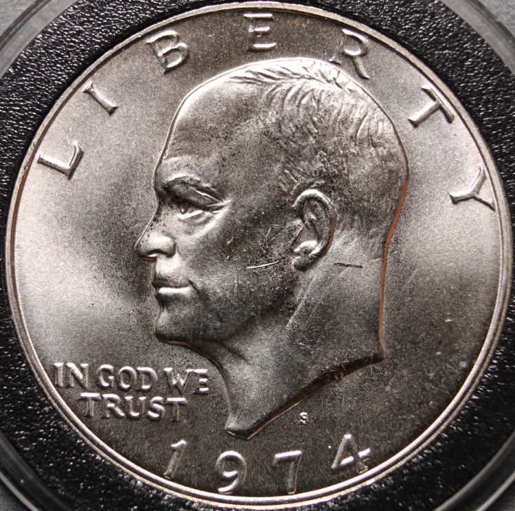 Thanks again...Mont Edited by MontCollector
04/16/2017 01:32 am
|
|
Bedrock of the Community
United States
12477 Posts |
I think it's definitely an improvement, especially in the jaw/neck area.
I don't assume to take great photos but, I recently found that if I move my lighting back a little and let my camera's (phone) exposure compensate, I get better details.
I'm using a few vertically mounted LED push lights that have translucent lenses (if you can call them that). I also found that in some cases, especially smaller coins, three was too much so I am trying to position two lights strategically to hit the specific coin's details the best.
It's definitely a work in progress!
In Memory of Crazyb0 12-26-1951 to 7-27-2020
In Memory of Tootallious 3-31-1964 to 4-15-2020
In Memory of T-BOP 10-12-1949 to 1-19-2024
Edited by spru
04/16/2017 9:43 pm
|
|
Moderator
United States
56855 Posts |
I read that when using a gray background it should be 18% grayscale,would that make a difference? John1  |
|
Pillar of the Community
United States
2403 Posts |
Quote:
I read that when using a gray background it should be 18% grayscale,would that make a difference? Actually it was supposed to be. I downloaded a grey that was supposed to be 18% grey....but from what I understand it isn't the color 18% grey it is the reflectivity of the color being 18% grey...this is why I tried with both plain paper and photo paper. I took one more tonight added a second undiffuused light source. Tomorrow gonna try diffusing second light...see what happens. 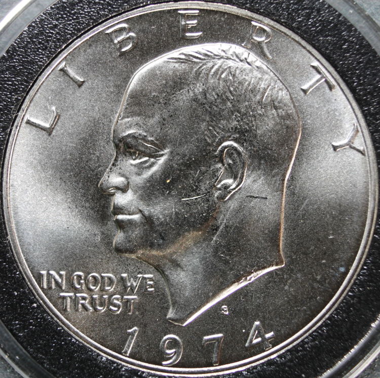 |
|
Pillar of the Community
United States
5674 Posts |
The problem with the Walmart card stock is that they may not be pure neutral grey, looks like a touch of blue or green mixed in. You're probably better off with your downloaded grey. I think your diffused light looks much better. I find that I have to optimize the lighting for each coin, depending on the relief of the devices, direction of the head, amount of luster, etc. I change the number of lights, direction and distance of light source, and amount of diffusion for each coin type. Thank goodness for large memory cards! |
| |
Replies: 16 / Views: 3,297 |


