| Author |
 Replies: 27 / Views: 4,675 Replies: 27 / Views: 4,675 |
|
|
|
Moderator
 United States
188952 Posts |
The last franc. Way to phone it in.  |
|
Bedrock of the Community
United States
20753 Posts |
Chute72: Those are really hilarious.
|
|
Pillar of the Community
 United States
6514 Posts |
I had to do a doubletake on that 'last Franc'. No kidding phoning it in Jbuck.
|
|
Bedrock of the Community
13014 Posts |
|
|
Pillar of the Community
Canada
5246 Posts |
Quote:
Some people really like it, but I suggest it looks like a high school shop project. For some reason I really like those swedish coppers. They have a sharp, modern look, plus the incused design means that they wear very well. That being said, I would not say that they are beautiful. They are simple. Simple does not mean ugly. |
|
Pillar of the Community
United States
1314 Posts |
God bless you Oriole for expressing your opinion. That's what it is all about.
I like the idea of a country using the opportunity of circulating money to show of their culture, art and heritage.
But when it comes to the Swedish coins depicted, I've see prettier numbers stamped on an engine block.
|
|
Pillar of the Community
United States
7953 Posts |
Quote:
But that 1 Sen is not bad In my opinion, that Indonesian national emblem is also attractive when it's allowed to fill the whole coin 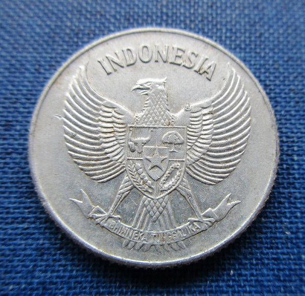 Edited by tdziemia
02/23/2018 9:05 pm
|
|
Moderator
United States
188952 Posts |
Quote:
In my opinion, that Indonesian national emblem is also attractive when it's allowed to fill the whole coin I do like it.  |
|
Moderator
Australia
16842 Posts |
Quote:
Good old modern art Ugly, like beauty, is in the eye of the beholder, but I do tend to agree with this sentiment, that modern art styles are less attractive on coins. Modern coinages are minimalist enough, with their cheap mass-produced plated-steel look; they don;t need to be made even worse by unattractive designs. On that basis, the coinage of the Netherlands deserves special mention for modern designs and artwork that needs a higher art degree for proper interpretation, or even orientation. Which way is up?. Can someone explain what this alien thing is?However, for unappealing coinage, I have to nominate Slovenia's pre-euro coinage. It's just.. blah. And all that blank space would look awful on a heavily circulated example. Don't say "infinitely" when you mean "very"; otherwise, you'll have no word left when you want to talk about something really infinite. - C. S. Lewis
|
|
Pillar of the Community
United States
2208 Posts |
|
|
Pillar of the Community
Canada
693 Posts |
Quote:
Can someone explain what this alien thing is? I think it is taken from a child's drawing. Maybe it is supposed to be a lion? I bought this coin a few years ago for my thematic set: "Coins Designs That Look Like Roadkill". |
|
Pillar of the Community
Russian Federation
5174 Posts |
I nominate the Bosnia and Herzegovina 1 convertible mark. Seriously, it looks like something designed on a shoestring budget for a random micronation. Among the world's current circulating coins, this is probably the type that looks least like an actual circulating coin. (Their other issues are kind of lame-ish too, but at least they're pretty.) |
| |
Replies: 27 / Views: 4,675 |


