Coin Community Family of Web Sites Join Thousands of Coin, Bullion, & Money Collectors
300,000 items to help build your collection! Coin, Banknote and Medal Collectors's Online Mall Join Thousands of Coin, Bullion, & Money Collectors Royal Canadian Mint products, Canadian, Polish, American, and world coins and banknotes. Vancouvers #1 Coin and Paper Money Dealer Specializing in Modern Numismatics Royal Estate Auctions - $1 Coin Auctions


Username:
Password:
Save Password
Forgot your Password?


This page may contain links that result in small commissions to keep this free site up and running.

Welcome Guest! Registering and/or logging in will remove the anchor (bottom) ads. It's Free!

1964 Lincoln Memorial Cent, Error Or Variety?

To participate in the forum you must log in or register.
Author Previous TopicReplies: 2 / Views: 768Next Topic  
Valued Member
Davidson's Avatar
Nauru
65 Posts
 Posted 11/04/2008  03:33 am Show Profile   Bookmark this topic Add Davidson to your friends list Get a Link to this Message Number of Subscribers
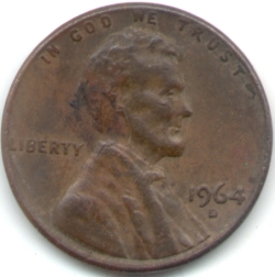
Can anybody assist by advising whether my observations on my 1964 cent are not unusual? That is other 1964 cents have the same issues. If not, then are these issues variations or errors?

On the 1964 Obverse:

The 'W' in WE is flush up against the rim while the other letters are not.

In the word 'LIBERTY', there a four sizes of the fonts i.e., 'LI' is small, 'BET' is slightly bigger, the top of 'R' is slightly higher than the others, and the top of 'Y' is slightly shorter. Pics below


1964-Lincoln-Memorial-Cent,-Error-Or-Variety?

On the reverse, there is a fat 'E' with 'E.PLURIBUS.UNUM'

Pics are below:


1964-Lincoln-Memorial-Cent,-Error-Or-Variety?

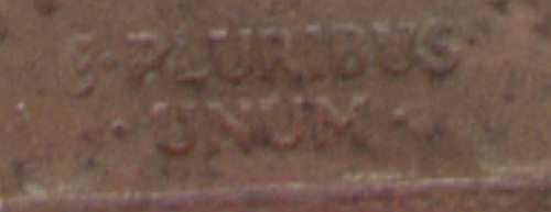
Th outline of the width of the 'E' is more clearer phyiscally than pic.
Pillar of the Community
TreasHunt's Avatar
United States
2540 Posts
 Posted 11/04/2008  06:49 am  Show Profile   Bookmark this reply Add TreasHunt to your friends list Get a Link to this Reply
Davidson:
What you are describing is just normal die wear.
Sorry, but no added value.
Pillar of the Community
coppercoins's Avatar
United States
7629 Posts
 Posted 11/04/2008  2:24 pm  Show Profile   Bookmark this reply Add coppercoins to your friends list Get a Link to this Reply
It's not die wear. It looks more like coin damage. A flat hit on a letter will smash it making it appear larger and fatter.

Die wear never affects only one small part of the design.
  Previous TopicReplies: 2 / Views: 768Next Topic  

To participate in the forum you must log in or register.


Disclaimer: While a tremendous amount of effort goes into ensuring the accuracy of the information contained in this site, Coin Community assumes no liability for errors. Copyright 2005 - 2026 Coin Community Family- all rights reserved worldwide. Use of any images or content on this website without prior written permission of Coin Community or the original lender is strictly prohibited.
Contact Us  |  Advertise Here  |  Privacy Policy / Terms of Use

Coin Community Forum © 2005 - 2026 Coin Community Forums
It took 0.21 seconds to rattle this change. Forums