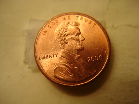
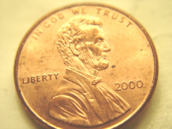
Chuckster...
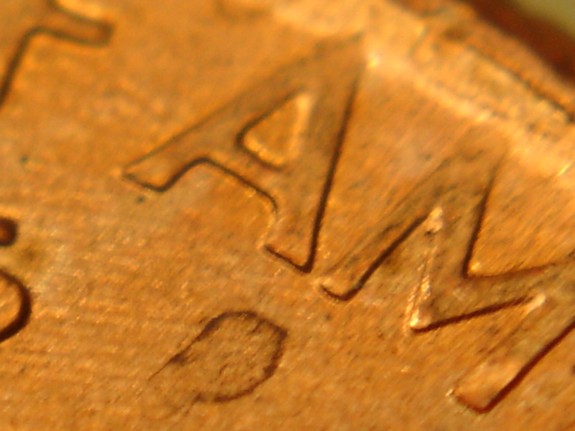
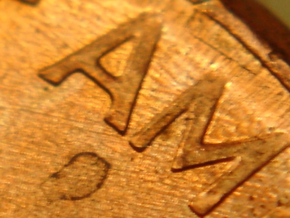
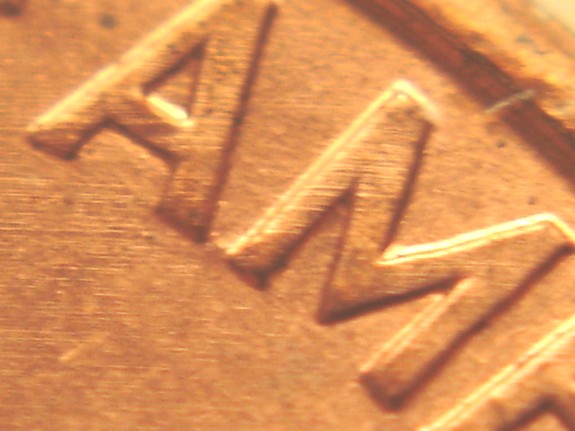
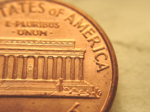
Your coin, and a lot of other coins suffer from a number of different things that cause the A and M to have a small gap between them.
1. Excessive die polishing - which your coin has. Letters on coins are trapezoid shaped with beveled edges. When you remove the field behind the letters, they become shorter in relief and more distant from one another.
2. Excessive die wear - which your coin also has. Die wear tends to eat away at the corners of sharp letters making them a bit mushy. This can separate letters that would normally touch.
3. Weak hubbing - which your coin might have. When dies are not hubbed strongly enough, some of the letters that have shallow connections (like the A and M on
Close AM cents) can be missing this shallow connection.
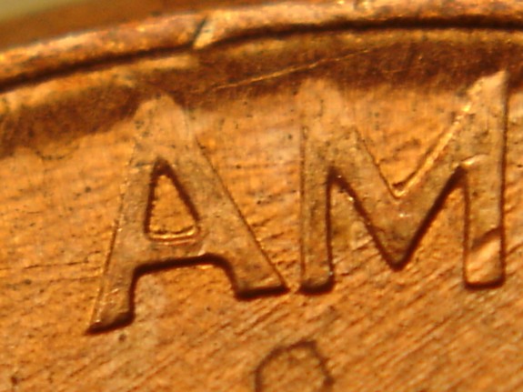
Bottom line is this: There were TWO designs used on some 1992, 1998, 1999, and 2000 cents (and possibly other years too). These two designs are very different from one another if you look very closely at the details:
1. The most obvoius, the gap between the A and M.
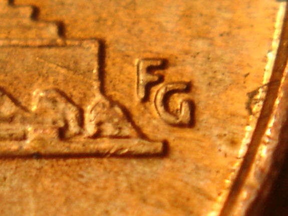
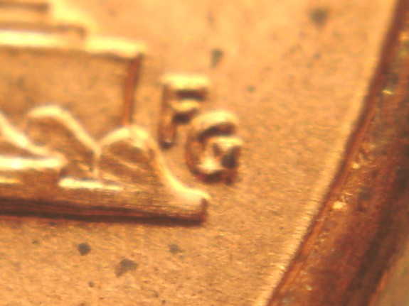
2. The designer's initials are moved farther away from the base on the newer
Close AM design.
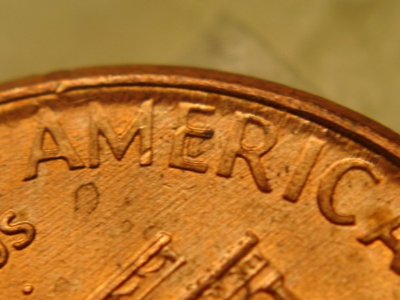
3. The "TAT" of "STATES" is spaced differently between the two designs. On the older,
Wide AM design, they are equidistant from one another. The A is half way between the two Ts. On the newer
Close AM design, the A is closer to the right T than to the left T.
There are numerous other minute details that are different between the two designs, but these are some of the more readily visible differences.
Point is, though...there are but TWO designs. There is no magic partial
Wide AM transition design. All the
Close AM coins you are finding with mild separation between the two letters have ALL the other characteristics of the
Close AM design. So they are
Close AM coins. End of story. That's the blunt truth.
I hope you find this helpful.