| Author |
 Replies: 15 / Views: 2,352 Replies: 15 / Views: 2,352 |
|
|
Valued Member
United States
417 Posts |
I mean, it's not even close. Even if it were just DB, those 2 letters appear a bit off center to the left, and then a whole 'nuther letter tacked on way off to the left. A quick web search finds nothing. Anyone know the story? 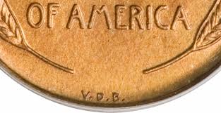 Edited by TimNH
02/14/2023 1:16 pm
|
|
|
|
Bedrock of the Community
United States
94367 Posts |
Lots of devices on our coins are not centered, going back to the 1790s.
|
|
Pillar of the Community
United States
2365 Posts |
Only Victor David Brenner and the Mint know the answer. Could be a design flaw considering it wasn't supposed to be there in the first place. Hmmmmm...good question. |
|
Pillar of the Community
United States
1648 Posts |
This was discussed back in 2009 on another forum which I cant link to, so I will try to summarize a bit since it was very interesting and why I bookmarked it. The initials were hand cut into the master dies unlike the rest of the inscriptions. Two different Master Die varieties are apparently known. Brenner had been told to use initials, but the reverse model he sent had his name on it. Engraver Barber was told to replace the name with initials "VDB" so there would be no confusion with "B" for Barber. The wheat ears were fixed in position by the master hub. Might Barber have started by putting a "B" in the center, then decided to add "VD?" From there forward he would have had to replicate the off-center position to avoid creating a variety for collectors to go after. (Barber was fully aware of coin collectors habits - he had one of the best pattern collections.) Do the two VDB initial sets differ in placement relative to the stalks? As to the two dies, the different sizes of the letters including the taller "V"; the different shape of the "B," and, easiest to spot, the different position of the period between the "D" and the "B". On one of them the period is noticeably closer to the D, while on the other it is centered between the D and the B. These differences were discovered and published by Ed Fleischmann in Coin World in the early 1970's. |
|
Moderator
 United States
191045 Posts |
Quote:
Might Barber have started by putting a "B" in the center, then decided to add "VD?" From there forward he would have had to replicate the off-center position to avoid creating a variety for collectors to go after. That sounds plausible to me.  |
|
Bedrock of the Community
United States
26060 Posts |
But the B of VDB is not centered between the ends of the wheat stalks.  Inordinately fascinated by bits of metal with strange markings and figures
|
|
Moderator
United States
191045 Posts |
Quote:
But the B of VDB is not centered between the ends of the wheat stalks. I believe it is centered enough for something added by hand.  |
|
Pillar of the Community
United States
1648 Posts |
Or he used the ME of America to center it instead, then added the VD as explained and is added by hand, making it seem very 'off center' to those who.are using the wheat stalks. At least we know it was added by the engraver barber by hand as to why this might happen regardless.
|
|
Pillar of the Community
United States
2365 Posts |
datadragon to the rescue - again!
Thank you!
|
|
Valued Member
 United States
417 Posts |
Thank you guys, this has bugged me forever, and now it makes sense. The B centers perfectly if you go by the midline in 'OF AMERICA' with 5 characters on each side including the space, as suggested by Mr. dragon.
Me personally, I never liked this coin, too much like a monument to one guy's ego, but this is a great story.
|
|
Pillar of the Community
United States
1648 Posts |
Quote:
Me personally, I never liked this coin, too much like a monument to one guy's ego, but this is a great story. Another add to the story. There had been discussion of replacing Brenner's full name with the first letter of his last name, but that was not done because Charles Barber, the Mint's chief engraver at the time, did not want it to be confused with the "B" that appears on the silver coins he designed. Many have suggested there was public outcry about the use of the "VDB" initials as advertising for the artist, but researchers like Q. David Bowers note that they found no press reports of the time, nor Treasury records, that corroborate that view, which he considers to be folklore. Moreover, the numismatic community objected to the removal of the initials, noting that it was inconsistent with past practice since coins like the gold ones designed by Saint-Gaudens featured three initials while others used just one. They and Brenner compared it to an artist's signature on a painting. The Mint quickly acted to remove the V.D.B, but not before a microscopic mintage of 484,000 was released. It was not until 1918, when Brenner's initials returned to the coin (this time they were on the obverse) as small letters below Lincoln's shoulder. Charles Barber died in 1917 and there is speculation that he was the one who had opposed the Brenner initials on the coin. Sometimes designers arent credited, such as in 1979 Atari programmer Warren Robinett was frustrated that he wasn't credited in the games he designed. So he added his own credit in the form of a hidden room in his game adventure -- gaming's first Easter egg. Edited by datadragon
02/14/2023 8:50 pm
|
|
Bedrock of the Community
United States
19990 Posts |
I always thought it was put their for "artistic flare".  |
|
Pillar of the Community
United States
562 Posts |
I wondered about it before, interesting.
|
|
Pillar of the Community
United States
2530 Posts |
very interesting. good stuff.
the B looks to me like it's centered nearly perfectly relative to the very bottom of the coin. if it were a clock face, the B is where the 6 would be.
|
|
Pillar of the Community
United States
6664 Posts |
Looks to me like the dots are centered |
|
Moderator
United States
15623 Posts |
Interesting topic and great discussion. |
| |
Replies: 15 / Views: 2,352 |
|


