| Author |
 Replies: 30 / Views: 2,959 Replies: 30 / Views: 2,959 |
|
|
|
Bedrock of the Community
 United States
18706 Posts |
Quote:
I think it is die #3 the difference between die 2 and die 3 can be a little challenging. the MM on die #3 slants just a little more to the right. I originally called it die#2 but I'm also going with #3 after seeing BADTHADS closeup. good call |
|
Moderator
 United States
54283 Posts |
The difference between die #2 and die #3 is that die #3 mm is positioned more to the right than die #2. If you drew a vertical line at the left side of the mm, on die #3 it would not touch the first 9 in the date, whereas with die #2 it would intersect with the first 9.  Show your financial support of the Coin Community Family (click here)See my topic on Mexican Numismatic Medals (click here) |
|
Valued Member
 United States
120 Posts |
It arrived today. Here are my pictures of it. Seller's photos seem enhanced.
|
|
Valued Member
United States
120 Posts |
Worked this time, sorry. 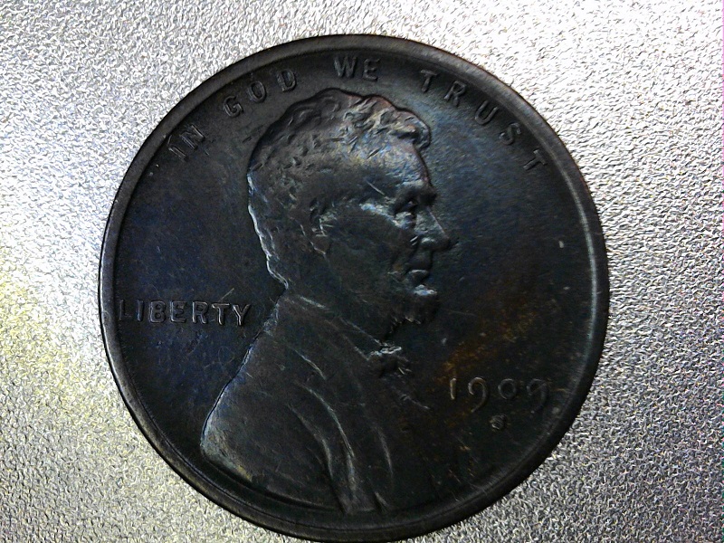 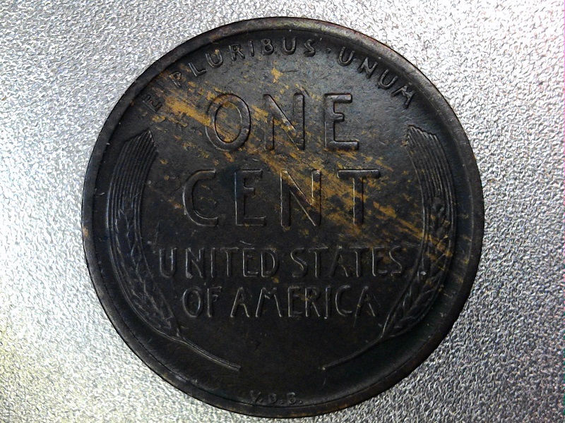 |
|
Bedrock of the Community
United States
94367 Posts |
Well those don't help!  |
|
Pillar of the Community
United States
3477 Posts |
Oh my, I would send that back.
|
|
Bedrock of the Community
United States
19969 Posts |
That's a bit of a contrast from the first pictures!  Honestly, I like it better. I like those almost black coins. The biggest concern is if someone applied shoe polish or other substance to it. If it's a true patina, which it could be, it's better than the first pictures I saw. |
|
Pillar of the Community
United States
5682 Posts |
Is the dark color accurate? If it just toned dark, I think it looks rather nice. The fact that you can still see the planchet streaking on the reverse suggests that it's not coated with something.
|
|
Bedrock of the Community
United States
18706 Posts |
better lighting needed to see the actual color. that bluish/purple color could signify a cleaning and possible AT but man those original photos were really touched up. I cant see how you can manipulate a coin that much
in any case I think the coin is a little better than VF so I'm upgrading my grade to XF but unsure about original surfaces. for me it would be tough call to keep it or send it back. I think it comes down to how much it was.
|
|
Pillar of the Community
United States
1361 Posts |
Did a bit of adjustments, your photos were too dark to see much. Is this more accurate? It looks decent to me honestly...better than the originals I feel like if so, other than that blue tint. Are there signs of a harsh cleaning under a loupe?   |
|
Valued Member
United States
120 Posts |
KYcoppercoins
Oh yes, that is much better. My photo set-up isn't the greatest for lighting. You nailed it.
|
|
Moderator
United States
54283 Posts |
Is it really that color?
Show your financial support of the Coin Community Family (click here)See my topic on Mexican Numismatic Medals (click here) |
|
Bedrock of the Community
United States
19969 Posts |
Interesting, the surfaces are definitely questionable. Probably the result of people oiling the coin back in the day and this is just how it came out over the years. I wouldn't mess with PCGS/NGC, I'd send this to IGC. They are more tolerant of toning and less apt to bag it IMO.
|
|
Bedrock of the Community
United States
18706 Posts |
copper tones in all kinds of ways but this doesn't look natural.
|
|
New Member
United States
38 Posts |
|
| |
Replies: 30 / Views: 2,959 |


