| Author |
 Replies: 27 / Views: 3,359 Replies: 27 / Views: 3,359 |
|
Pillar of the Community
Canada
1733 Posts |
   I picked up a new camera and even though the macro lens hasn't arrived yet it's still miles above what I had. So I'm going to post an image a day for a week or so and I would like you to say whether the coin was artificially toned or naturally toned. I will tell you for sure before I post the next coin. I've set all the colour balances and defined them then tested them on three machines so you will get a pretty good approximation of what the coin looks like in hand on most systems. 1st coin 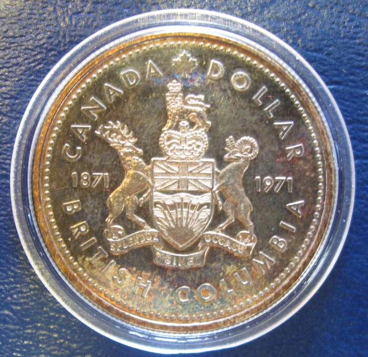
|
|
|
|
Valued Member
Canada
200 Posts |
NT
I don't know why but plenty of the 1971's look like that. Possibly the case they came in?
|
|
Valued Member
Canada
78 Posts |
I'm going to say artificially toned. The insides of the letters and numbers appear not to be toned. Looks like all the hard to reach areas are not toned.
|
|
Pillar of the Community
Canada
1248 Posts |
HUGE and important question:
Is the background color the actual color?
|
|
Pillar of the Community
 Canada
1733 Posts |
Impossible to tell you that about the background unless I know for certain what colour profile your computer is using.
|
|
Pillar of the Community
Canada
1051 Posts |
|
|
Pillar of the Community
United States
1571 Posts |
Not knowing the coin, nor the ability to look closely, due to beinng legally blind, I would have to guess NT. It is a 50/50 chance I'll get it right, (or wrong)>!
Dick
|
|
Pillar of the Community
Canada
1733 Posts |
The 1971 is naturally toned and is caused by the case and packaging the mint put them in as pennylover1010 suggested. These were pushed raw into a grip type holder inside a clam shell case that obviously allowed this rainbow style toning to occur on many samples. Later coins were encapsulated. Next coin 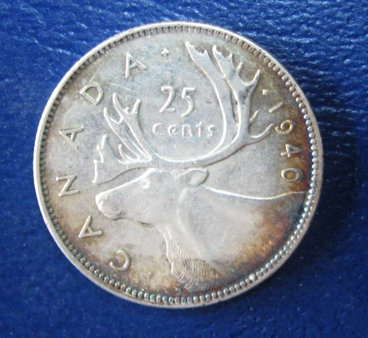 |
|
Pillar of the Community
Canada
1248 Posts |
Ugly,
the coin color is much affected by the background color you use. I. e. where the coin is lying on.
if you use black, NO color reflects on it and the actual coin properties will be better noticed.
I experimented long with this....crop this quarter and then at the fiels ... what do you see..... BLUE shine.... hard to then determine toning...
also it sure helps if you take pictures without the influx of day light....
|
|
Pillar of the Community
Canada
1733 Posts |
I'll change it up next round, thanks for the feedback.
|
|
Pillar of the Community
United States
1571 Posts |
|
|
Valued Member
Canada
168 Posts |
The quarter looks NT to me. Beautiful pics by the way! Amazing details! What type of camera did you pick up?
|
|
Valued Member
Canada
200 Posts |
The 1940 "looks" NT.
But I'm going to say you did this yourself? so AT
|
|
Pillar of the Community
Canada
1248 Posts |
have some like that and I did not tone them
NT
|
|
Pillar of the Community
United States
1571 Posts |
Again on the 25cent, NT
Like they say, a black background is best.
You can also use a pedstal,. That way, there are no shadows.
Dick
|
|
Pillar of the Community
Canada
1051 Posts |
1940 - going out on a limb and saying AT, possibly cleaned and AT. I could buy it on a MS coin, but it looks "wrong" to me on a circulated coin.
|
| |
Replies: 27 / Views: 3,359 |


