| Author |
 Replies: 16 / Views: 3,761 Replies: 16 / Views: 3,761 |
|
Valued Member
United States
57 Posts |
Good evening again. I found this one CRH and I had to really give it a second look to see what I see. At first I thought it was simply damage to the plating, but a closer look revealed the letters PLU across the end of the motto. Once again, I cannot get the acute angle in photos that I can see with my eyes and a 30X loupe, but despite how they appear in these pictures, the letters are raised on a ground that is lower than the surface of the coin. They are not indented nor are they in reverse as they would be if hit by or squeezed against another coin. Also, the letters on the IGWT on the obverse look thin in places. Any thoughts on how this happened and if it has any value other than an interesting find.       |
|
|
|
Valued Member
United States
356 Posts |
I believe what you are seeing is some sort of Post Strike Damage. It almost looks like a stamp of sorts. It did not leave the mint this way for sure and you can tell this by the brighter metal that has been disturbed which caused this damage. Sorry.
|
|
Bedrock of the Community
United States
62064 Posts |
The motto is showing a lot of over polishing, almost removing those devices. As far as the dropped letters go, they are not clear enough to be sure what happened there? Even a larger denomination coin with reeds, could of caused that. Just not clear enough to be definite to say for sure,
|
|
Pillar of the Community
United States
4408 Posts |
Looks very much like the PLU from PLURIBUS. Not exactly sure what the cause is though. I don't see this being damage, letters aren't inverted and some strike throughs do result in a slight color or luster change to the metal.
|
|
Valued Member
United States
356 Posts |
I agree with coop. What I do see is what looks like two subsequent shapes of something that looks like L's side by side in your last pic but not the letters PLU. Not seeing dropped letters here IMHO. With that said, I'm the novice here and coop is the pro hands down.
|
|
Pillar of the Community
United States
6116 Posts |
Can't say for sure, but that looks good to me as a dropped PLU. Hope it is as that would be a really nice find.
|
|
Pillar of the Community
United States
713 Posts |
Looks incuse, I go with damage.
|
|
Pillar of the Community
 United States
8940 Posts |
@CentSation, if it were a dropped letter, which I can't confirm either way, it would be incuse.
|
|
Pillar of the Community
United States
713 Posts |
"if it were a dropped letter ... it would be incuse."
Thanks for the clarification, not much of an error person so I figured 'dropped letter' meant that something was dropped on the die, not the planchet.
Had to look it up.
Edited by CentSation
03/15/2021 12:33 am
|
|
Valued Member
United States
356 Posts |
I think some clearer pics may be beneficial from the OP. I may be wrong but I thought dropped letters have to be the same size and shape of the other letters/devices on the coin it came from in order to qualify. Yes, dropped letters are incuse but I am not seeing any resemblance of PLU here on this coin (makes me worry that my eyesight is getting that much worse....). Someone please help my old eyes and show me what you are seeing in the form of an incuse PLU..... Thank you, Seriously!!
|
|
Pillar of the Community
United States
3281 Posts |
Interesting. I'd like closer photos of the area in question before I give my input.
|
|
Bedrock of the Community
United States
62064 Posts |
|
|
Pillar of the Community
United States
713 Posts |
"CoopHome: What is a dropped letter/letters/design and how does it affect the strike?"
Coop, I am interested in finding out more about dropped letters and I didn't see anything specific to it on your linked page. Is there more info on the site?
Edited by CentSation
03/15/2021 5:15 pm
|
|
Pillar of the Community
Canada
6244 Posts |
|
|
Valued Member
 United States
57 Posts |
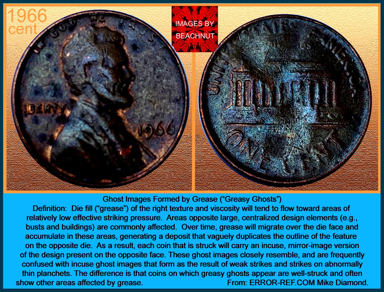
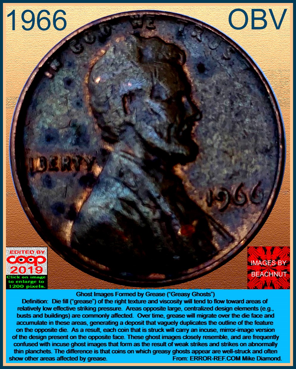
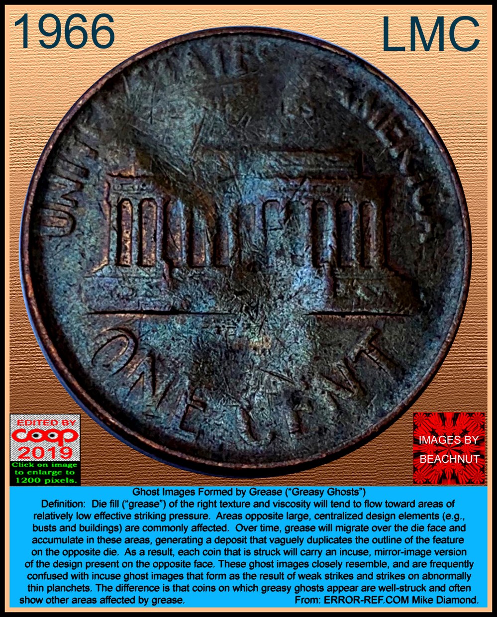
Good evening all - I so appreciate all the time and knowledge you all have spent reviewing this post. And Coop - WOW! That is such great information and a wonderful bunch of examples of dropped type. So much so that I am more convinced than ever that this coin is in that category. I have spent the last hour TRYING to take more clear images, but I am limited to my Galaxy Note 8 with the camera on zoom and the 30x loupe held over the lens! I really need a few more hands, but I have done my best. Additionally, I adjusted the color of the second image to what Photoshop says is proper adjustment for lighting and color - but ya never know. I hope that you can all now see clearly the image as follows: The dropped letter "P" is slightly behind the "E" in the motto. The L is very clear and the exact shape and size of the original. If there is anything a bit off it is that the foot of the "L" slightly drops. the "U" is clear on the left side almost to the base, and the inside of the curve is easily seen. The rest of the "U" is visible where it starts to go up on the right of the letter. I look forward to hearing your comments again. THYI    |
|
Bedrock of the Community
United States
62064 Posts |
Well those images are a lot better. The dulled look shows that there was some grease involved. Now if we could get you to use a diffuser, then you will be even happier. I have on my setup something that removes glare. Nothing costly at all. Depending on the type of light you are using. Bond paper can remove the glare from images. I've used in my studio (A cardboard box, a dark piece of fabric, a desk lamp and two sheet of paper, that I use for a setup for full images: here is the results of the setup: 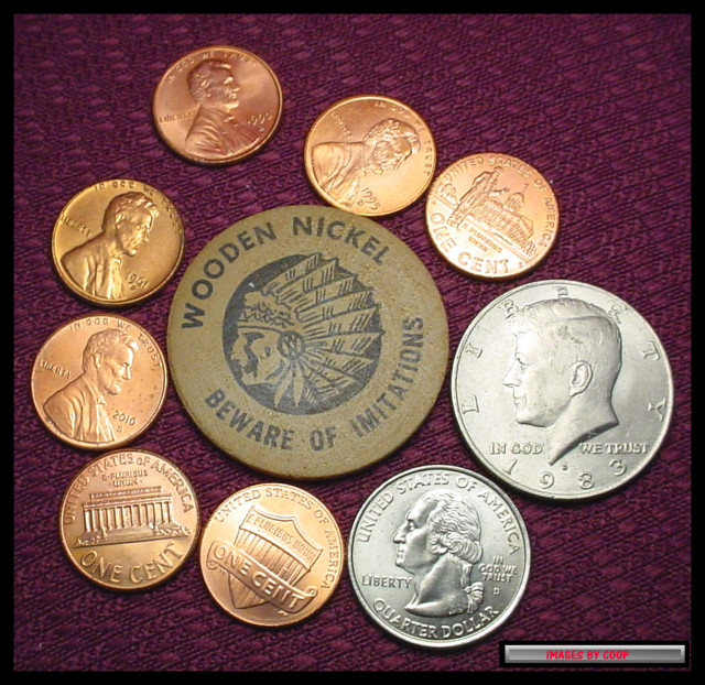 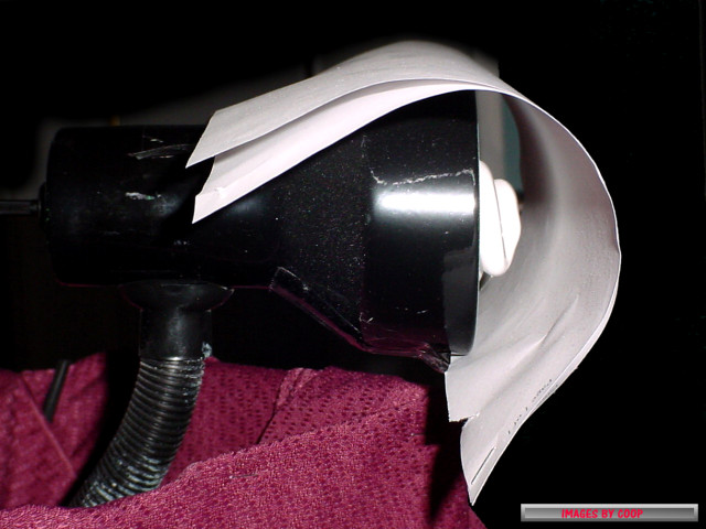 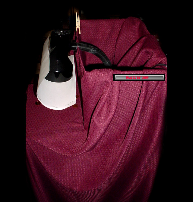 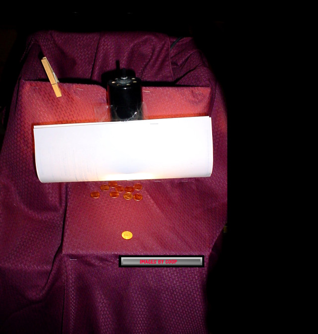 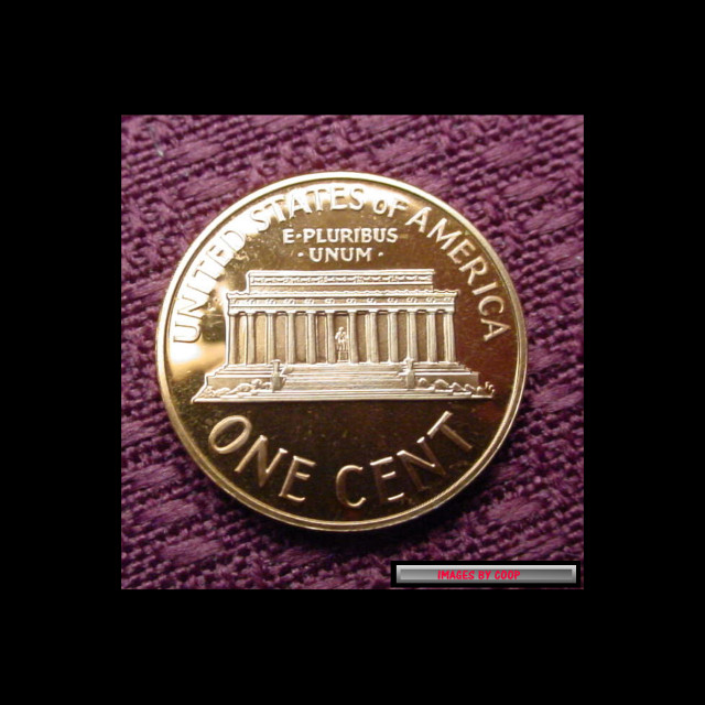  For this setup I like to encircle the coins with BU coins to show how the center coin looks next to BU current coins:    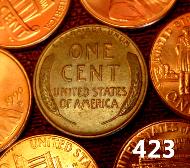 In the past I've used a setup like this: 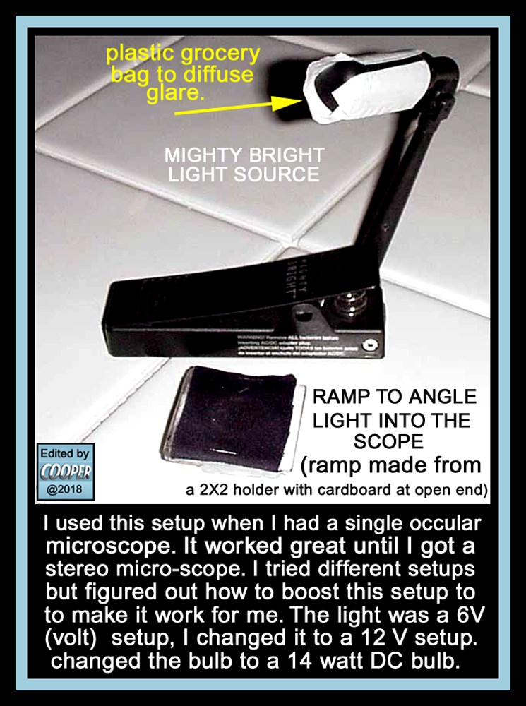 This setup worked great for the tiny scope I used to use. With that light and the small scope, I took hundreds of images for coppercoins.com (Note the plastic grocery bag over the light?, that was the diffuser) Then I bought a bigger scope and needed more light, so I still used the light source, but upper the power a bit and used a 14 watt bulb on a 12 volt system. 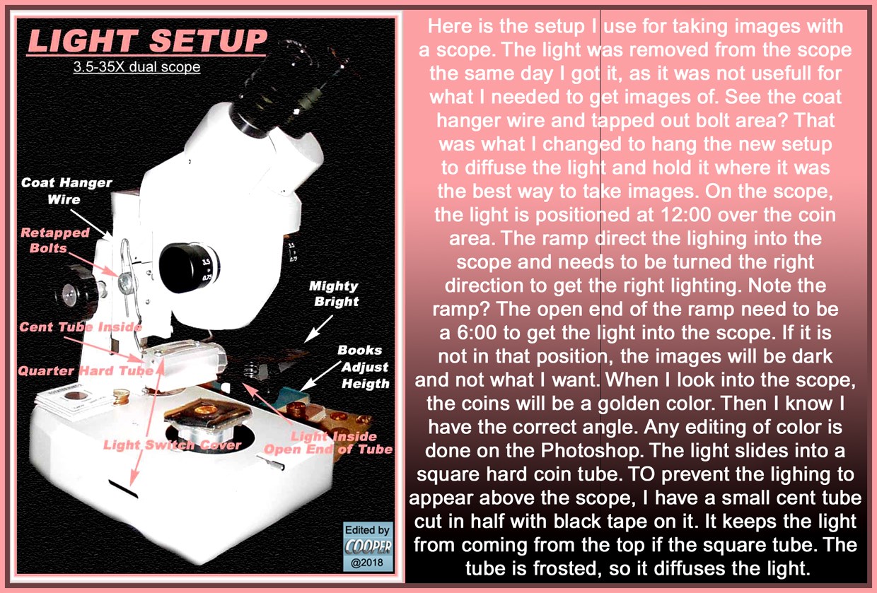 With the new setup I found different issues. Dealing with unwanted light. So I figured out the direction and use a diffuser to block the unwanted light: 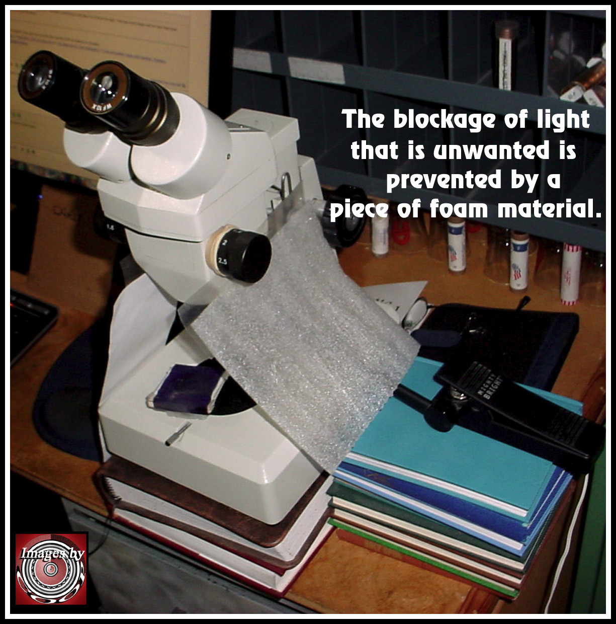  The two different blockers were used to show that anything could be used, it just prevents the unwanted light glare from hitting the coin. I use a ramp to direct the desired reflection into the scope lens. The ramp is a 2X2 with a piece or two of cardboard to widen the ramp and fasten dark fabric on top to cover the ramp. Expensive stuff huh? But the removal of glare gets rid of too shiny views of coins. Determine the direction of light you don't want and block it out. (Place your hand around the coin, then figure out the direction of the unwanted light) A single light source is better for Micro Photos. Two is okay for full image coins. The angle on the ramp I found was best on my scope was light source as 12:00 and the taller angle of the ramp at 6:00. If I needed to rotate the coin, turn the coin, not the ramp. The angle will be correct at that setting, bu rotating the ramp will make the image lighter/darker or a golden color when you have it at the right angle. CoopHome: Lighting, ramp, diffuser, setups for full images or single images. |
| |
Replies: 16 / Views: 3,761 |