


The two slightly different edge pattern styles as seen on the purported 1795 and on the 1800, respectively, should be correct for those dates (Lima altered the style right around that mid-to-late 1790s period).
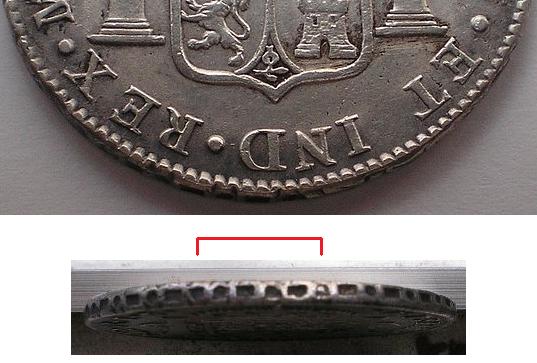
However, aside from that, I don't like what the surfaces of the 1795 look like in general (even microscopic granularity, and cleaned), the scattered pores, how the denticles transition into the edge pattern (check that chasm around the bottom of the reverse), how the legend lettering transitions into the space around it.
Back to the edge pattern, particularly the overlaps... Looking at the reverse, as that's how the photos are, the overlap just before (to the right of) 6 o'clock looks normal enough... but what's with the other one? The center of that overlap looks close enough to exactly 180 degrees from the one just mentioned... BUT why is it so long? Also, seeing how the two halves of the edge pattern come together, shouldn't it look sloppier? Seems like there should be more ghosting visible from the extra bit of the first half of the edge pattern to make contact (which was then overlapped). Maybe we just can't see it well in the pics, or the edge application was just a bid odd but legit... however, it seems "not usual".
The piece is sketchy on multiple fronts... I vote fake.


