| Author |
 Replies: 18 / Views: 2,759 Replies: 18 / Views: 2,759 |
|
Pillar of the Community
Canada
3234 Posts |
Should frostiness override a blazer..? or is it marks or contacts..? Any comments or opinions appreciated.. 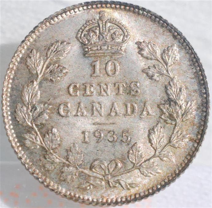 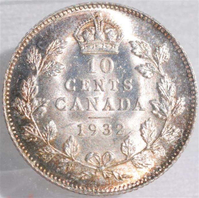 Edited by DEVLEC
05/28/2013 08:41 am
|
|
|
|
Pillar of the Community
Canada
3167 Posts |
#2 IMO
I love the "blazing" effect, so that is more eye-appealing to me than the 1st. Not to say that I don't like it, because oh heck I do, but I'm a fan of the crazy luster.
Edited by noahs-numismatics
05/28/2013 09:13 am
|
|
Valued Member
Canada
258 Posts |
I would agree with Noah. Just based on my initial visceral reaction, coin #2 is more impressive to me.
|
|
Pillar of the Community
Canada
2427 Posts |
The Lustre and toning on the second coin stands out over the first.
|
|
Valued Member
Canada
449 Posts |
I agree with the above posters. I find the toning on the second coin has much more appeal where it has developed. The first coin, it obscures the details and makes the coin look a little fuzzy almost.
|
|
Moderator
 Canada
10460 Posts |
Impossible to answer, without seeing the coins in hand and seeing how the lustre plays with the light when the coin is tilted at various angles...
"Discovery follows discovery, each both raising and answering questions, each ending a long search, and each providing the new instruments for a new search." -- J. Robert OppenheimerContent of this post is licensed under a Creative Commons Attribution-NonCommercial 3.0 Unported License. See: http://creativecommons.org/licenses...0/deed.en_USMy eBay store
|
|
Pillar of the Community
Canada
1554 Posts |
 I prefer the look of the 1935 dime. I love that soft satin look with the gold toning beginning around the peripherals. It also looks like a higher grade, 1 or 2 points above the 1932. I would give the 1935 an MS-64 PQ if the Obverse is similar in quality, no contact marks whatsoever on the Reverse. Glenn  |
|
Pillar of the Community
 Canada
9865 Posts |
Eye appeal in hand and online can be two very different things.
Based on the pics I agree with glenzy,and also like the more fully struck crown on the '35.
How about some obverse pics please?
"Dipping" is not considered cleaning...
-from PCGS website
|
|
Pillar of the Community
 Canada
3234 Posts |
Here are the Obverse pics. The 35 is Graded ICCS MS 65 and the 32 is ICCS MS 64 .... back in the 90's. I prefer the frostiness myself because it somehow seems more antique and original because of the time that has passed and the fact that my preference is for silver to have at least a touch of toning. The old copper coins were lacquered by some of the early collectors,..probably knowing that copper would darken dramatically with time and therefore take away from the original visuals. I also like "Red and blazing" on copper...but... The early rare mint sets show very dark and original toned silver coins,.. and they still get a very high grading much of the time even through the darkness. So I guess that I like some toning on the silver ones. A blazer somehow looks like it's been dipped somewhere down the line...but it does also give the impression that it was struck yesterday... Thanks for your impressions and opinions here. I do listen carefully to what you say.. 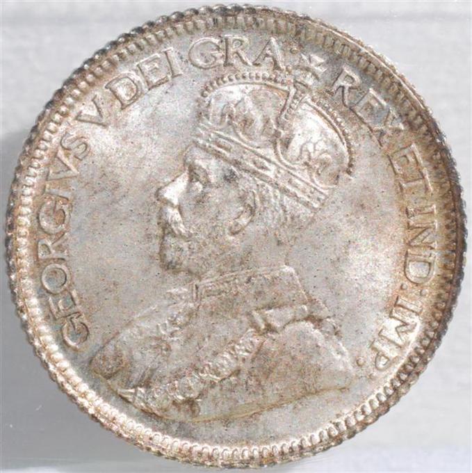 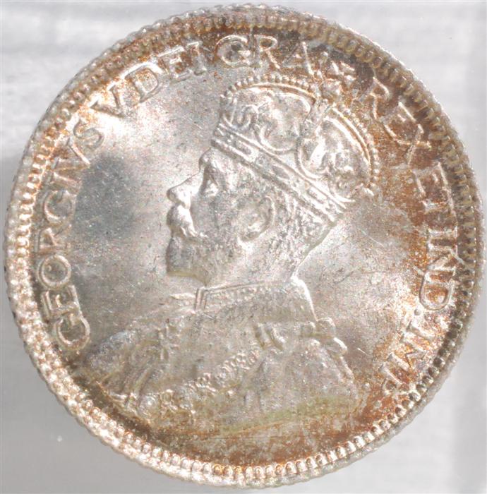 |
|
Pillar of the Community
United States
797 Posts |
#2 easily! That thing just Pops. Everyone Likes something Shiny!
|
|
Pillar of the Community
United States
1949 Posts |
I also have to say #2, just a beautiful coin...
|
|
Valued Member
Canada
99 Posts |
|
|
Valued Member
Canada
293 Posts |
#2 is the one I'd like in my collection.
|
|
Moderator
Canada
10460 Posts |
#1 (1935).... I do like a full strike and I prefer matte surfaces over mirror surfaces...
"Discovery follows discovery, each both raising and answering questions, each ending a long search, and each providing the new instruments for a new search." -- J. Robert OppenheimerContent of this post is licensed under a Creative Commons Attribution-NonCommercial 3.0 Unported License. See: http://creativecommons.org/licenses...0/deed.en_USMy eBay store
Edited by SPP-Ottawa
05/28/2013 3:38 pm
|
|
Pillar of the Community
Canada
686 Posts |
#1 is technically a better coin, but since the question was strictly eye appeal, I'm with the majority... #2
|
|
Valued Member
Canada
306 Posts |
#2 is my favourite in the pictures but I would have to see them in hand to be sure.
|
| |
Replies: 18 / Views: 2,759 |


