| Author |
 Replies: 16 / Views: 6,267 Replies: 16 / Views: 6,267 |
|
Valued Member
United States
431 Posts |
|
|
|
|
New Member
5 Posts |
Oh c'mon you know what we think!! It's pretty darn nice! Although the first set of pictures look much better then he second. But cameras will do that sometimes. My camera makes my notes look less appealing then they really are in person. A scanner is definitely the way to go. In the second set I can see the light wallet folds. I'd say it could get maybe an EF Grade possibly Choice VF. It is indeed the Lyons/Roberts sig combo. It is not the rarest combo as they printed 119,408,000 with that sig combo. The rarest by far is the Napier/Thompson combo.. But I'd say it is nicer then mine    Edited by Collectorking2
05/08/2016 1:41 pm
|
|
Bedrock of the Community
United States
94367 Posts |
Very nice - keep us up to date! Almost impossible to grade high-end PM from pics.  |
|
Bedrock of the Community
United States
94367 Posts |
PS - My general sense is possibly AU-50/53, or a 3-fold EF-45 at worst based on shadow lines.
As to scarcity, this note (as the first issue) is generally among the least expensive in the series grade-for-grade.
Edited by Coinfrog
05/08/2016 5:57 pm
|
|
Pillar of the Community
United States
5891 Posts |
Assuming it's genuine, it's stunning! Much nicer than mine as well: 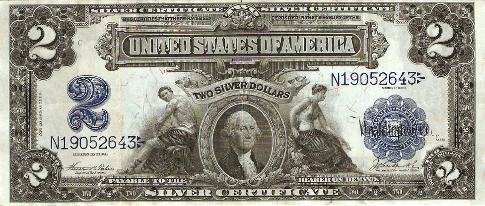  |
|
Pillar of the Community
United States
2851 Posts |
Lyons/Roberts is actually pretty common. It has what looks like 3 folds which will probably net it an XF40/45. Still a nice note.
|
|
Pillar of the Community
United States
1068 Posts |
Sharp looking note... Back when our bills were designed with class...
|
|
Pillar of the Community
United States
4637 Posts |
Quote:
Sharp looking note... Back when our bills were designed with class... Nice note @georgescoins, and I do like the front design with George Washington on the front......however, I prefer our current back design on two dollar bills.  |
|
Pillar of the Community
United States
1068 Posts |
Quote:
Nice note @georgescoins, and I do like the front design with George Washington on the front......however, I prefer our current back design on two dollar bills. I do like some of the aspects of today's currency ($2 and $50 bills are really nice bills) but I just think the older bills were designed and look so much better... |
|
Bedrock of the Community
United States
94367 Posts |
As much as I love the older notes, I would agree with Steve that the reverse of the modern $2 deserves virtually permanent representation on our currency. This is among the most famous of American historical paintings ("The Declaration of Independence"}, done by John Trumbull around 1817. as you may know. If you have had the wonderful experience of seeing it, you can also appreciate its massive size, some 18 feet wide by 12 feet high.
|
|
Bedrock of the Community
United States
94367 Posts |
PS - It was in fact used on an early large-size note, the First Charter NBN $100 issue.
|
|
Pillar of the Community
United States
1285 Posts |
An 'edited' version appears on this Maine banknote: == 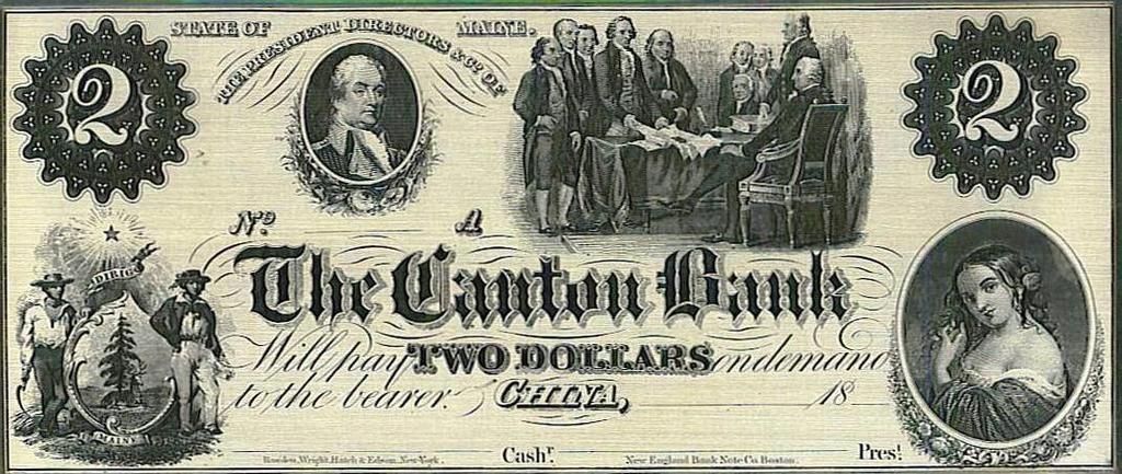 == P.S. The note is not mine, found the picture "somewhere" but cannot remember where. |
|
New Member
United States
1 Posts |
Can anyone please tell me what this is Its blank on the back side. But it is printed on money paper. 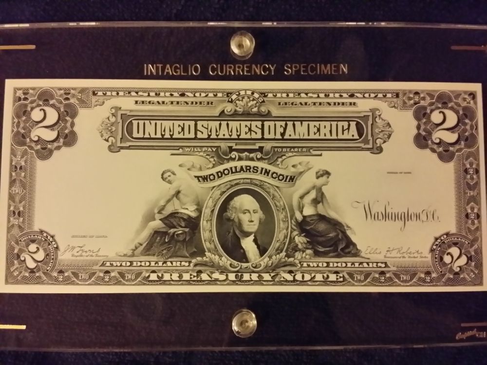 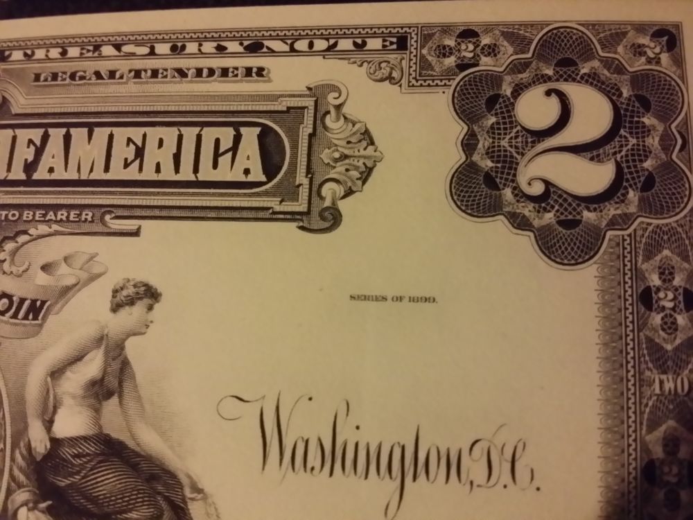  Edited by Scottlocklear
05/31/2016 01:33 am
|
|
Pillar of the Community
United States
1068 Posts |
Looks like a replica to me since there is no serial numbers attached to it...
|
|
Pillar of the Community
United States
4409 Posts |
|
|
Pillar of the Community
Germany
645 Posts |
|
| |
Replies: 16 / Views: 6,267 |


