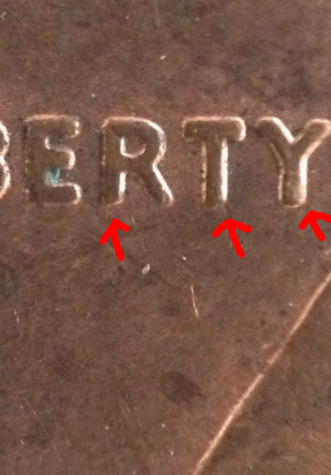
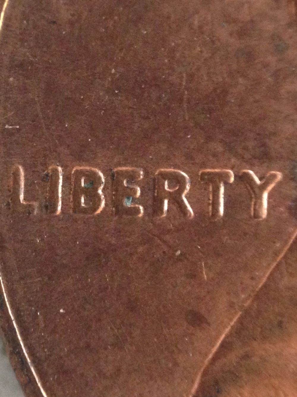
Just found this. Note the distortion on the serif of R closer to the rim. Also note the notch on T and the slight distortion of y. Let me know If you think I should shoot John Wexler an email. I already have a shipment sent out so I'd have to wait to send it out. Any opinions would be greatly appreciated.