


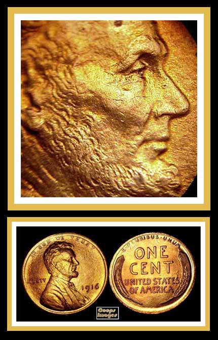


The strike on your 1916 is gorgeous as far as the design details on the bust. It looks practically PL when it's magnified as it is. Even so, I can see the L in LIBERTY creeping up the rim, starting to show die age.
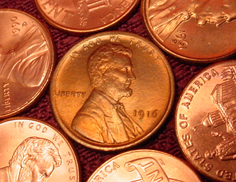
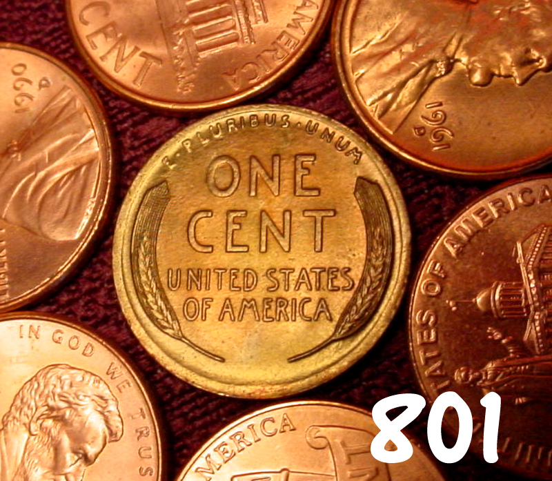
As far as the 1916-D that I posted, I've never seen flow lines so distinct and widespread. Even the field below CENT toward 6:00 there are flow marks.
Is 1916 the year the mint did some work to upgrade the design or was it in '16 that they acknowledged restoration was in order? I need to dig into Wexler & Flynn to educate myself, but looking at real coins is so much more fun!
Edited by Biedercoins
10/29/2016 07:00 am
10/29/2016 07:00 am


