| Author |
 Replies: 20 / Views: 4,263 Replies: 20 / Views: 4,263 |
|
Pillar of the Community
United States
2221 Posts |
It seems to me that when the Sac dollar was first minted, the mint was interested in appeasing coin collectors who were in love with the "classic" style of design (say pre-1900). The eagle reverse is in a classic style and is vaguely reminiscent of the Flying Eagle cent obverse. 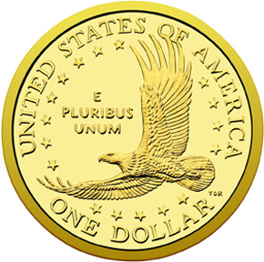  Then in 2009, they removed the date from the reverse and put it on the edge. This created a cameo effect, reminiscent of the 1837 Half Dime. 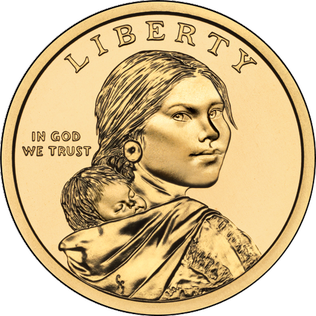  Putting the date and motto on the edge was also reminiscent of the 1794 large cent, which also had lettering on the edge. 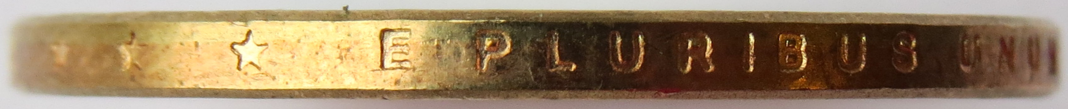  What do you think? Do you think the mint did these things with collectors in mind? |
|
|
|
Pillar of the Community
 United States
4605 Posts |
No
-----Burton 50+ year / Life / Emeritus ANA member (joined 12/1/1973) Life member: Numismatics International, CONECA Member: TNA, FtWCC, NETCC, EveryCountry (online) coin club Owned by three cats and a wife of 40+ years (joined 1983) Author: 3rd Edition of the Sample Slabs book, https://www.sampleslabs.info/ |
|
Pillar of the Community
United States
3483 Posts |
 with BStrauss3 |
|
Moderator
 United States
190660 Posts |
The eagle, maybe. The edge lettering was done to match the Presidential dollar series. A huge mistake, in my opinion, and one that actually works against the collectors who use albums. |
|
Bedrock of the Community
United States
94367 Posts |
Sorry, don't make a strong connection.
|
|
Pillar of the Community
United States
4870 Posts |
The edge lettering was the biggest blunder ever. This is why I don't collect dollars.
|
|
Bedrock of the Community
United States
94367 Posts |
The Sac alloy tarnishes very quickly, especially if not in circulation, leaving a most unattractive appearance compared to its original impression.
|
|
Pillar of the Community
 United States
2221 Posts |
So what was the official reason for putting the date on the edge? It sounds like a really bizarre thing to do.
|
|
Pillar of the Community
United States
4870 Posts |
I'm not quite sure. But I can tell you there was plenty of room on the obverse for the date and MM.
|
|
Bedrock of the Community
Australia
21788 Posts |
Very obviously American, I don't think a man in the street in another Country to America would have much trouble in identifying it as American. Classic American? No. Classic American to me means NEO Classic American where the design has been inspired the best traditions of the high period in ancient Greek Art. The best examples of NEO Classic American numismatic art are: 1. the gold Pan Pac $50 Half Union 2. the silver Weinman Half Dollar 3. the St Gaudens $20 Double Eagle. 4. the Liberty Seated dollar, and 5. the Trade dollar are honorable mentions. BOTH the obverse AND the reverse of the top three above carry design examples of Neo Classic American art inspired by the ancient Greeks. The last two could derive some of their design inspiration from Roman Imperial coinage, and Roman Colonial coinage, as well as from classic Greek coinage. |
|
Bedrock of the Community
United States
12870 Posts |
I am not a fan at all of the edge-incused dates and MMs. Maybe the IGWT motto or something else, but as jbuck said, it is a nightmare for collectors who use albums.
|
|
Pillar of the Community
Russian Federation
5181 Posts |
Quote:
I am not a fan at all of the edge-incused dates and MMs. Maybe the IGWT motto or something else, but as jbuck said, it is a nightmare for collectors who use albums. - and even for classic coins it's often a pain working out the edge variety, because it so easily wears (and/or corrodes) away. |
|
Pillar of the Community
United States
2221 Posts |
Original post update: The Sac eagle and the Flying Eagle really don't resemble each other at all. I was just trying to find an example of an eagle from the "classic" period of US coins, and the FE was the only one with its wings outstretched. But I still do think that the Sac reverse was patterned after the classic designs of the 19th century. |
|
Pillar of the Community
United States
2221 Posts |
I just read the official mint explanation for removing the date and motto from the obverse/reverse faces of the coin and putting them on the edge: It gave the artists more room for their designs.
|
|
Pillar of the Community
United States
4870 Posts |
That same space where the date/mm were on the Sacs are still there. Same design so no good reason to remove it.
|
|
Moderator
United States
190660 Posts |
Quote:
I just read the official mint explanation for removing the date and motto from the obverse/reverse faces of the coin and putting them on the edge: It gave the artists more room for their designs. That makes sense for the Native American dollars reverse, but no reason to move the date. For the presidential series, the term information takes up a lot of room, so the date had to be moved. |
| |
Replies: 20 / Views: 4,263 |


