| Author |
 Replies: 22 / Views: 4,368 Replies: 22 / Views: 4,368 |
|
Valued Member
Australia
110 Posts |
   *** Moved by Staff to a more appropriate forum. *** *** Moved by Staff to a more appropriate forum. ***
|
|
|
|
Valued Member
United States
275 Posts |
I say fake. The stars don't look right to me.
|
|
Valued Member
 Australia
110 Posts |
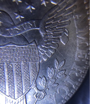
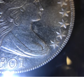
This is the back of coin  |
|
Bedrock of the Community
Australia
21788 Posts |
You would normally expect that this type if found in the wild, to be fake. How did you acquire it?
Provable provenance is essential with a coin like this, not just heresay.
Unfortunately, I can't pick it from pictures alone, I don't have the die variety knowledge of these to express a valued opinion in this regard.
"Stars don't look right to me" - I don't have this sort of knowledge with this series.
Since this coin could have great value, I would have it XRF tested and accurately weighed.
Getting it graded would help. So would the slabbing, for protection. Keep all documentation for this - that would help support provenance.
|
|
Pillar of the Community
United States
3479 Posts |
The stars on the obverse are WAY off and Liberty's face looks like she underwent some plastic surgery. Fake and an easy one to spot out.
|
|
Valued Member
Australia
110 Posts |
I bought from an auction.
It is not magnetic
Weighs 26.66 (mine may be out a bit)
|
|
Bedrock of the Community
United States
12057 Posts |
A fake, for certain, but perhaps one intended as a collector's restrike rather than a cheap mass-market fake.
Member ANA - EAC - TNA - SSDC - CCT #890 "Most of the things worth doing in the world had been declared impossible before they were done." -- Louis D. Brandeis |
|
Pillar of the Community
United States
887 Posts |
In comparing your coin (obv only, as rev photo is too small) to those shown on PCGS, yours doesn't match up in my opinion. Weight is good (26.66 vs 27.00), but that's about it.
As already stated, the stars don't look right. To me, they look 'modern', and too perfect. Liberty's face also looks off to me, especially the crease that runs from her nose and down past the lips. In her hair, the topmost left curl, just below the 'B' is too long. I think the bottom left star (4:30ish) is too close to her bust. The hair ribbon tail seems to point to the wrong area compared to those on PCGS. Hair detail and actually the hair style/design doesn't look right either. Lowest hair curl is lacking detail. I could go on the longer I look & compare.
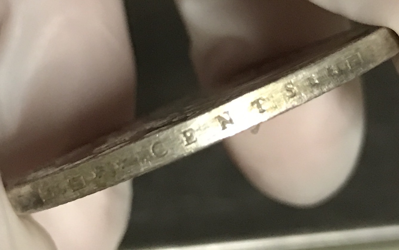
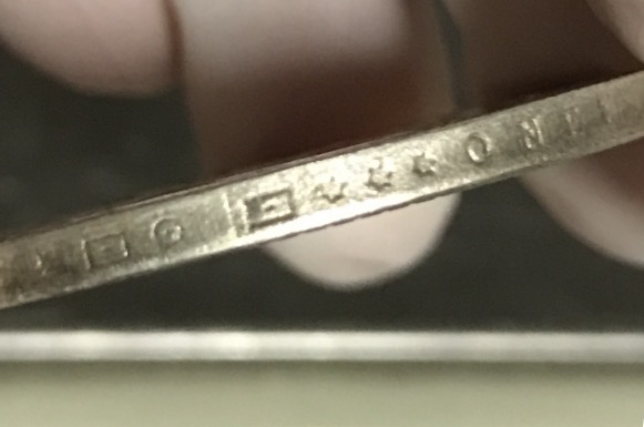
But the biggest thing to me is the edge. It just looks too good. I have no clue what you paid for it, but it looks like a $10k (US) coin.
I would really like to see a better reverse picture.
|
|
Pillar of the Community
861 Posts |
COUNTERFEIT......The font used on "Liberty" is not even close to what was used on real bust dollars.
|
|
Pillar of the Community
Germany
1849 Posts |
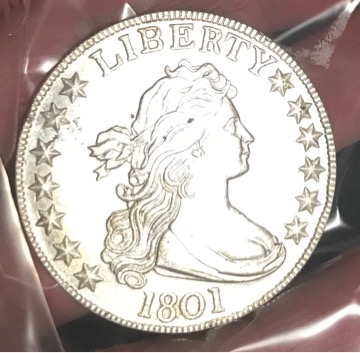
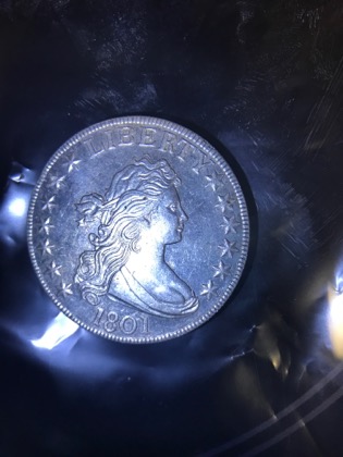
I agree - not genuine. Here for comparison my genuine (but cleaned) 1801:   |
|
Pillar of the Community
United States
3343 Posts |
The stars, dentils, toning and roundness make me suspicious that it is a fake. Overall it looks too perfect.
"Two minutes ago I would have sold my chances for a tired dime." Fred Astaire
Edited by thq
07/25/2017 08:16 am
|
|
Valued Member
Australia
110 Posts |
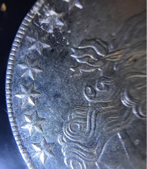
Thankyou for all opinions greatly appreciated  I bought this for just over $200 I thought... well I'm willing to lose $200 if counterfeit as still very nice coin and if it were real it's not a real waste of money, just took a chance I suppose. I will upload more close up pics that I took with magnifier to show you how detailed this coin is.  |
|
Valued Member
Australia
110 Posts |
|
|
Pillar of the Community
United States
4469 Posts |
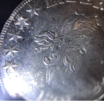
The alignment of the letters in LIBERTY is way off in this counterfeit.
|
|
Valued Member
Australia
110 Posts |
|
|
Valued Member
Australia
110 Posts |
|
| |
Replies: 22 / Views: 4,368 |