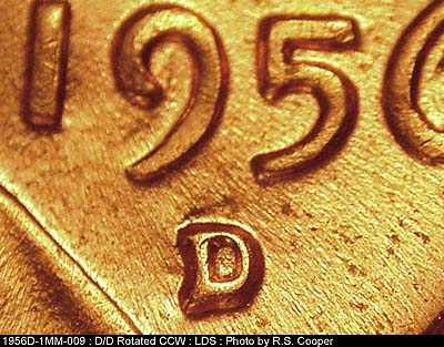
Looks like a normal mintmark to me. I'm not seeing a second punching. Looks more like a contact mark on the lower serif. Note how that area looks pushed. A split serif should be raised on each punch. Note on this rotated RPM how the shape is raised on both areas:
Edited by coop
09/17/2022 11:02 am


