| Author |
 Replies: 9 / Views: 1,086 Replies: 9 / Views: 1,086 |
|
|
Pillar of the Community
United States
808 Posts |
I was looking for the DDR-001 for this 2003 D but this coin just did not meet the markers, however it's a real looker! I think it is at least a AU-58. What do you guys think? let me know your thoughts. Regards all.   |
|
|
|
Pillar of the Community
United States
3207 Posts |
there's something uncommon about your lighting, camera, or digital processing because this looks to have unnatural surfaces, almost antiqued, which makes it tough to compare with normal cents for grading purposes
I don't see many hits or dings, suggesting the coin is high grade, but the color and contrast are distracting
|
|
Bedrock of the Community
United States
19948 Posts |
Appears to have seen circulation. AU-55/58
Lincoln Cent Lover!VERDI-CARE INVENTOR https://verdi.care/
|
|
Bedrock of the Community
United States
19150 Posts |
|
|
Bedrock of the Community
United States
36744 Posts |
I think the photos are making it look circulated.
|
|
Pillar of the Community
 United States
808 Posts |
Ok I am not processing the information. I reduce the lighting to prevent glare! The coin is highly reflective and brass colored. I use Picasa which is a Google product. It stores the picture in a JPEG foremat and I run the option to compress the data so the rate of the data is acceptable to coin community website! All my coins I show are circulated. All are bank derived, I don't spend money to buy coins because I cant afford to!
|
|
Pillar of the Community
United States
3207 Posts |
this cent reminds me of a beverage coaster a friend had, a fake, large Lincoln Cent antiqued and overly polished do the coins actually resemble the photos you post? most of your coin photos look like the contrast has been turned way up, or been processed through an "eye candy" type of reflection enhancer if I take this cent photo, and use my photo editor's automated tool to reduce the contrast, and I invoke it twice, then to me your coin starts looking more like the typical Zincoln cent in hand anyhow, this is meant as constructive feedback so that future photos look more natural which in turn will help us more accurately grade your coins |
|
Bedrock of the Community
 United States
18662 Posts |
i have seen a lot of zinc coins that the photos look like this. it must be due to lighting and the coin composition. the sharpness of the coin is good try looking for an area that has less light and definitely no overhead lighting. a window sill on a cloudy day seems to work well. you could also try adjusting the lighting on the photo before uploading heres my best shot of adjusting the lighting. looks like an high AU coin 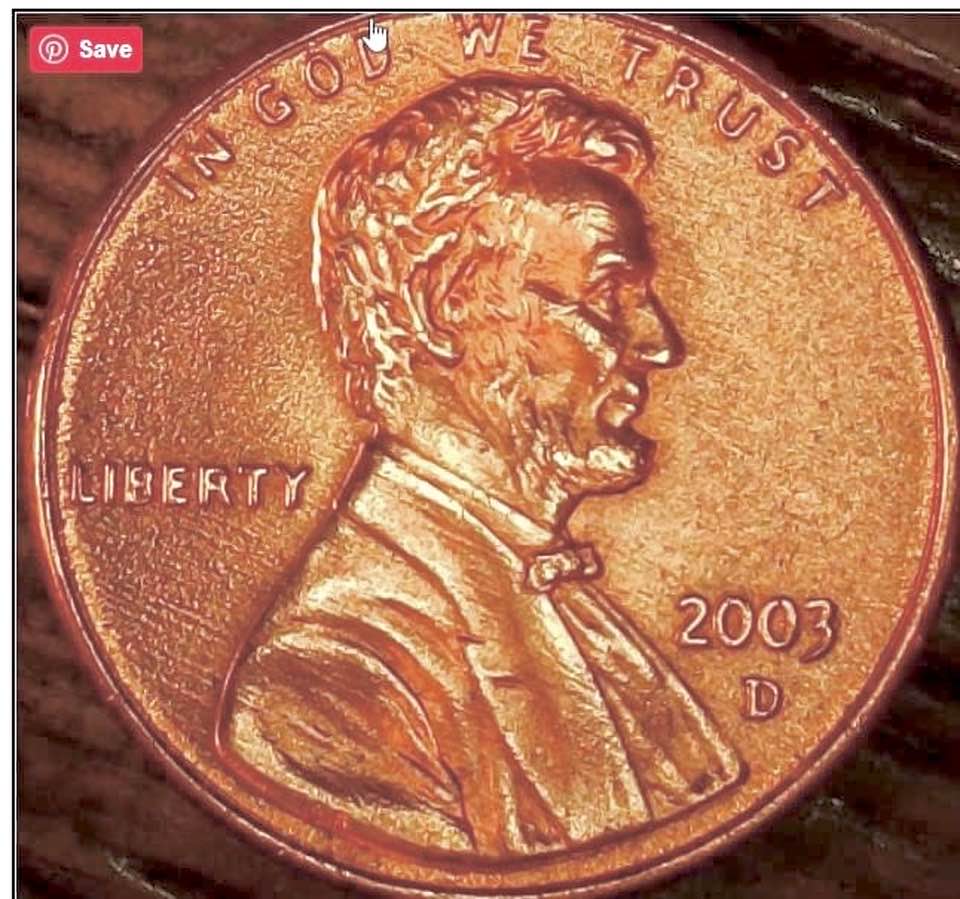 |
|
Pillar of the Community
United States
808 Posts |
here is a test shot of the obverse of this coin. I reduced the light and refocus the image!  |
|
Pillar of the Community
United States
3207 Posts |
I'm trying to put into words why these images are tough to grade. The high areas such as on the hair, cheekbone, side of the chin, edges of the coat, and elsewhere are such a consistently bright yellow they tell me they've been worn down into flat spots, but the rest of the coin does not appear to have so much wear. That visual conflict leaves me unable to decide if this is a mint state coin.
|
| |
Replies: 9 / Views: 1,086 |
|


