| Author |
 Replies: 30 / Views: 1,688 Replies: 30 / Views: 1,688 |
|
New Member
United States
30 Posts |
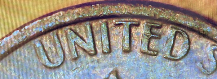
Hi I have a question about a 1978 LMC that has a reverse that doesn't look like the usual reverse I have seen on the 1978 or other late 1970's LMC's. It does, however, seem to be more similar to the reverse of a proof 1978-s. The lettering on this reverse is thinner and has more spacing between the letter's. It seems very different from the regular strike 1978. I've done a little searching online and haven't found anything regarding different reverse design varieties for the late 1970's LMC's. I am aware of the Close AM's of the 1992 LMC's and Wide AM's for 93-08. However, I haven't found anything regarding similar error's in the late 1970's LMC's. Are there any reverse design variety errors among the late 1970's LMC's? The coin that I'm curious about is on the left in my pictures with a comparison 1978 on the right. Thanks for your help! 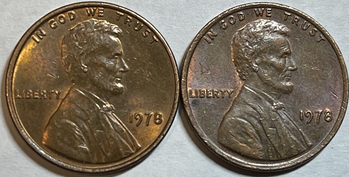 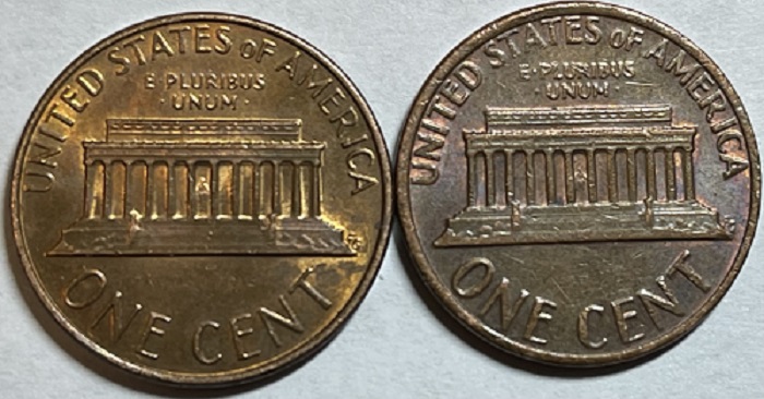  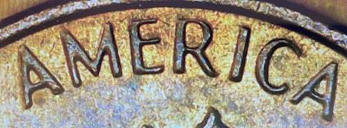 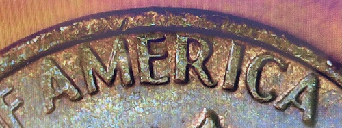 Edited by AF1996
05/21/2023 4:50 pm
|
|
|
|
Moderator
 United States
96124 Posts |
Yep, I see what you are pointing out, the letters on one of these cents are fatter than the other. I'm not sure if this is a variety or not. But Wide AM's are normal for this year. There are a few cent experts here that can better answer your question. |
|
Pillar of the Community
 United States
8751 Posts |
I can't really tell from the pics but would say it is due to a lightly Grease Filled Die or even more likely, an abraded die, where the letters are polished down some. -makecents-
|
|
New Member
 United States
30 Posts |
Hey here are some additional pictures. I compared this reverse to other late 1970's LMC's on PCGS website and the reverse seems to be more similar to a 1978 proof LMC. Thanks for taking a look! 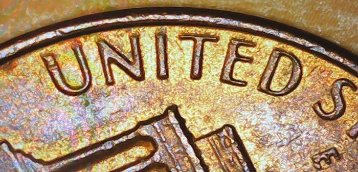 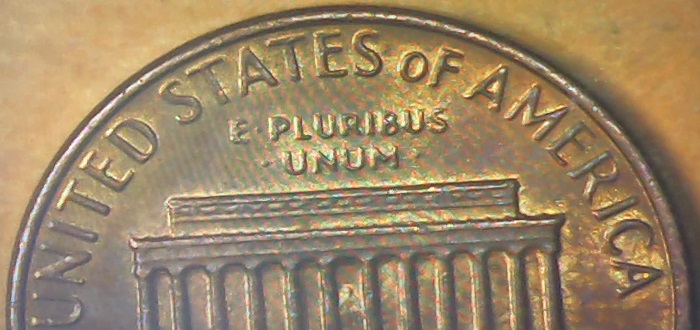  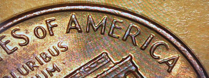 |
|
Pillar of the Community
United States
8751 Posts |
Thanks for the extra pics. I stand by my first assessment and you new pics show a couple of nice finger prints.
-makecents-
|
|
New Member
United States
30 Posts |
|
|
Moderator
United States
96124 Posts |
I have to agree that the spacing is closer, Especially seeing the newer images. It looks to me as a thicker font was used.
Edited by Dearborn
05/21/2023 9:43 pm
|
|
Pillar of the Community
United States
5239 Posts |
It appears the reverse with the thinner devices have come about by over polishing.
|
|
New Member
United States
30 Posts |
It is the reverse with the thinner and greater spaced letters that I'm interested in. I included a picture of the reverse for the 1978-S proof coin. This picture is from PCGS.com. When comparing the reverse's it seems similar to the Proof coin. I agree the letters are thinner but they seem spaced out quite a bit more then a regular strike coin. 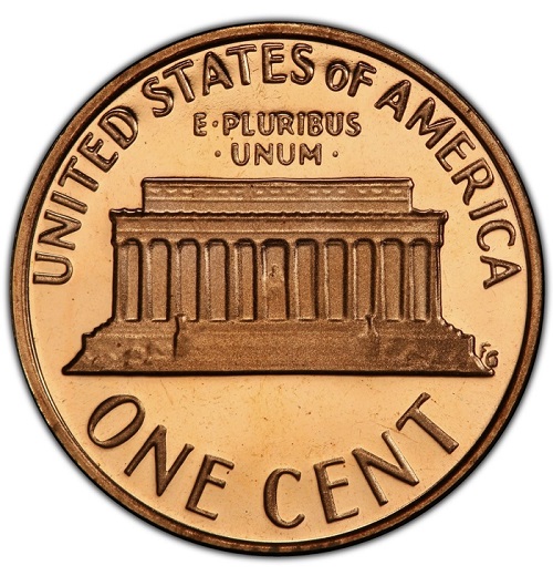 |
|
Pillar of the Community
United States
8751 Posts |
You apparently are not understanding. When the letters are abraded and made thinner, the spacing becomes greater. Not a different font, not a different reverse.
-makecents-
Edited by -makecents-
05/21/2023 8:51 pm
|
|
Pillar of the Community
United States
2376 Posts |
The thinner letters example was caused by die abrasion. I did an overlay of your example photos. The thinner version over a thicker. One photo is an exact overlay and the other is with the photos offset. As you can see there is no spacing difference, only a difference of thickness cause by die abrasion.   |
|
Bedrock of the Community
United States
62064 Posts |
Die polishing reduces the size. How? The die has the opposite appearance than the coin. What? Everything raised on the coins will show on the die as deeper into the dies.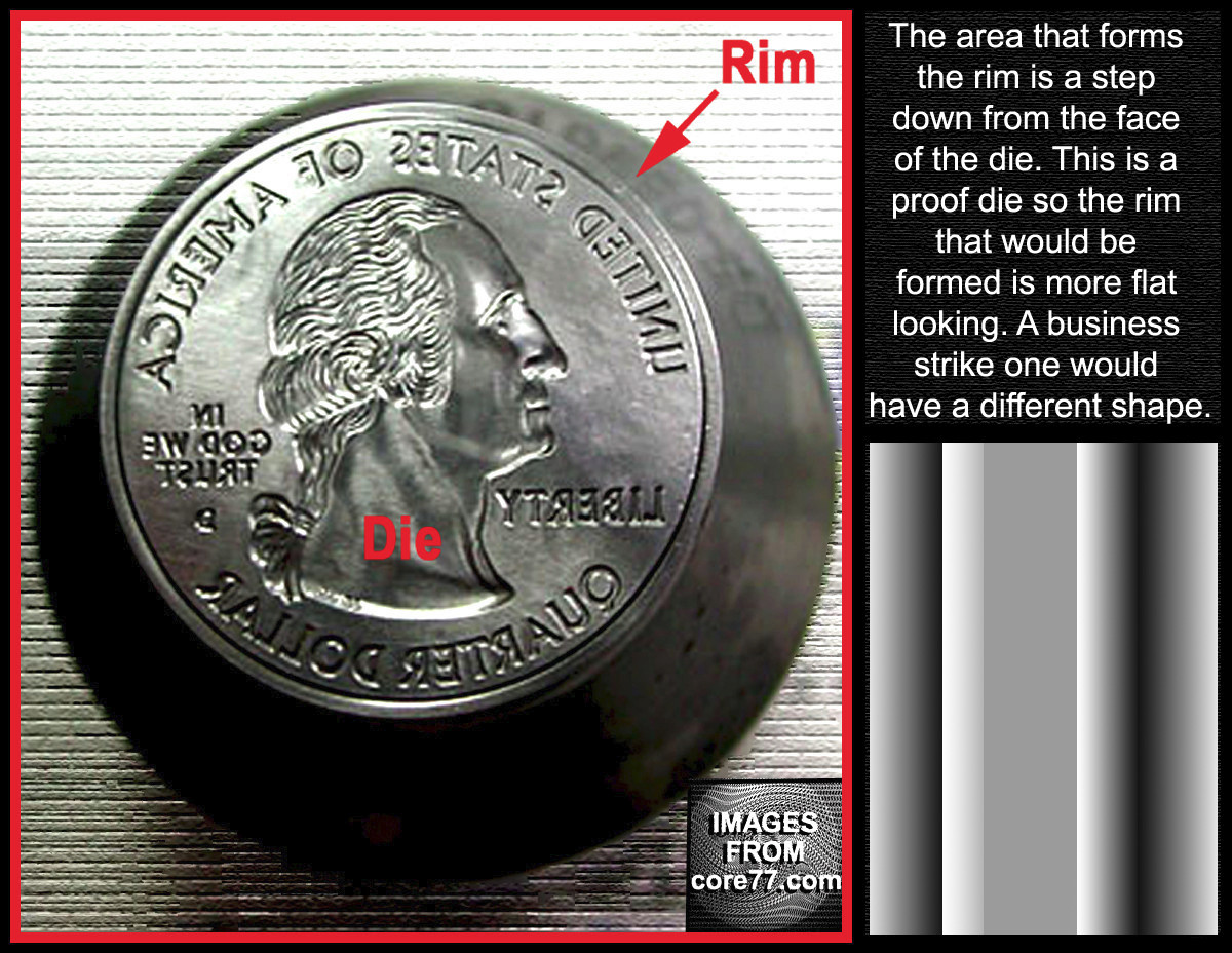  Besides being mirrored the fields are the outside edge of the die. The devices are deeper into the die. The taller the device is on the coin, the deeper the devices will be into the die. Note the outer edge of the die has a gutter? That is what helps for the rim on the coins outer edge of the design, protecting the devices on the coin. When a die is polished, what is affected first? The fields. These are often altered first on the die. The later die wear will affect the incuse devices on the die. But when a die is polished, the devices bases are the widest/tallest parts of the design. When the polishing happens, the bases of the devices will be reduced in size, making the devices shorter and thinner as the die gets the fields polished more and more times. Why are the devices tapered? If they weren't the coins would strike to the dies post strike. So the tapering of the coins prevents them from being stuck on to the dies. What is why the devices will be reduced in size as the fields are polished away. On a doubled die, the devices are enlarged on the die because of the hub creation on the die. Thus looking for enlarged devices is what to look for. Reduced devices are just a normal die that was over polished. Hope this helps? CoopHome: Why are some devices reduced in size on the coins?
Edited by coop
05/22/2023 1:12 pm
|
|
Pillar of the Community
United States
7174 Posts |
Just the difference between old dies and new dies.
|
|
New Member
United States
30 Posts |
Thanks everyone for the help! That reverse looked very different from other late 70's LMC's, however, I see now how over polishing a die can change the appearance of the devices. Thanks again! |
|
Moderator
United States
96124 Posts |
Quote:
You apparently are not understanding. When the letters are abraded and made thinner, the spacing becomes greater. Not a different font, not a different reverse. Apparently not - it would seem that I was looking at it 'backwards' (if that makes sense) Thanks for the clarity. You Da Best Jon! Edited by Dearborn
05/22/2023 8:46 pm
|
|
Valued Member
Canada
333 Posts |
Very interesting! The pros never cease to amaze me! Thanks!
|
| |
Replies: 30 / Views: 1,688 |