| Author |
 Replies: 20 / Views: 2,316 Replies: 20 / Views: 2,316 |
|
Pillar of the Community
Canada
1226 Posts |
I was going to put this coin in the grading section but I don't think it's a good candidate for an accurate grade from these pictures. I decided to put it here and just ask of your opinions. Is this coin ugly or do you find it attractive? If you wish to share your opinion on grade please feel free to comment. Cheer's Bill   |
|
|
|
Bedrock of the Community
United Kingdom
18069 Posts |
I personally don't like that kind of toning but it may be a British thing - UK collectors don't go as crazy over toning (or minor varieties and errors) as US collectors!
|
|
Moderator
 United States
56855 Posts |
WADR,  . Kinda looks like a fingerprint on the horse side? I just checked the bay for comparisons and the horse is facing right? John1  |
|
Pillar of the Community
 Canada
5606 Posts |
Double ugly, as are the fingerprints
|
|
Valued Member
United States
244 Posts |
I like it. It appears to have a purplish-brown toning to it but I can't really tell for the photos.
|
|
Pillar of the Community
Canada
9877 Posts |
Almost nice.
The fingerprint spoils it.
"Dipping" is not considered cleaning...
-from PCGS website
|
|
Bedrock of the Community
United States
36916 Posts |
Dark toning hurts the eye appeal in my opinion. Rainbow and bulls eye are much more appealing.
Edited by IndianGoldEagle
03/24/2024 12:02 pm
|
|
New Member
Canada
13 Posts |
I enjoy toning, I feel the way to make metal worth more than its weight is to make it a piece of art, to make art worth more it just needs to be a one of a kind and toning does that to coins. IMO
As for this specific coin, I don't mind the toning but the finger print kind of ruins the over all experience
|
|
Pillar of the Community
Canada
9260 Posts |
No I don't like that kind of toning.
|
|
Pillar of the Community
Canada
1780 Posts |
 As well, the finger prints are a spoiler.  I have a couple of 1973 dollars that are toned, due mostly to the RCM double dollar packaging. (certainly ruined the specimen cents) Edited by Sharks
03/24/2024 1:58 pm
|
|
Pillar of the Community
Canada
1505 Posts |
Depends on the toning. There is attractive toning that enhances the coin and toning that detracts. I suspect this one looks much nicer in hand than the pics show. Assuming nice redish/blueish/purplish colors, which is common in coins from those cases.
|
|
Bedrock of the Community
United States
10601 Posts |
Quote:
Is this coin ugly Yes.........Ugly, Dark, Fingerprint! |
|
Bedrock of the Community
United States
10601 Posts |
Quote:
I just checked the bay for comparisons and the horse is facing right? The horse is facing left........... 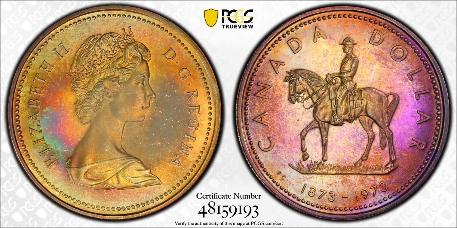 |
|
Bedrock of the Community
United States
94367 Posts |
|
|
Pillar of the Community
United States
2703 Posts |
It's a beautiful piece with a lot of character.
I would soak it in verdecare for about 12 hours to lighten it up ever so slightly.
AU-53
|
|
Moderator
United States
56855 Posts |
The OPs' coin is facing left, the ones on the bay are facing right and the date is in a different spot as well.There must be different varieties. John1 |
| |
Replies: 20 / Views: 2,316 |


