| Author |
 Replies: 27 / Views: 1,586 Replies: 27 / Views: 1,586 |
|
Pillar of the Community
United States
1770 Posts |
gigi2110
|
|
|
|
Pillar of the Community
United States
4135 Posts |
Good eye to spot that one. I am not familiar with it and probably would have missed it.
|
|
Pillar of the Community
 United States
8855 Posts |
Nice find! I remember when Bob found this one. We were all scouring 2016's, trying to be the first to find a DDR, Bob won.  -makecents-
|
|
Pillar of the Community
 United States
1770 Posts |
Thank you oddguy and makecents!! oddguy, everytime I am hunting penny, I alway look at the date, Liberty and initials design for doubling in the Lincoln Shield, you never know what you can find.  makecents, I can't imagine how much fun that must have been, I would have liked to participate in it but I guess I wasn't into the hobby back then  gigi2110
|
|
Pillar of the Community
United States
6650 Posts |
Wow, those are some distorted letters. Neat find. =)
|
|
Bedrock of the Community
United States
94367 Posts |
|
|
Pillar of the Community
United States
1770 Posts |
Thank you Brandmeister, and Coinfrog!!  Im trying to find another one of this and one of the WDDR-002 but not luck yet  gigi2110
|
|
Pillar of the Community
United States
2877 Posts |
That's a good one, nice find. |
|
Pillar of the Community
United States
1770 Posts |
Thank you coin rejector!! gigi2110
|
|
Pillar of the Community
United States
782 Posts |
Great find! |
|
Pillar of the Community
United States
3535 Posts |
Nice One! Note the elongated features! RobO411 was just asking about his 2022-D that he thought could be a DDR on the initials. |
|
Bedrock of the Community
United States
75855 Posts |
Great find!  Errers and Varietys.
|
|
Pillar of the Community
United States
8855 Posts |
I've tried to show this a few times to explain the difference between the DDR's and normal coins with these shields. Where it's a different type of doubling (Class 9), it's not what we are used to seeing with other types of doubling, where you have separation and possibly notching. Look at gigi's find and notice how the vertical is thicker and the horizontal is thinner, this creates a distortion of sorts. Now if you look at Rob's example and the normal example, you will see that it is consistent in all directions, no distortion. That is why I think that Rob's is just from deterioration, also, I have noticed that the Denver coins have a thicker font to begin with. See what you think about the pics below. 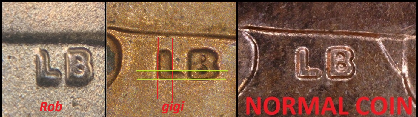 -makecents-
|
|
Pillar of the Community
United States
3535 Posts |
I agee 100% MakeCents, I'm hoping Rob sees this post!
|
|
Pillar of the Community
United States
8855 Posts |
|
|
Moderator
 United States
100060 Posts |
very nice DDR Gigi! cool find! |
| |
Replies: 27 / Views: 1,586 |


