| Author |
 Replies: 15 / Views: 2,156 Replies: 15 / Views: 2,156 |
|
|
Bedrock of the Community
United States
14454 Posts |
|
|
|
|
Bedrock of the Community
United States
10038 Posts |
Aesthetically I like the top one first. The higher contrast seems to make the details stand out more. I also like the silver-white look of the third. If I were grading it, I am not sure which one I would vote for b/c I am not used to grading coins with the contemporary system.  |
|
Valued Member
United States
91 Posts |
I guess I 'like' the first one best, but they all have a color balance problem.
Alan
|
|
Bedrock of the Community
 United States
14454 Posts |
the white looks white to me, what part looks to have color balance problems?
|
|
Valued Member
United States
380 Posts |
I like the first one, but I think its because it's in focus.
I would repeat the same test and not move anything except for the ISO... and of course shutter speed or aperture to adjust for exposure.
You should find that your lowest ISO will be the best. Sometimes the lowest isn't the best though.
|
|
Bedrock of the Community
United States
14454 Posts |
the lowest is what everyone seems to like best. I know when I max out the ISO at 3200 you can not see the coin at all, it looks just like a white sheet of paper and nothing on it
|
|
Pillar of the Community
United States
509 Posts |
I also thought the first foto was the best. Here's what has worked best for me with PL coins using my own Canon Rebel -- Aperture f/5.6, Exposure 1/320, ISO 200 at 55mm. Of course the lighting is a critical variant to any setting; type of lighting, intensity and positions. I was using 2 compact flourescent goosenecks with the above settings. Less lighting would probably mean you need a higher ISO or longer exposure time. Just some thoughts from my limited experience. I'm still playing with it just like you. I've even found I need to change my settings when changing from shooting from the obv to the rev in some cases due to the coin's different surfaces, reflectivity and toning.
|
|
Pillar of the Community
Canada
4227 Posts |
|
|
Bedrock of the Community
United States
14454 Posts |
this is pictures taken with sidekick's settings (only with 50mm lens)   |
|
Pillar of the Community
United States
509 Posts |
Exposure and detail look pretty good. Color seems off (lotsta red). You may want to go through your manual white balance settings see what you can bring up.
|
|
Pillar of the Community
United States
1064 Posts |
I always ask "which one looks the most like what you're actually looking at, especially the coloring?"
|
|
Bedrock of the Community
United States
14454 Posts |
the toning on this coin around the edges does look the color the picture shows. The coin is labeled as a MS-63 DMPL "CAMEO" by ANACS. I think the last pictures are the closest yet without showing the mirrors on the coin
|
|
Bedrock of the Community
United States
14454 Posts |
this is one without toning   |
|
Pillar of the Community
United States
509 Posts |
Looks like there's no stopping you now. Hope you don't mind but ran your foto through Gimp with a quick white balancing act. Look closer to the actual coin or worse? BTW, did you ever get that Canon software working for your remote shooting?  |
|
Valued Member
United States
260 Posts |
Sidekick-CA very nice improvement.  Bryan1315 you certainly are improving. |
|
Bedrock of the Community
United States
14454 Posts |
this is pictures of the same coin with the same settings but with the new 100mm lens after a WB in Gimp, kind of looks to blue to me when I do a simple WB in Gimp 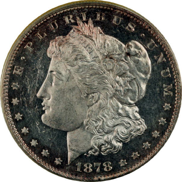 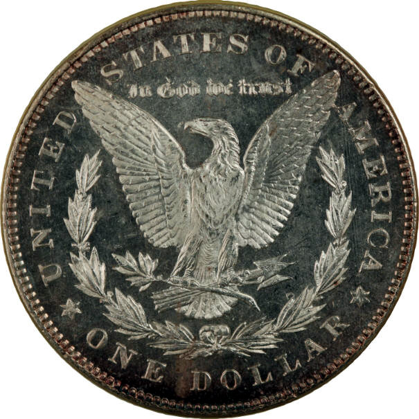 |
| |
Replies: 15 / Views: 2,156 |
|


