| Author |
 Replies: 140 / Views: 49,948 Replies: 140 / Views: 49,948 |
|
|
|
Pillar of the Community
  United States
4038 Posts |
With the good result that Sidekick-CA got with the aluminum reflector, I decided to put together a new setup including this as a core element. I took a piece of cardboard, and cut a notch in it to slip onto the lens mount on the bellows. I left the white side as-is, and taped aluminum foil to the brown side, so it is reversible depending on the need. Here's what the setup looks like: Front View showing reversible white/foil reflector/diffuser and the lights set up for diffuse illumination  View from below showing the foil side more clearly  I took photos of the '35 Merc with white reflector and foil reflector for comparison. Note that I included a lens hood for these photos since I ended up shining the light more directly at the lens than shown in the above photos: '35 Mercury dime with Foil Reflector/Diffuser  '35 Mercury dime with White Reflector/Diffuser  |
|
Pillar of the Community
United States
509 Posts |
That's a very well done reflector set up you have there. Impressive. Not like my tinker toy jury-rig set up  . I've been  trying to think of some material I might use other than the cardboard I have now that would be easily pliable (and something that would stay put) in order to make slight changes in the reflector angle for lighting variations. I can do it to some degree now but it's awkard and not always precise. To me it seems easier than moving the lights as their position is critical and it's easy to over adjust when trying to get just a very slight change. |
|
Moderator
United States
23522 Posts |
The foil reflector looks to have real promise. Not so sure I like the white - it diffuses the light a bit much.
|
|
Pillar of the Community
United States
4038 Posts |
What I don't like about the foil is that it reflects more than it diffuses. You can see this in the shadows, which are too pronounced around some features (especially the face) for my taste. My goal in illuminating a coin is to have all the features outlined enough with shadow to ensure you can see them, but not to lose definition. The diffuse white is great around the edges of the features, but loses some definition on flatter surfaces (see the front lip of the cap over forehead). It is probably just down to angles and distances in setup. In the end I agree that the foil reflector really looks best for its luster and surface color definition, so I'm going to play with it a bit more and see if I can generate some guidelines. This is my first attempt at imaging a Mercury dime and I'm finding it interesting how hard it is to illuminate the field above the cap! Contact me for photographic equipment or visit my home page at: http://macrocoins.com |
|
Pillar of the Community
United States
2424 Posts |
rpm,
thanks for tinkering with these setups. for people like myself who like to capture the cartwheel luster affect on highly lustrous coins, I find that the 2 LED lights, point source, capture the luster the best. the foil, and diffusers seem to capture other details of the coin which is good too.
if I use the two point source lights with a point n shoot camera, how would my setup look like? place the light sources at 11 and 4 oclock? or 10 and 2? pointing directly downward at the same distance as the camera is to the coin?
|
|
Pillar of the Community
United States
4038 Posts |
SDcoinguy...I almost always have best luck with two lights at 10:00 and 2:00, for most US coins. This illuminates the devices/features well and accentuates cartwheel luster well on both left and right fields. If you put the lights opposite each other, they would each illuminate "luster bars" on top and bottom of the coin, but since they are coming from opposite sides they diffuse that area and reduce contrast so that luster is reduced. For a very lustrous coin, it is sometimes better to use one or two diffuse lights to overall illuminate the coin, and then a pinpoint source to accentuate the luster where you want it to show. Figure that luster is accentuated in a line (the "luster bar") perpendicular to the direction the pinpoint light source is pointing. So if you shine a light from 6:00, you will accentuate a luster bar that goes from 3:00-9:00, though it will be interrupted by any devices or features on the coin. As for height of the sources, this is really experimental based on the type of light source and the style of presentation you are looking for. The lower the source(s), the "bigger" they look, ie they have a wider illumination angle vs the coin. So as you move the source closer to the coin, it will make a more diffuse looking illumination with less shadowing. Move the source farther from the coin, and it looks "smaller" and "pinpoint" so accentuates more luster and creates more shadowing. So height is something you will need to experiment with to get the "look" you want. Contact me for photographic equipment or visit my home page at: http://macrocoins.com |
|
Pillar of the Community
United States
4038 Posts |
Pics I show earlier in this thread with the Nikon 5X BD Plan used a Nikon 150mm EL-Nikkor as the relay lens for the objective. The 150mm EL-Nikkor is also a pretty good lens for coin photography IF you have a large copy stand and can work with the extra working distance, or if you are taking pics of larger items like mint medals or similar. I just noticed today one of these Nikkors for sale on ebay. It's not mine and I don't know the seller, but it's for sale for a VERY good price, and I don't need another one. It is item number 260810380743. If anyone here snags it, post results here! Edited by rmpsrpms
07/01/2011 09:47 am
|
|
Pillar of the Community
United States
4038 Posts |
By request, I took a photo of a British Sovereign reverse with my latest setup, using 2 LED direct lighting. It's the first gold coin I've taken a picture of for a long time (been focused on copper, and a little silver) and it imaged so easily! I think what's going on is there is no prominent face to deal with. Our brains are wired to focus on faces, and any small issues with lighting, shadows, etc show up much more prominently when a face is involved. Anyway, here is the result:  Contact me for photographic equipment or visit my home page at: http://macrocoins.comEdited by rmpsrpms
07/06/2011 01:13 am
|
|
Moderator
United States
23522 Posts |
Are you comfortable with the color? It seems, again, a little green.
|
|
Pillar of the Community
United States
4038 Posts |
SuperDave...You have a good eye for color. This sovereign is indeed green-toned! I have a preference for toned coins, and perhaps green ones more than any other color. Here is a later sovereign that is pretty much untoned gold color for comparison. Same white balance as the first one:  Contact me for photographic equipment or visit my home page at: http://macrocoins.com |
|
Pillar of the Community
United States
4038 Posts |
|
|
Moderator
United States
23522 Posts |
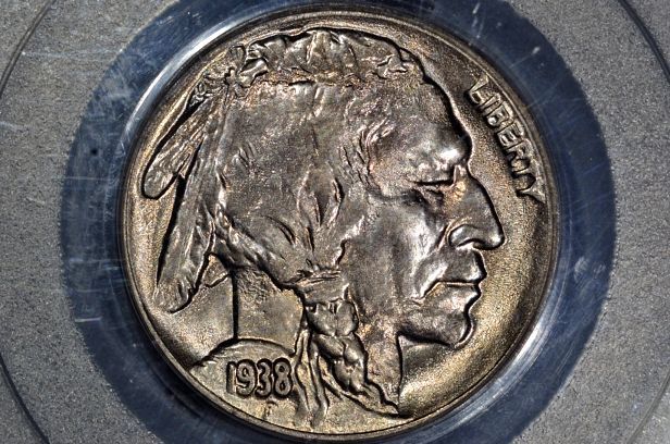
I stand reassured; the second Sovereign is proof positive that it is the coin and not the image. Perhaps a takeaway here regarding the baselining of coins presented for technology-related discussion.
As regards the Buffs, from a subjective, "this is what a coin should look like in a photo" perspective, I like the first image by a clear margin. From a grading standpoint, I believe the second photo is the most informative, with perhaps -0.5EV.
It illustrates the potentially-deceptive subtleties of coin photography. Especially considering I'm looking at these shots on my own monitor, calibrated perhaps differently than yours and known to be (deliberately) a little "colder" than the second monitor to my left.
Edit: On my "warm" monitor, no difference in opinion is noted, save that the coin is a little better-toned. How do you see its' color in-hand?
|
|
Pillar of the Community
United States
4038 Posts |
In-hand, with 6500k reference bulb, the color is just about right except that there is a tad bit more contrast between the pinkish tones in the recesses vs the bluish tones on top surfaces. I have my camera set up to shoot with no saturation or sharpening enhancement, so the colors don't always pop like they would if I was trying for a glamor shot.
Looking at the images in the post, the subjective differences seem relatively small. I was shocked by how different these images look when tabbing through them in an image browser. The shadows and highlights are in completely different places, so when you tab from one to the other your brain has a hard time processing the info (at least mine does...). My first impression is "that's 4 different coins!" yet looking at them all together it's easy to see they are the same coin.
Overall my preference is photo #2. I prefer its coloration, shadow detail, and contrast to the others. It still shows the luster but is not overly contrasty like #1
|
|
Moderator
United States
23522 Posts |
It could just be my own personal preference as opposed to the "popular" one, but it's that extra contrast which makes it subjectively "nice" to me.
Consider, though: I've been heart-and-soul into coin photography for six years now. That's included looking at the published work of anyone I could find who shoots coins, to get a feel for what's considered "right."
At no point during this time have I found an individual who is approaching the subject with anything near your degree of directed, structured research. You are refining the genre here. Although I'm three months from starting my walk down the same path, I'm already beyond excited by the possibilities.
|
|
Pillar of the Community
United States
4038 Posts |
SuperDave...thanks very much for the kind words. I have been working on trying to get the best images I can as a dedicated hobbyist for a while now, and with your comments I feel I am finally doing "Yeoman's work". However, I am still a neophyte when it comes to many aspects of coin photography such as getting excellent shots of proofs, intricacies of shooting different types of slabs, broad range of coin types, etc. This thread, and the questions that have come up that have pushed me to try new things, has been a catalyst for me to make progress and has also been a lot of fun!
I was a bit disappointed that Sidekick-CA gave up on the bellows route, and back to P&S land. Clearly the bellows setups can be superior by a wide margin to most any other approach, and I feel that I failed in helping him to get his setup working well. I'm 99% sure I could make it work if I had access to it, but the problem is likely something that I take for granted and wouldn't even think to discuss.
|
| |
Replies: 140 / Views: 49,948 |