| Author |
 Replies: 20 / Views: 4,352 Replies: 20 / Views: 4,352 |
|
Valued Member
Canada
293 Posts |
I've put together a coin display with an animal theme. I like most of it but I'm having trouble with the foam around the outside of the small coins. I tried black, but it make the whole thing look gloomy. Right now it has white, and I think it brings out the color in the coins, but it seems to give it a bit of a cheap look for the solid silver coins. I think it looks OK on the colored coins, so I may have to just get two more colored ones that will complete the set.
Please have a look and see if you could provide me with any suggestions on what to do with it.....thanks.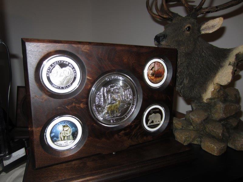  Edited by GaryN
01/03/2014 2:20 pm
|
|
|
|
Pillar of the Community
Canada
2124 Posts |
For me is just beautiful.
|
|
Valued Member
United States
331 Posts |
I like the white! It makes the presentation look clean.
|
|
Moderator
 United States
23522 Posts |
Quote:
I like the white! It makes the presentation look clean.
Agreed. You, as the builder, are seeing individual components since you put them there. I, as the viewer, am seeing appropriate whitespace to highlight what's inside. |
|
Bedrock of the Community
United States
20753 Posts |
I'm on the NOT white background suggestion. Completely distracts from the coins. All coins are bright and light enough to stand on their own for visuability. The white background distracts from the coins. Using a darker background makes the coins stand out more.
As an example of this notice the wood. The wood is very dark and this makes the coins stand out exceptionally. For some reason the white almost makes the coins look like lesser or not as the highlight of the display.
Why not compromise and attempt other colors such as Purple or even Goldish.
However, remember it is the coins you want noticed, not the background.
|
|
Pillar of the Community
United States
844 Posts |
I agree the white is too much. I was thinking with it being nature related, why not a light earth tone? Darker than white, but 4-5 shades lighter than the wood. Such as a light tan. I absolutely love the woodwork! Did you do that?  |
|
Moderator
United States
191130 Posts |
I see nothing wrong with the white. Cheap is the last thing I would call it.
By the way, I think black with the dark wood would swallow the coins.
|
|
Pillar of the Community
Canada
2784 Posts |
I really like it.
I think the white makes the smaller coins look bigger, or at least more in balanced in proportion to the larger center coin.
/agree dark ring would swallow the coins, the white is a stark contrast to the dark wood and draws you into the coins themselves.
|
|
Pillar of the Community
United States
1261 Posts |
Green like in the intercept shield albums
|
|
Pillar of the Community
United Kingdom
2905 Posts |
I was about to suggest green as well - as in the felt you get in coin trays.
|
|
Pillar of the Community
United States
3184 Posts |
I like it! How are you doing it?
|
|
Pillar of the Community
 United States
1896 Posts |
I'd replace the plain white with a darker color like mint green or royal blue. And if you want a regal look that would really enhance the beauty of the coins without overwhelming them, go with velvet fabric. Felt would be a cheaper substitute but lacks the 'royal' look. Nice display!
|
|
Valued Member
United States
408 Posts |
I think it is a very attractive display. The white does not make it look cheap! The white doesn't take away from the color of the coin. White 2 X 2 holders highlight coins and so do your inserts. Well done.
|
|
Pillar of the Community
United States
5216 Posts |
Not a fan of the white. What about airtites without the foam? IS that moose gold plated on the ATB 5oz? Say it isn't so. |
|
Pillar of the Community
United States
8524 Posts |
That's an elk.
Oregon coin geek.....*** GO BEAVS ! ! ! ***
|
|
Pillar of the Community
United States
5216 Posts |
Then I guess by a technicality the "Moose" isn't gold plated  |
| |
Replies: 20 / Views: 4,352 |


