| Author |
 Replies: 18 / Views: 3,332 Replies: 18 / Views: 3,332 |
|
Pillar of the Community
United States
4867 Posts |
Now that coloured circulating coinage has been around for a while, what are your thoughts about them? How well do the colours hold up? Do you like or dislike them?
|
|
|
|
Bedrock of the Community
United States
94367 Posts |
Wretched gimmicks aimed at the mass "collectibles" market.
|
|
Pillar of the Community
United States
840 Posts |
|
|
Valued Member
Canada
153 Posts |
Coloured Canadian coins are nice and last a long time. Eg. The 2011 coloured Canadian Parks quarters are still seen in circulation and have been holding up well.
|
|
Valued Member
Canada
153 Posts |
Edited by Wizard1
10/15/2016 7:54 pm
|
|
Bedrock of the Community
Canada
21603 Posts |
Not something I would collect.
Any I get in my change I give to my granddaughter
who collects coins.
|
|
Formerly nancyc
Australia
5385 Posts |
Quote:
Wretched gimmicks aimed at the mass "collectibles" market.  Just another form of 'Grannie Bait'. life is a mystery to be lived not a problem to be solved
|
|
Bedrock of the Community
Australia
21786 Posts |
I will collect one of each type found in circulation.
There are currently about 6 types of coloured $2 coins released into Australian circulation so far.
That's a good way of collecting commemorative coins at face value.
The colours should stand up well to circulation wear, because the colours are only in small incuse parts of each design type.
IF they are in wide circulation as the Australian $2 coloured commemorative coins are,
I do not consider them 'gimmicky'.
|
|
Valued Member
United States
408 Posts |
If you are into that kind of stuff, I say go ahead and buy it. Just do not pay a premium for it. It's not worth paying too much for.
I am a big American Silver Eagle fan, but I hate when people color them. It destroys a perfectly beautiful coin that did not need tampering with.
|
|
Pillar of the Community
Canada
3049 Posts |
I am a big fan of west coast / salish aboriginal art and I love the series they did with the quarters both with and without colour... I say what ever grabs the attention of youngsters and gets them to start collecting the better... and I can hardly call the coins that come from the RCM which are made for circulation as "granny bait" when they're obtained at face value... - the stuff the produce for the boutique (NCLT) that's a whole different ball of wax in my opinion |
|
Valued Member
Malaysia
121 Posts |
Hi, personally I would buy it if it is not only about the colour but also the high relief, new technology, items inserted... obviously I a talking about pure silver proof coins here... sorry if I was off topic here...
|
|
Valued Member
Canada
261 Posts |
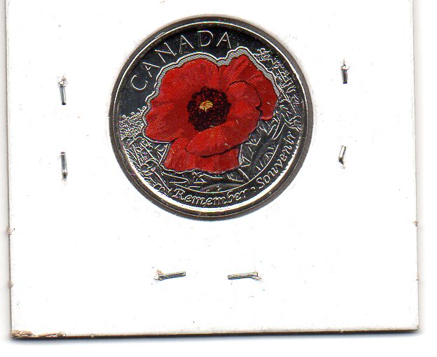
Other than the 2004 Poppy the colours hold up well.
At least they're something to look for in my change since ARP has pretty much destroyed that aspect of the hobby in Canada.
|
|
Valued Member
Canada
153 Posts |
Yeah I would only get them if it was an RCM exchange or from circulation |
|
Pillar of the Community
Canada
3692 Posts |
I would assume that the Americans here are referring to their own after-market colored coins, hence the gimmick comment. But the Canadian coins are done differently, from the mint itself. I personally keep them all as savings and put aside the MS ones.
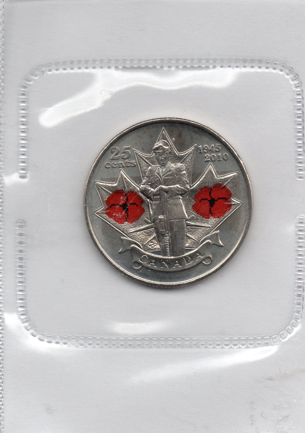
Ones I don't like: Breast Cancer coin (color fades quickly), 2010 Remembrance Day poppy (looks like a Peak Freans cookie or lipstick with digital lining). The 2008 Armistice coin was almost a pleasant coin but it fades quickly, the white background looks out of place, and the black lining again was too digital in appearance.
Ones I like: 2015 Canada flag coin - the only thing that saves this coin is the texture in the flag itself (the waviness). Actually, the non-colored version looks amazing, up there in my favorite modern Canadian coins along with the beautifully designed 2006 Bravery coin (Best coin since 1967 animal series). I also like the 2011 Inuit animal series - a nice break from the usual red that the mint botches routinely.
In all, I think the added color looks much too pixelated. The 2010 Poppy coin came close to an actual smooth color but the black lines messed it up. It's my opinion that Canadian modern quarters are much too "busy", with too much going on to be beautiful. The mint got carried away with showing themes that they neglected to appeal to the eye. Regular coinage (the reverse sides) looks well designed while the newer coins just lack eye appeal because they have spacing issues, they don't enough field, and just show too much detail and make one squint. They're getting better at it, but how long do we have to suffer looking at horrible coins year after year... It's exhausting.
|
|
Pillar of the Community
Canada
849 Posts |
Because I collect Canadian quarters by date, I have them in my collection. However, they are not my favourite and I could live without them. The 2015 poppy must have been popular though, because as I roll search, I see a fair number of the non coloured ones, but rarely find the coloured version.
|
|
Valued Member
Canada
228 Posts |
At first I wasn't a fan of circulation colourized coins. They've grown on me. I think it's a great way to get the kids into the hobby.
|
| |
Replies: 18 / Views: 3,332 |