| Author |
 Replies: 30 / Views: 4,537 Replies: 30 / Views: 4,537 |
|
Pillar of the Community
Canada
1733 Posts |
I flipped over a 2011 Twenty five cent piece today. I was dismayed by the quality of the piece, its plating, its strike and then finally I looked at Granny.
I absolutely hate that portrait of HRH. It's not regal, it's not a Queen, it looks like someone stuck a random senior citizen on the back of my coin. I do not find it befitting the Queen of Canada to look like someone on her way to shuffleboard.
I have complained, I have whined and I have female dogged to all parties involved with that image and yet it remains. I respect the artist for her work, but I intensely dislike her for putting this image forward.
Do you like the image? Do you dislike the image? Would you prefer another image? I would like to know others opinions on this matter.
|
|
|
|
Pillar of the Community
United States
1150 Posts |
Well...the queen was a senior citizen at one point and she may have actually played shuffleboard so no complaints here. ;)
Other than that I think this coin, as well as many others, would benefit from a higher relief. In my opinion a lot of lifeless and bland designs would really look great if in higher relief.
|
|
Pillar of the Community
3352 Posts |
Ugly => I totally agree with you ... Elizabeth first appeared on the 1935 $20 bill (77 years ago!), as Princess Elizabeth (classic, timeless portrait) Her next appearance was in 1953 when she became queen (59 years ago!) ... again, an all-time classic portrait! (devil's face) 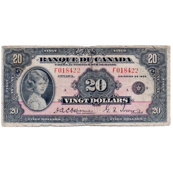 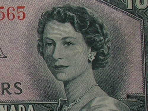 ... and sadly, I totally agree with you that the current portrait of Elizabeth is very unflattering and I'm amazed that it snuck-past the screening and made it into circulation! |
|
Pillar of the Community
Canada
849 Posts |
I love the portriat on the 1935 note, its by fair my favorite... Kinda wish I had one :).
|
|
Pillar of the Community
Canada
1554 Posts |
 Mr. Ugly, I surprised at you even taking the time at looking at the Modern day junk coinage. Stick to the "Classics"> 1858-1967 and you''l never be disappointed. You know the modern stuff is just for Grandma's lookin' for Birthday and Anniversary gift's for kids and ain't meant for real Collectors! Glenn  |
|
Pillar of the Community
Canada
902 Posts |
Some of that junk is worth more than your pre 1967
|
|
Bedrock of the Community
United States
10038 Posts |
Ugly - you hit it right on the nose! This actually is one of the reasons I stopped being serious about collecting modern Canadian coins! I liked the look of the REV, but when you flip the album page all you see is multiples of a poor effigy reminding me of any senior citizen you see on the street.  At LEAST they could have put a crown on her. I think this would have greatly improved the OBV b/c then HRH would appear royal as she deserves. BTW - I really like the new avatar - looked at these on the RCM website and wished I had the $$ for one - but I'd make sure it was always displayed with the REV showing  ! How much squash could a Sasquatch squash if a Sasquatch would squash squash? Download and read: Grading the graders Costly TPG ineptitude and No FG Kennedy halveshttps://ln5.sync.com/dl/7ca91bdd0/w...i3b-rbj9fir2 |
|
Pillar of the Community
 Canada
9865 Posts |
Least flattering portrait ever on canadian coins.So generic,who could have approved this?
|
|
Valued Member
Canada
278 Posts |
I agree completely. My personal fave is the 2002 50C effigy.
|
|
Pillar of the Community
 Canada
1733 Posts |
@Glenzy - it's not like I was packing it up in a flip as a proud display piece  @Steve, the 1935's were the best notes ever, I am finishing my French collection if I can. @mitch high relief is nearly impossible with plated coins as crappy as ours, the strike image has to be round and soft with gradually inclining surfaces. That's why there are so many plating errors on the letters of these junk coins. What started tonight's little round of disgust a few years ago is I had sent a silver maple and a set of circulating coins to a friend. She wrote she got the coins and loved the unique look, but who was that homeless person on the back. Now before I even thought I started typing out the explanation of Canada's Monarch. Then I stopped, because I realized she lives in Australia and she was of course pulling my leg. Homeless person. Thank you Ms. Blunt. |
|
Pillar of the Community
Canada
4227 Posts |
I agree... don't like it at all...
|
|
Moderator
 Canada
10460 Posts |
Kind of looks like Richard Nixon (or at least his sister) on the obverse of our coins... "Discovery follows discovery, each both raising and answering questions, each ending a long search, and each providing the new instruments for a new search." -- J. Robert OppenheimerContent of this post is licensed under a Creative Commons Attribution-NonCommercial 3.0 Unported License. See: http://creativecommons.org/licenses...0/deed.en_USMy eBay store
Edited by SPP-Ottawa
01/08/2012 11:21 pm
|
|
New Member
Canada
43 Posts |
I agree, there is nothing regal about the 2011 Queen; however, she does have a certain air to her. It is hard for me to explain appropriately.
Edited by Mrent
01/08/2012 11:48 pm
|
|
Pillar of the Community
Canada
535 Posts |
"the modern stuff is just for Grandma's lookin' for Birthday and Anniversary gift's for kids and ain't meant for real Collectors! "
The last time I checked I am not a Grandma but I collect modern coins. I also collect 20th , 19th, 18th century coins, just about everything. I guess by Glenzy's definition, I am not a real collector.
As to the original question. The Queen is a senior citizen so the portrait to me is ok. Artwork, be it on a coin or a painting on a wall is subjective.
|
|
Pillar of the Community
Canada
1051 Posts |
It's the least attractive portrait of the Queen, IMO. Since 1953, I find that each new portrait has been successively less attractive than the one that preceded it. Truth be told, I find the current one terrible to the point that I have basically zero interest in collecting anything from the current series.
|
|
Pillar of the Community
Australia
7096 Posts |
 with you Ugly, But she is an old lady now. Ultimately she would have approved this design, Just goes to show what an amazing unvain woman she is  The Queen is doing what I would imagine as a very stressful job and she has been doing it since 1953 or nearly 6 decades. So who gives a rat what she looks like in her later years, She looks what she looks like without all that plastic surgery crap a lot of people use in a vain effort to turn back the hands of time. In the mean time regardless of the portrait HRH Queen Elizabeth is one of the most widely recognised portrait in the world (regardless of her age. Cmmon Ugly I've seen your pic mate, you are as unlovely as me mate  . So don't pick on the designer, they can only portray what they see. Just wanted to put my 2 bobs worth in |
| |
Replies: 30 / Views: 4,537 |


