I know that some of you guys on here may or may not find these die pairs all that interesting, however for Canadian modern dimes all varieties have been hardly documented or even recognized for that matter. So I took it upon myself for the sake of the hobby to start piecing these varieties together into listings so that it gives collectors and roll hunters other things to look for.
I don't know about you guys, but for the Canadian Modern dimes, varieties don't seem to pop up all too often. These varieties shown below are included in my book (maybe not word for word) along with the images and information within this post are subject to Copywrite and are my intellectual property and must not be shared, copied, edited, or reproduced for any publications without my permission.
However, for the sake of these listings, you CAN use them within the Coin Community Forum only, as well as for personal use for comparisons. Long story short, I don't want any of my photos being shared anywhere for any reason other than on this forum unless you get written consent from myself.
Let's begin...
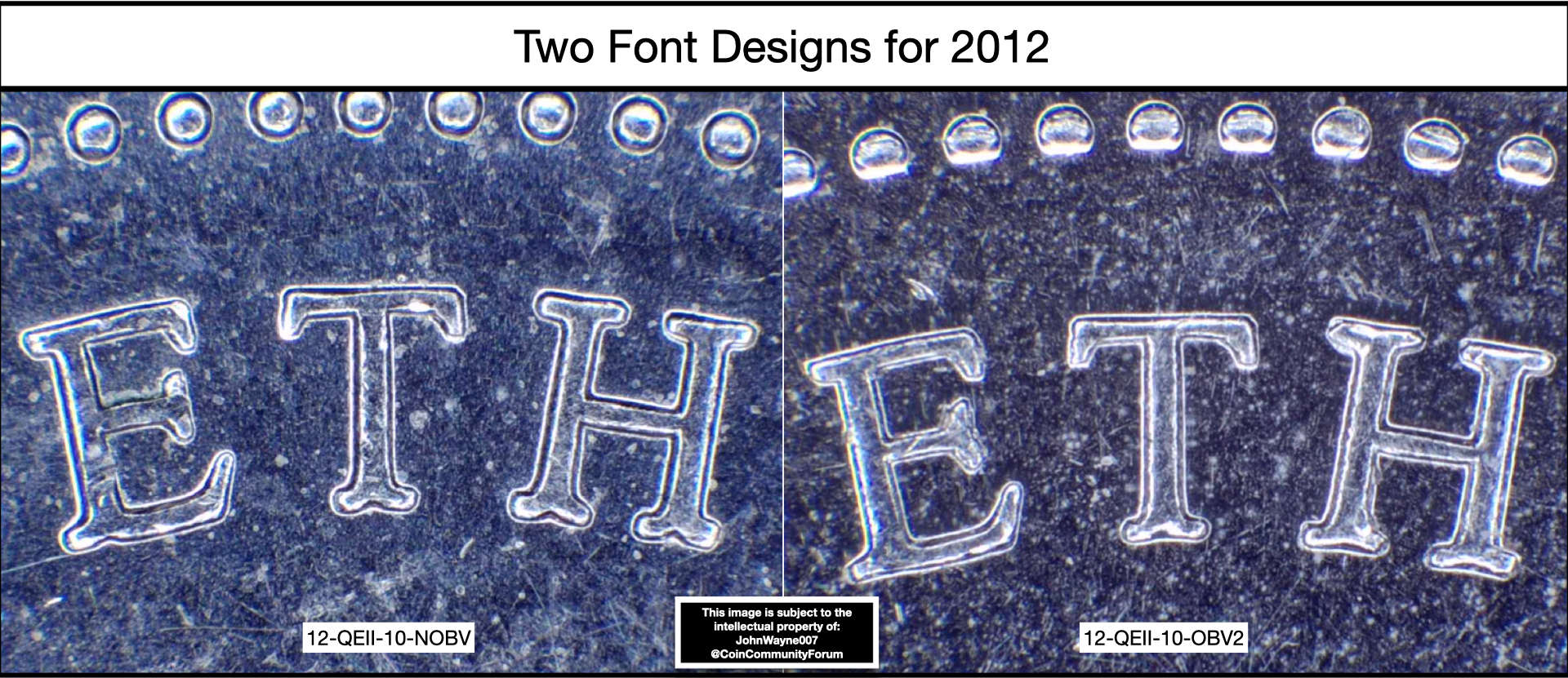
Die Pair Varieties for 2012 Dimes.Variety #1 Listing Number: 12-QEII-10-NOBV
(Normal Obverse for 2012) - Common
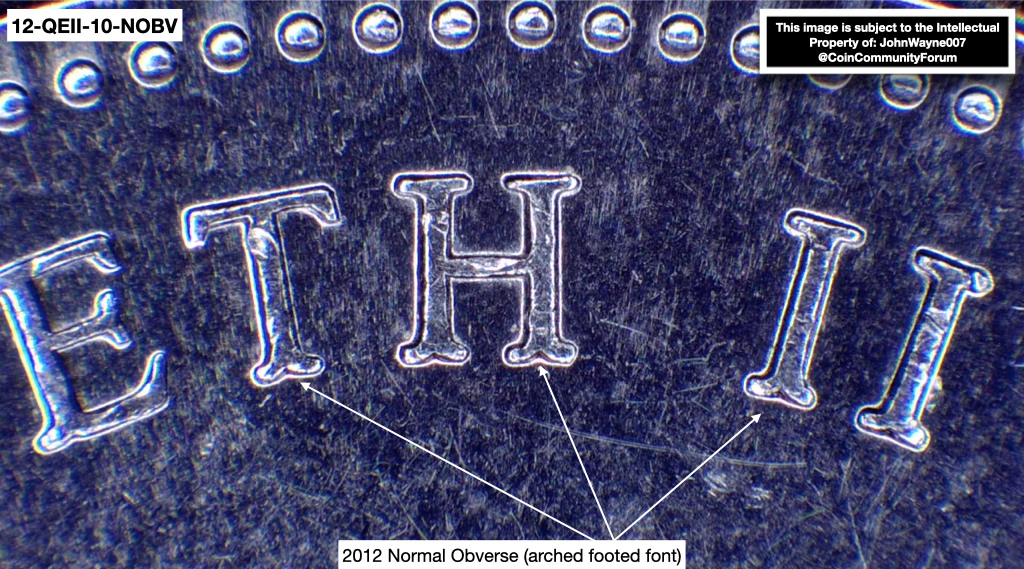
During the minting process in 2011, the standard obverse die design for the legend "ELIZABETH II" and "D.G. REGINA" showed a flat bottom for each letter.
Later on in 2011 when the
RCM started to mint the 2012 dimes for the upcoming year, they switched the font style to show the legend "ELIZABETH II" and "D.G. REGINA" with arched bottoms (think of an upside-down heart).
Although subtle and sometimes hard to spot without a 2011 dime side by side or photos to compare it with, you can see the differences easily with the use of a loupe or other forms of magnification on hand (its a dime, most details, in general, are hard to see on a coin this size).
Out of $1,250.00 worth of dimes, I stopped counting after I filled 4 rolls.
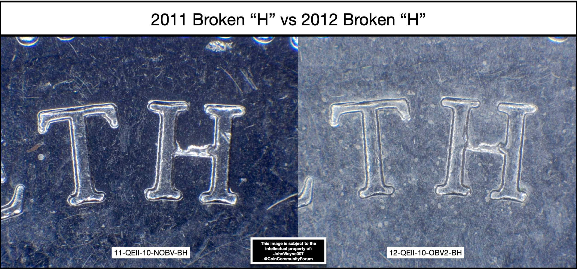
Variety #2 Listing Number: 12-QEII-10-OBV2-BH
(2011 broken "H" obverse paired with 2012 Reverse) - Not as Common
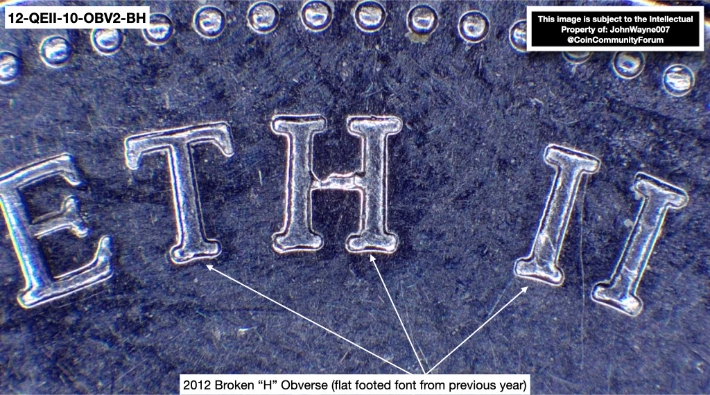
These two images below can be used to do an overlay to show that they both are the result of the exact same die damage that was the result of a broken master punch or working punch before being transferred to the working dies during the hubbing process.
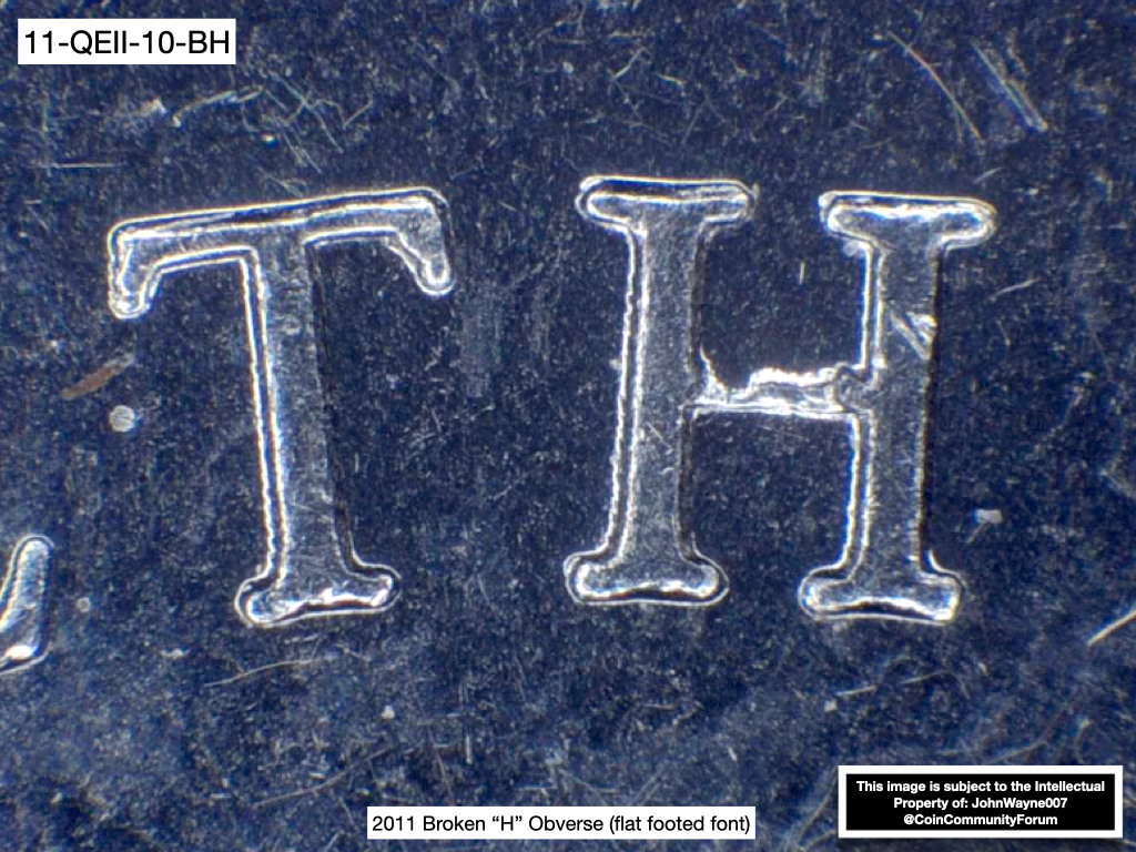
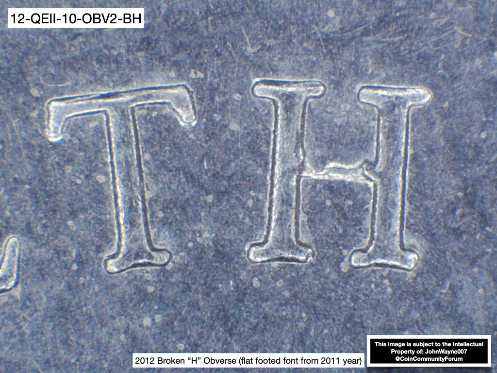
This die pair can be found on both 2011 and 2012 dimes like shown above, as this one has a very noticeable die marker that was the result of a broken post on either the master punch or working punch during the production of the 2011 obverse dies that were later used to strike 2012 dimes.
The broken post that I refer to is the post between the "H" in "ELIZABETH" and does not need any type of high magnification to find. This variety has been around for a while as most have over-looked it as damage, when in fact it is not.
When the
RCM was striking dimes for 2012 they used some of the obverse dies leftover from 2011 to finish the production. Some of those dies showing the broken "H" and some not showing any die markers at all (12-QEII-10-OBV2 for instance) but still show the standard obverse font design for 2011 which is flat bottoms on each letter found on the obverse, instead of the arched foot design that was intended for 2012 (upside-down heart shape).
Out of $1,250.00 worth of dimes, I managed to find one full roll.
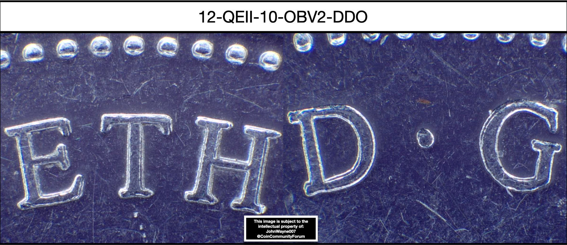
Variety #3 Listing Number: 12-QEII-10-OBV2
(2011 obverse paired with 2012 reverse) - Not Common
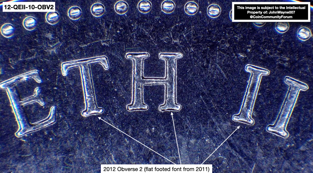
This die pair is not as easy to find as the previous two. Since the
RCM used leftover dies from 2011 to mint the 2012 dimes as mentioned previously, the only way to differentiate which obverse die that was used, is to compare the Legends on the obverse of a 2011 and a 2012 dime.
The two main designs used for the obverse legends are flat bottom for 2011 dimes, and arched bottom letters for 2012 dimes. Finding a 2012 dime with no broken "H" and only showing the flat bottom design had proven to be fairly difficult.
Out of $1,250.00 worth of dimes, I managed to find 10 examples.
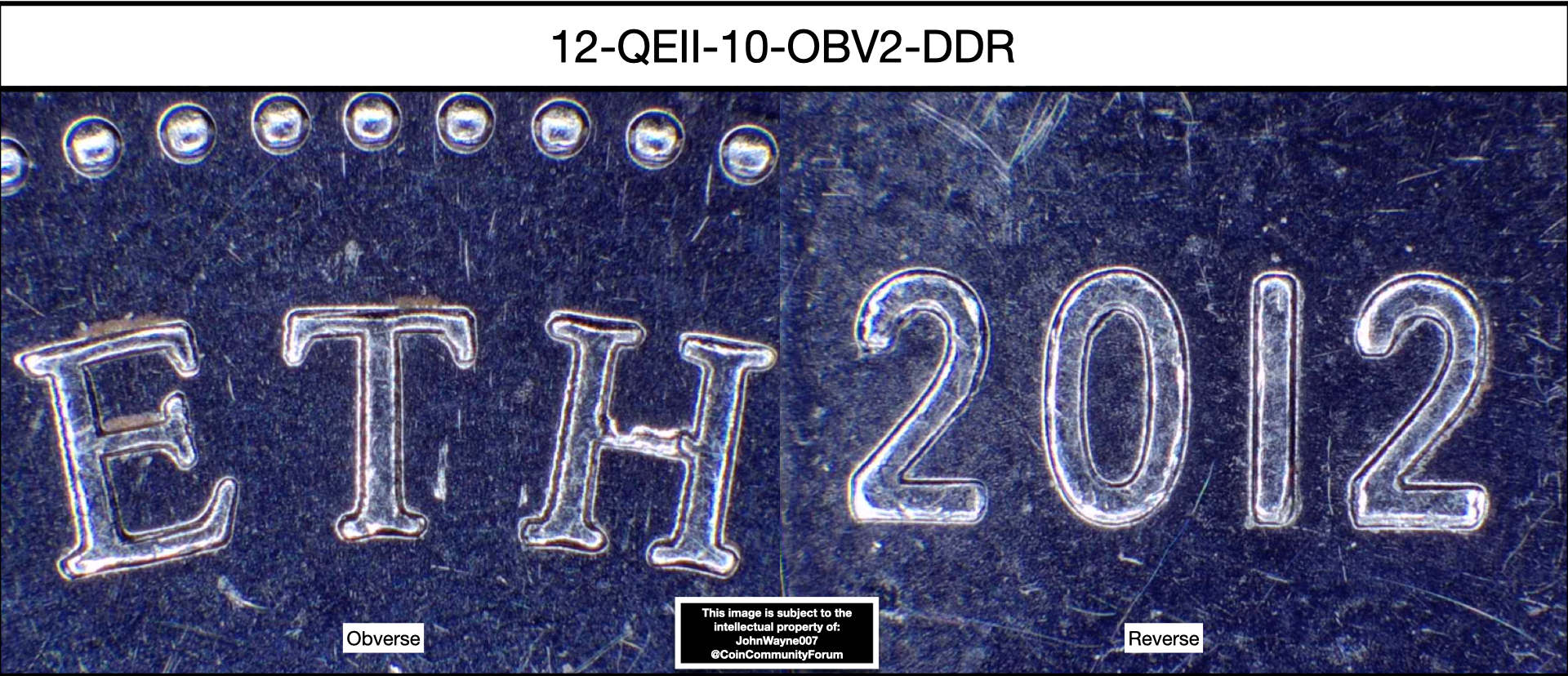
Variety #4 Listing Number: 12-QEII-10-OBV2-DDR
(2011 broken "H" obverse die paired with 2012 doubled die reverse) - Not Common
This die pair somewhat surprised me, It was not only paired with a 2011 Obverse die with a broken "H", but it was also paired with a doubled die reverse. Reason being as to why I say "somewhat" surprised me is that on almost all denominations for 2012 there are doubled dies being found so I expected to find one sooner or later for the 10 cent dimes.
On the reverse, a small spread of doubling can be found on the left of the devices in "CANADA" and at the bottom of the date, as well as "10 CENTS" going in a Southwest direction. Although the spread of doubling is small, it is easily recognizable and still a genuine doubled die.
Out of $1,250.00 worth of dimes, I only managed to find one example.
Please Note: No photos are available for listing number: 12-QEII-10-OBV2-DDR as I have not taken any yet but will, later on this evening and I will update this post.